Product Sections
Product sections cover everything from the main product page to carousels, bundles, comparison tables, and the overlays that support buying from anywhere in the store. Lotio includes 16 product sections: the main product section with its three alternate page layouts, nine sections you can add to any page, and three overlay sections that live in the Overlay section group.
Product information
The main product section used by the default product template. It renders the media gallery on one side and a buy box built from blocks on the other, and every alternate product layout below reuses the same block set.
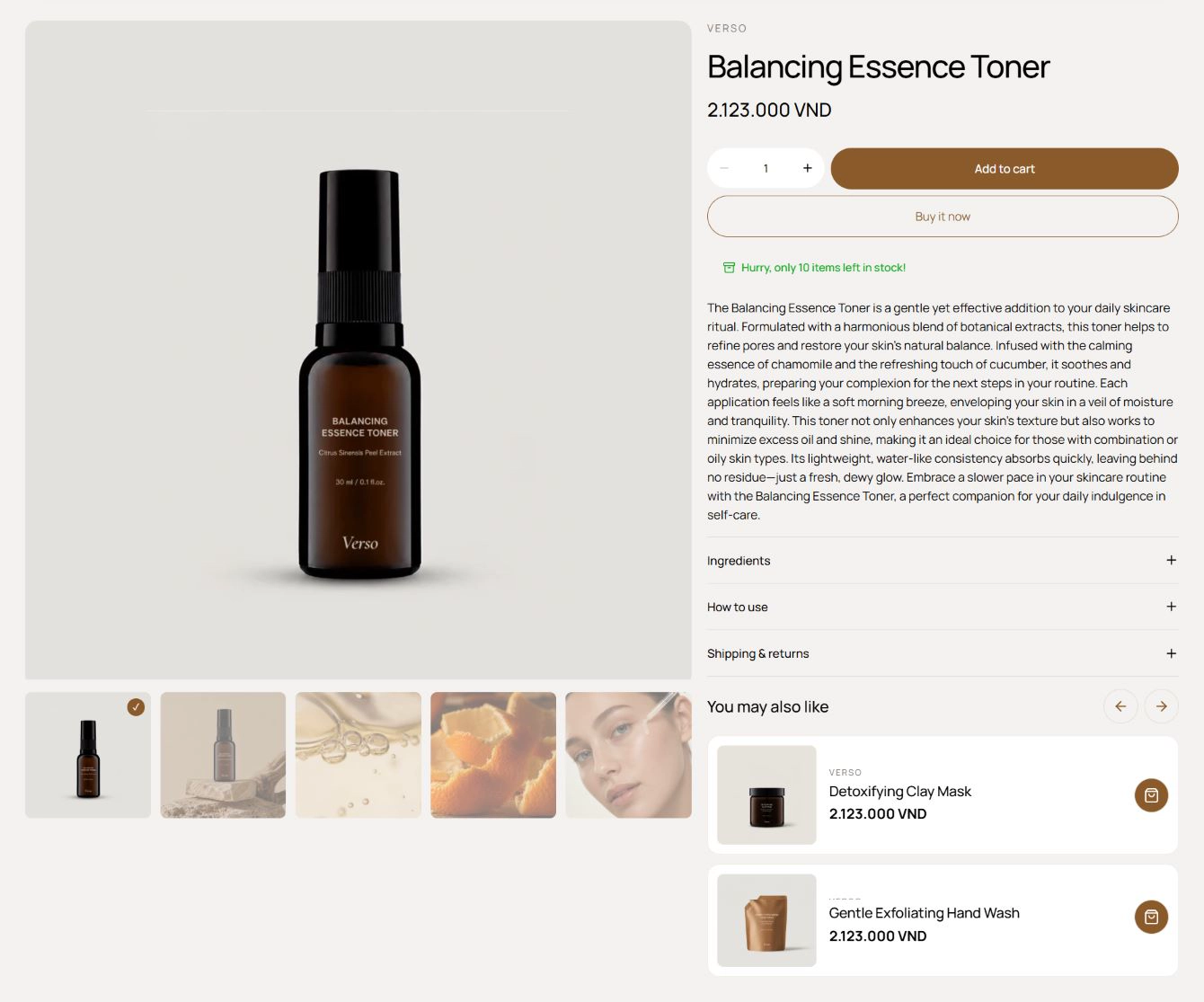
Features:
- Enable sticky cart with a Sticky cart type of Quick add or Standard add, so the add-to-cart bar follows the customer as they scroll
- Media sticky keeps the gallery pinned while the buy box scrolls
- Gallery type: Carousel or Scroll, with Thumbnail position Bottom or Right
- Enable image zoom on the gallery
- Variant media options: Hide other variants' media after selecting a variant, and Only show selected variant image
- Layout columns and gap per device, plus a Media layout column span that controls how wide the gallery is on desktop and mobile
- Fixed row and Auto row controls in the Advanced group
Blocks:
- Vendor: the product vendor with its own padding controls.
- Heading: the product title.
- Description: the product description.
- Price: the current price with the compare-at price when the product is on sale.
- Variant picker: Dropdowns, Buttons, or Swatches, with direction, alignment, spacing, and a Show selected value toggle. See Color swatches.
- Inventory status: a stock label or progress bar with a Low inventory threshold, Show inventory count, and in-stock and out-of-stock colors.
- Countdown timer: a timed offer message with configurable colors.
- Buy button: Layout (Quantity top, Buy now bottom, or All stacked), Size variant, Corner radius, Show dynamic checkout buttons, and the recipient information form for gift cards.
- Pickup availability: local pickup availability for the selected variant.
- Promo banner: a highlighted headline and label with its own colors.
- Line item properties: a Checkbox, Radio, or Dropdown field whose value is added to the cart line. See Product line item properties.
- Volume discount: tiered quantity pricing with a label, note, quantity, and Fixed amount or Percentage discount. See Volume discount.
- Collapsible row: a heading and rich-text content in an accordion, with Open by default.
- Product recommendations: a related-products row inside the buy box, with a heading and typography preset.
- App blocks: any Shopify app block installed on your store.
Product page layouts
Lotio ships three alternate product-page sections. They are enabled only on product templates, share the same block set as Product information, and each has its own template so you can switch a product to a different layout without rebuilding the buy box. See Page Templates and the Change product template guide.
Product backdrop
A cinematic layout where the product's cover photo is the section background. It opens full-viewport with the product name and price overlaid, then zooms and fades into a sticky ghost backdrop as the customer scrolls, while the buy box and a column of floating gallery cards drift over it.
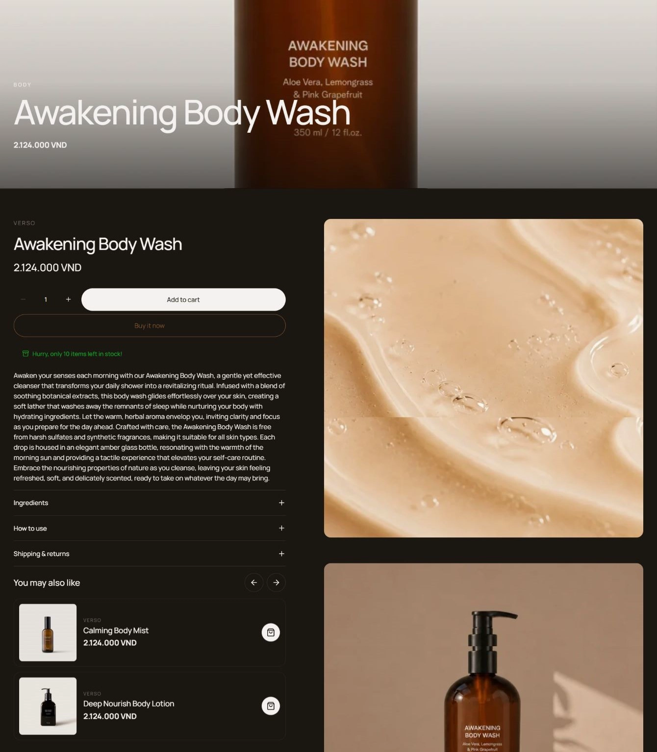
Features:
- Scroll-driven zoom and fade on the cover photo, disabled on mobile where it becomes a static image
- Intro overlay with eyebrow, product name, and price
- Floating gallery cards for the remaining product media with a slow parallax drift; videos and 3D models stay static so they remain interactive
- Buy box built from the same blocks as Product information
- Blocks: Vendor, Heading, Description, Price, Variant picker, Inventory status, Countdown timer, Buy button, Pickup availability, Promo banner, Line item properties, Volume discount, Collapsible row, Product recommendations, App blocks
Product carousel vertical
A two-column product page with a breadcrumb on top, the buy box on the left, and a synced media carousel with a vertical thumbnail strip on the right. It adds two editorial blocks for benefits and trust tabs at the bottom of the buy box.
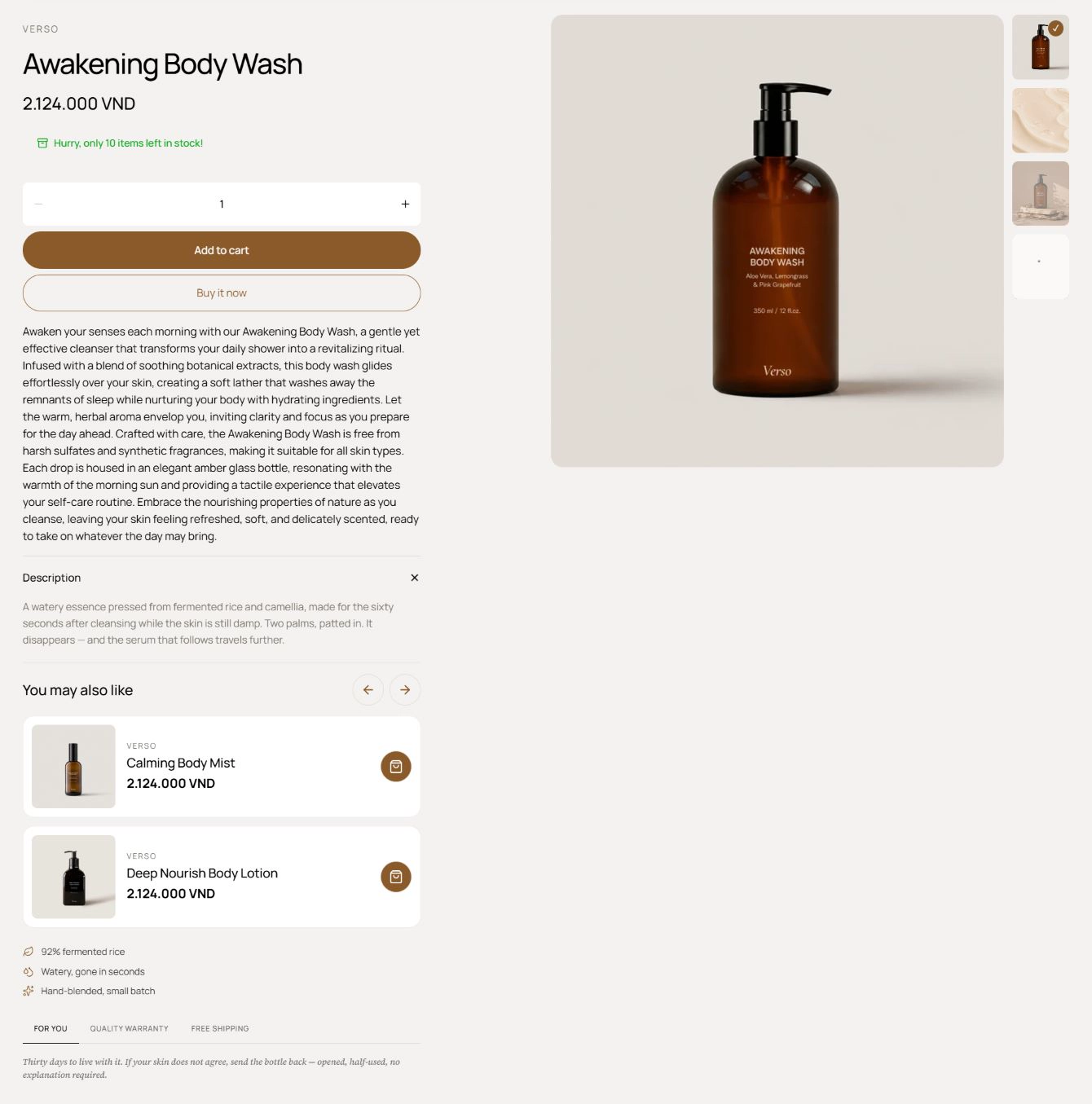
Features:
- Breadcrumb (Home, first collection, product) above the grid
- Media carousel with vertical thumbnails on desktop; the gallery stacks above the buy box on mobile
- Enable sticky cart with Quick add or Standard add for the mobile add-to-cart bar
- Hide other variants' media after selecting a variant
- Benefit list with an icon (Leaf, Droplets, Sparkles, or Check) and text per item
- Trust tabs with a Tab label and Note each, for content such as shipping and warranty
- Blocks: the full Product information block set plus Benefit and Trust tab
Product gallery wall
A short, image-led product page with a breadcrumb over a two-column grid: a justified photo wall of every product media on the left and the buy box inside a bordered card on the right.
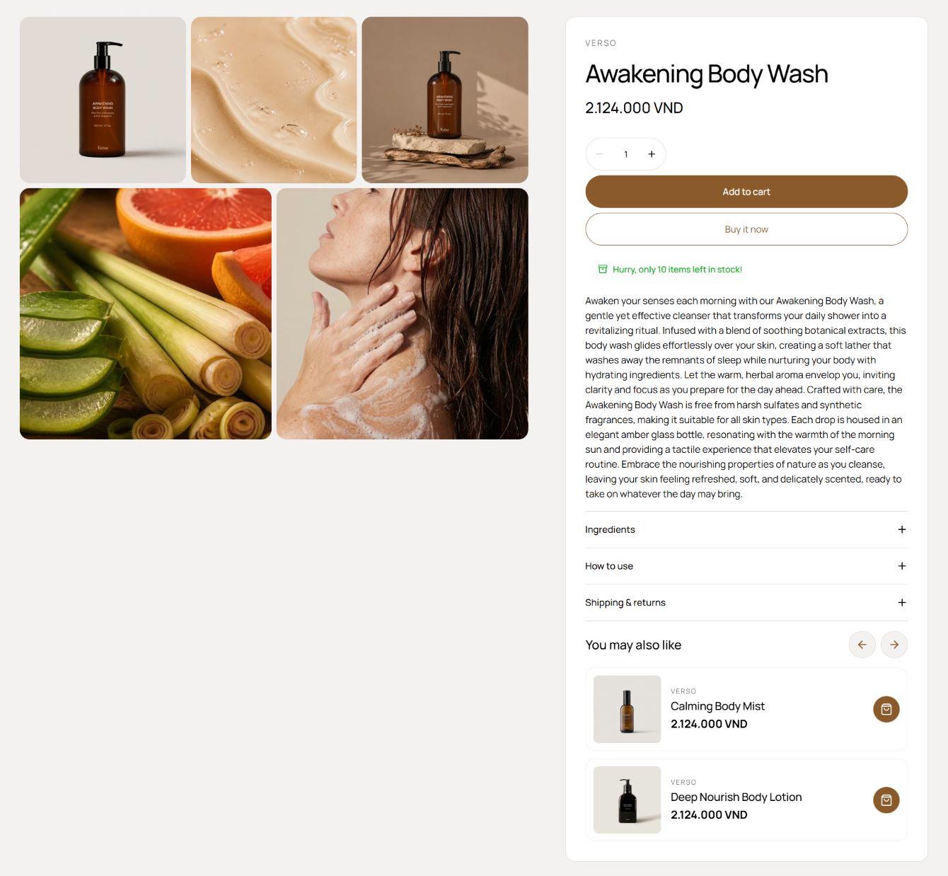
Features:
- Justified "photo wall" that shows all product media at once
- Breadcrumb (Home, first collection, product) above the grid
- Inline buy box in a bordered card; on mobile the gallery stacks first and the sticky cart bar handles add-to-cart
- Enable sticky cart with Quick add or Standard add
- Hide other variants' media after selecting a variant
- Blocks: Vendor, Heading, Description, Price, Variant picker, Inventory status, Countdown timer, Buy button, Pickup availability, Promo banner, Line item properties, Volume discount, Collapsible row, Product recommendations, App blocks
Featured product
A single product with its gallery and buy box, placed on any page. Use it to spotlight a hero product on the home page or a landing page with a working add-to-cart.
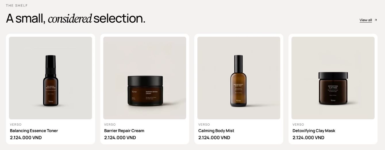
Features:
- Pick the Product to feature
- Gallery type: Carousel or Scroll, with Enable image zoom
- Hide other variants' media after selecting a variant, and Only show selected variant image
- Layout columns and gap per device, plus a Media layout column span for the gallery width
- Blocks: Vendor, Heading, Description, Price, Variant picker, Inventory status, Countdown timer, Buy button, Promo banner, Line item properties, Volume discount, Collapsible row, App blocks
Product list
A plain product grid or carousel with a simple heading, without the overline and intro of Featured products. It is the lightweight choice when you only need a row of product cards.
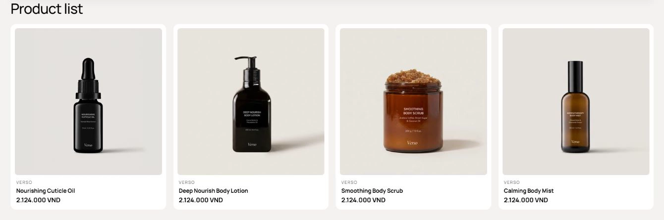
Features:
- Source products from a Collection or a specific Products list, with Number of products to show
- Heading and Heading size
- Cards layout: Grid or Carousel, with desktop and mobile column counts and gap
- Carousel options: per-move count, navigation arrows, pagination, effect, speed, autoplay, and loop
- Product card: Color scheme, Product card type, and toggles for vendor, price, swatches, add to cart, quick view, compare, and badge
- Product media aspect ratio, hover effect, navigation style, and bullets
- Variant display option and Option name for card swatches
Product stack
A scroll-driven stack of full-bleed product scenes. Each product block pins to the viewport in turn; as the customer scrolls, the mood image scales down and rounds its corners while a product card stays centered on top.
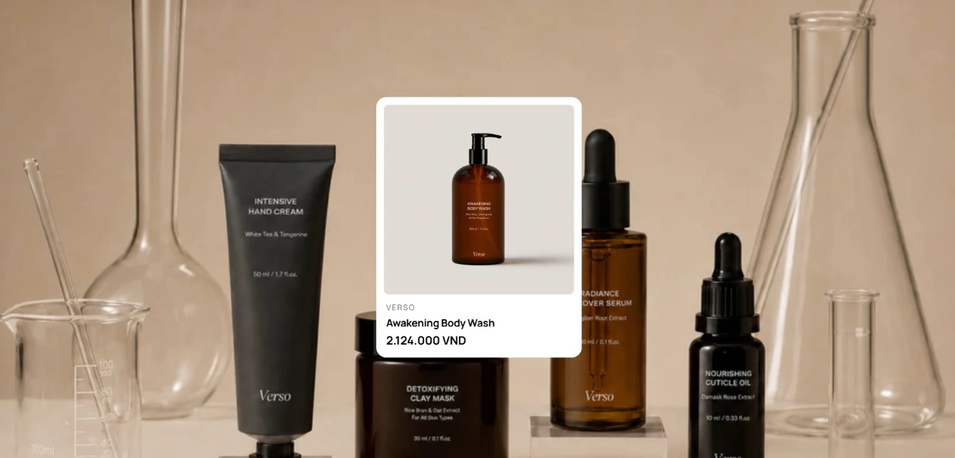
Features:
- One Product per block, each with a full-bleed Background image and alt text
- Sticky, staggered reveal so items pile up one after another
- Product card: Color scheme, Product card type, and toggles for vendor, price, swatches, add to cart, quick view, compare, and badge
- Product media aspect ratio, hover effect, navigation style, and bullets
- Variant display option and Option name for card swatches
- Blocks: Product
Product spotlight
A sticky, scroll-choreographed showcase for one hero product. Over a tall scroll runway the heading fades up, the product cutout rises into place, a large featured spec slides in, a strip of smaller specs staggers in, and two call-to-action buttons arrive last.
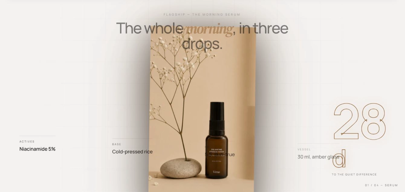
Features:
- Eyebrow and Heading; wrap a word in italics to accent it
- Product image with alt text; a transparent cutout PNG works best
- Featured spec with Value, Unit, and Label, and a Show featured spec toggle
- Primary and Secondary buttons with label, style, size, URL, and new-tab option
- Index label pill in the corner
- Spec strip built from blocks, each with a Label and Value
- Blocks: Spec
Product recommendations
Shopify's related-products row for the current product. It has no preset and is meant for product templates, where it loads recommendations for the product being viewed.
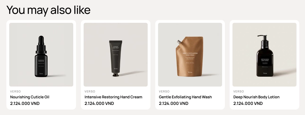
Features:
- Heading with a full Typography group (preset, font, size, italic, weight, line height, letter spacing, case, and wrap)
- Number of products to show
- Layout columns and gap per device, per-move count, navigation arrows, and pagination
- Layout advanced: effect, speed, autoplay, loop, and overflow
- Product card: Color scheme, Product card type, and toggles for vendor, price, swatches, add to cart, quick view, compare, and badge
- Product media aspect ratio, hover effect, navigation style, and bullets
- Variant display option and Option name for card swatches
Recently viewed
A row of the products the customer has looked at during their visit. Place it near the bottom of product or cart pages to bring shoppers back to what they were considering.
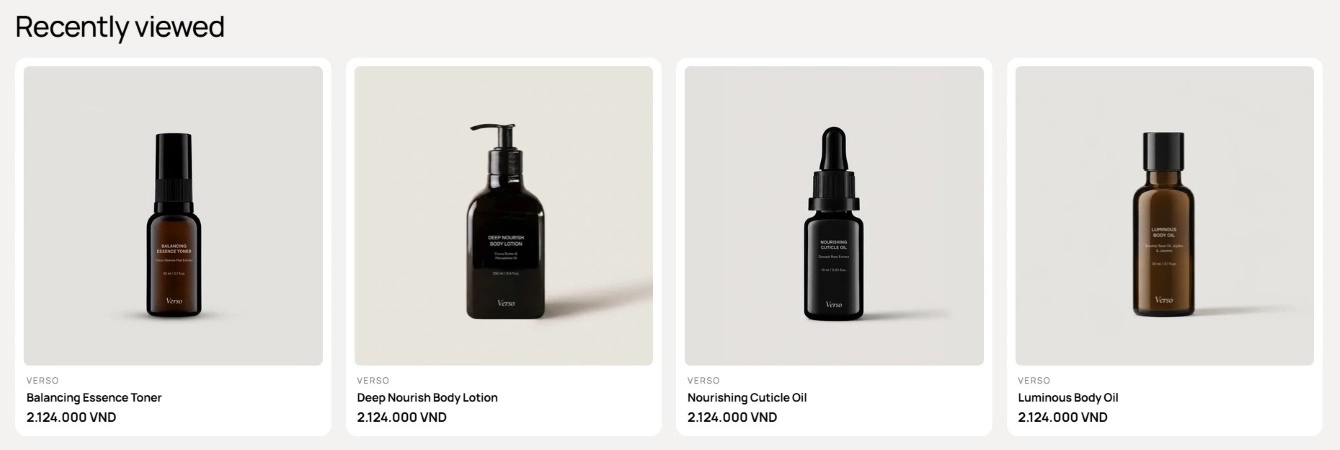
Features:
- Heading and Heading size
- Number of products to show
- Navigation style: Pagination or a View more button with a Target URL
- Layout type (Grid or Carousel) with columns and gap per device, per-move count, arrows, and pagination
- Advanced carousel options: effect, speed, autoplay, loop, overflow, and auto height
- Product card: Color scheme, Product card type, and toggles for vendor, price, swatches, add to cart, quick view, compare, and badge
- Product media aspect ratio, hover effect, navigation style, and bullets
Bundle builder
A step-by-step bundle builder with tiered discounts. Each collection you choose becomes a numbered step, customers add products from each step, and a live summary panel tracks the piece count, the discount tier reached, and the subtotal before adding the whole set to the cart.
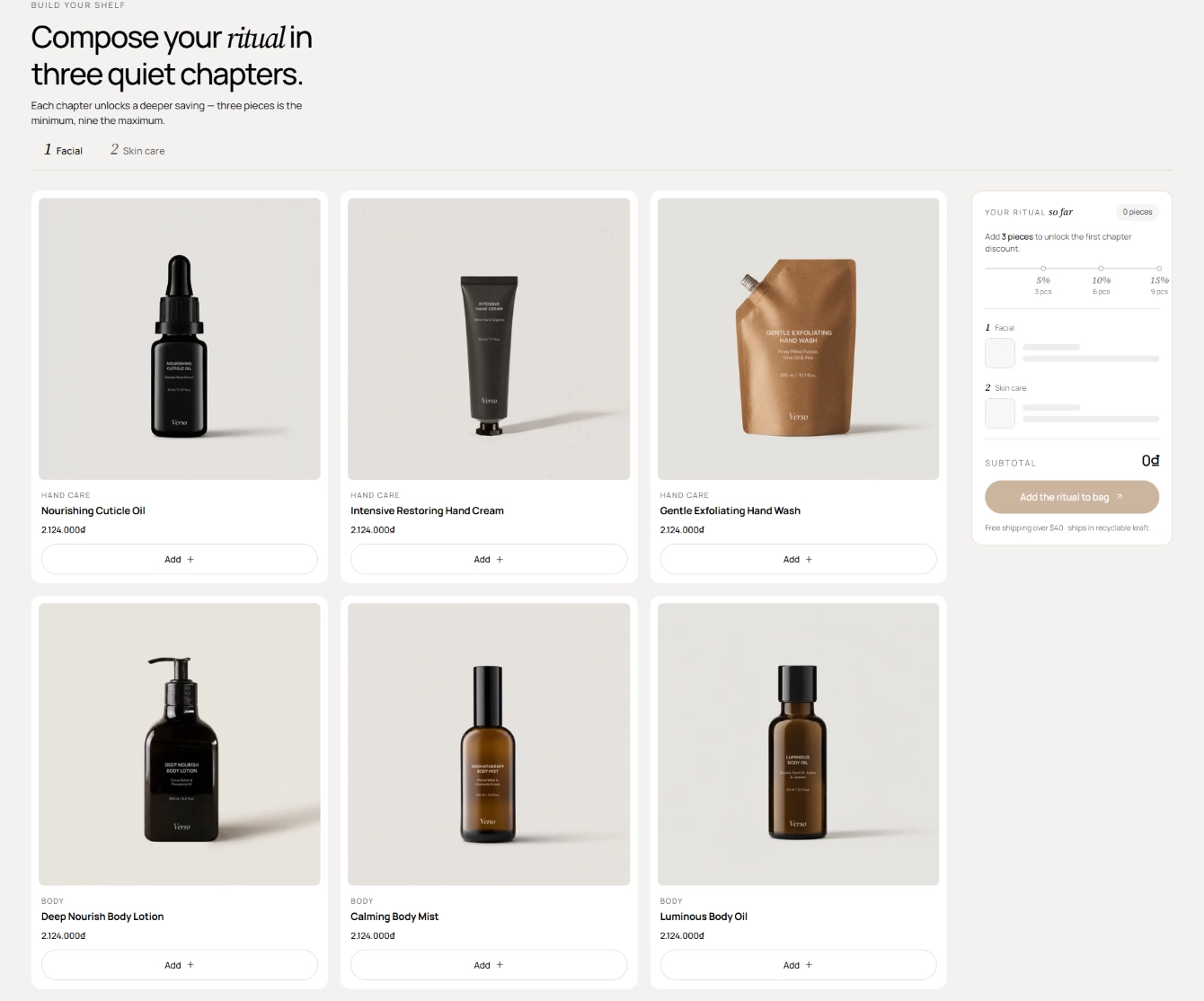
Features:
- Heading area with Overline, Heading, Intro, Heading size, and Alignment
- Collections list where each collection becomes a step, with Products per step
- Three discount tiers, each with a minimum number of pieces and a percentage discount
- Add button label on the product cards
- Summary panel with Panel overline, Panel hint, Subtotal label, Button label, style, size, and a Panel footnote
- Live progress bar with tier markers, per-step item lists, and a compare-at total showing the saving
Spec compare
A side-by-side specification table for up to a handful of products. Row labels are defined once on the section and each product block supplies its values in the same order.
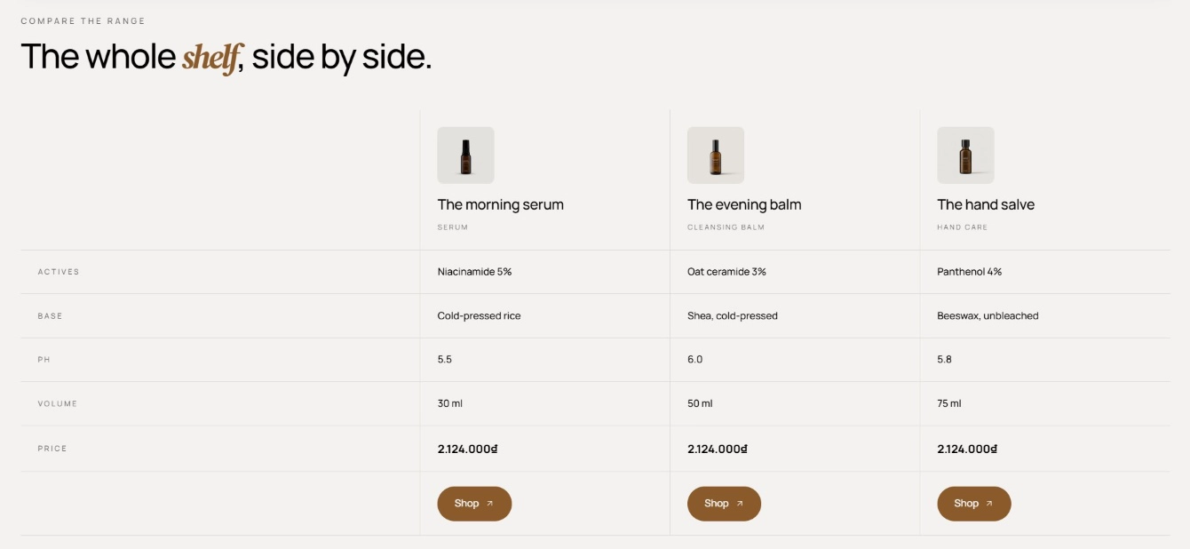
Features:
- Overline and Heading; wrap a word in italics to accent it
- Row labels, one per line, plus a Price row label
- Product per block: pick a Product so price and button link fill in automatically, or enter a fallback Price and URL
- Image override (a transparent cutout works best), Name, and Category per column
- Spec values, one per line, matching the row labels; use a dash for not applicable
- Button label, style, size, and new-tab option per column
- Blocks: Product
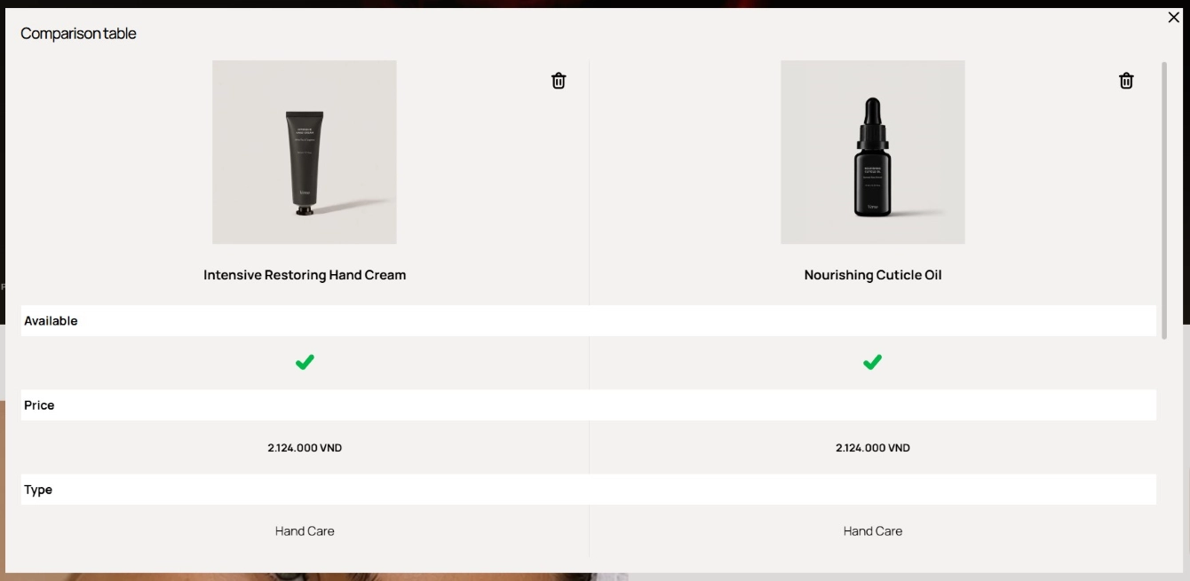
Product compare modal
The comparison overlay opened by the Compare action on product cards. It lives in the Overlay section group, lists up to four products side by side, and lets the customer remove products or clear the list.
Features:
- Rows toggled individually: Available, Type, Price, Vendor, SKU, Tags, and Variants
- Custom metafields, one per line, to add your own comparison rows
- Products fetched from the customer's compare list, up to 4 at a time, with per-product remove
- Horizontal scroll on narrow screens so all columns stay readable
- Enable the Compare button on cards from the Product card settings of each product section
Quick view
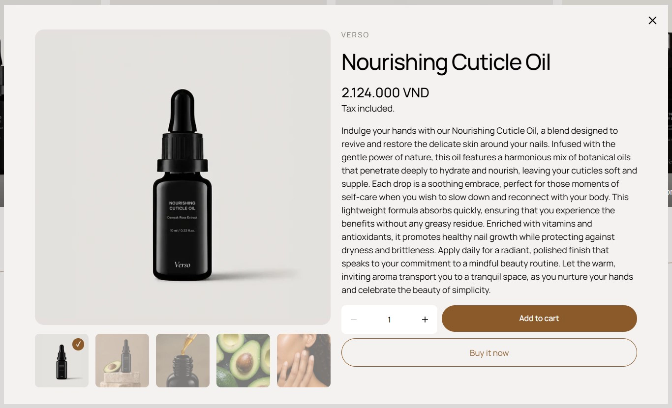
The modal that opens when a customer clicks Quick view on a product card. It lives in the Overlay section group and loads the product's gallery, price, variant picker, and add-to-cart without leaving the current page.
Features:
- Modal container sized for a two-column product layout
- Media carousel on the left and product content on the right; the two columns stack on mobile
- Variant selection and add to cart from inside the modal
- 3D models are included for products that have them
- Enable the Quick view button on cards from the Product card settings of each product section
Quick view content and Quick view bundle are internal variants rendered inside this modal: the first for standard products, the second for products opened from a bundle context. They have no settings of their own and you do not add them to pages.
Pickup availability
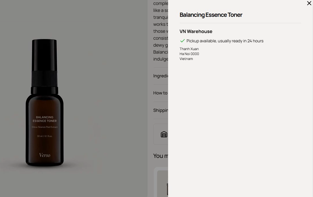
The local pickup panel used by the Pickup availability block. It lists the store locations that offer pickup for the selected variant and opens a detail list with addresses. It has no settings and no preset; add the Pickup availability block to a product section to use it.
Features:
- Reads the store availabilities of the selected variant and shows only locations with pickup enabled
- Summary line under the buy button with a link to the full location list
- Refreshes for the selected variant, with a link to view store info and check other stores
- Requires local pickup to be configured in your Shopify shipping settings
Cart mini
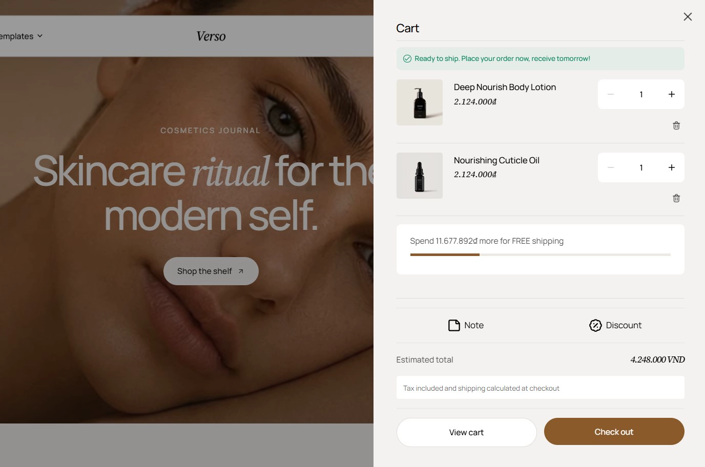
The cart drawer that slides in when a customer adds a product or opens the cart icon. It lives in the Overlay section group and has no section settings; its behavior comes from Theme settings > Cart.
Features:
- Cart type: Drawer, Page, or Popup notification, set in Theme settings
- Drawer position (Left or Right) and cart color scheme
- Optional order note and discount code fields inside the drawer
- Free shipping message with a threshold and optional product suggestions from a chosen collection
- Renders both the slide-in drawer and the popup notification, depending on the Cart type
See Theme Settings for the full Cart group, and the Cart attributes guide for collecting extra information at checkout.
Every product grid section (Featured products, Product list, Recently viewed, and Product recommendations) shares the same Cards layout controls. Set Type to Carousel, choose the desktop and mobile column counts, then open Cards layout advanced to turn on navigation arrows, pagination, autoplay, and loop. Keep the Product card settings consistent across sections so cards look identical wherever they appear.