Editorial Sections
Editorial sections tell your brand story. They lean on large type, quotes, signed letters, and scroll-driven motion rather than product grids, so they suit About pages, campaign landing pages, and the narrative parts of a home page. Lotio includes 14 editorial sections. All of them share the universal width, color scheme, background, and padding controls described in Section Settings.
About with stats
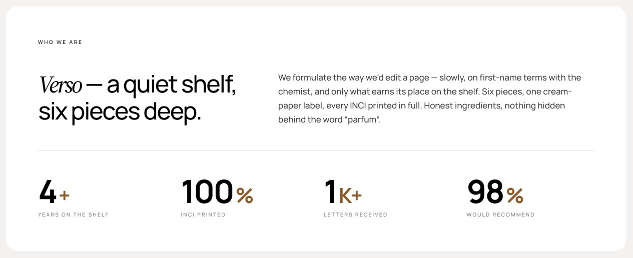
A brand-intro card with an eyebrow, a heading beside a body paragraph, and a row of animated stat counters that count up when they scroll into view.
Features:
- Eyebrow, heading, and rich-text body
- Heading and body sit side by side on desktop and stack on mobile
- Stat counters animate from zero with a staggered delay
- Each stat has a number, an optional suffix such as "+" or "%", and a label
- Blocks: Statistic
About values
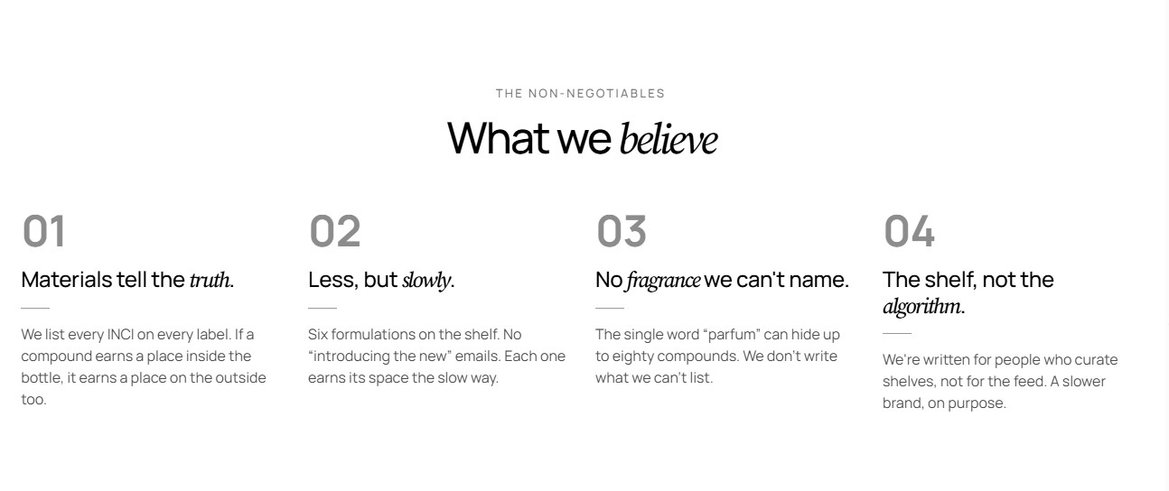
A section heading over a set of numbered value cards. Each card shows an auto-numbered principle, a rule line, and a detail paragraph.
Features:
- Overline, heading, intro, heading size, and alignment, with an option to accent the italic word
- Switchable cards layout: grid or carousel, with columns and gap per device
- Carousel controls: navigation arrows, pagination, autoplay, loop, and effect
- Cards auto-numbered 01, 02, 03…
- Up to 12 values, each with a principle and detail
- Blocks: Value
Founder letter
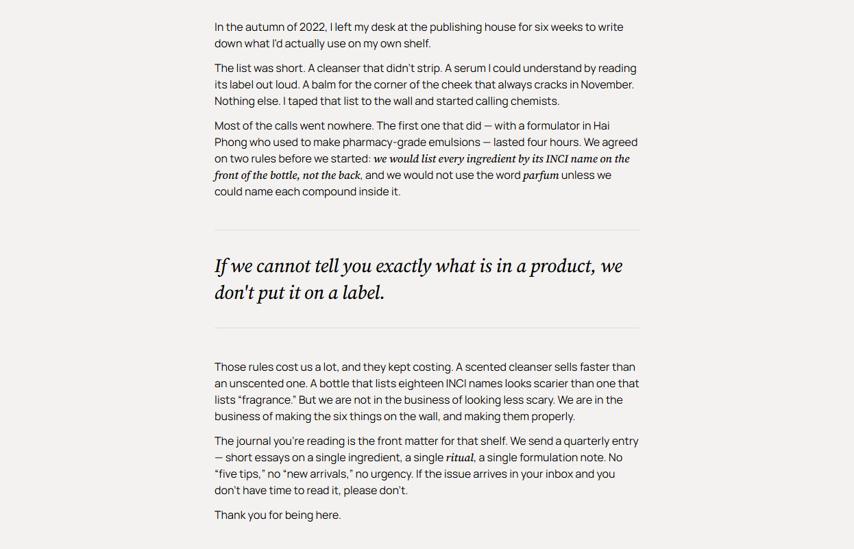
A long-form signed letter in a narrow centered column. An opening line is followed by paragraphs and pull quotes in any order, closing with a name and a place and date.
Features:
- Opening line with inline formatting
- Paragraph and pull-quote blocks that you can mix in any order
- Sign-off name and place and date
- Narrow reading column styled as prose
- Up to 12 blocks
- Blocks: Paragraph, Pull quote
Designer quote
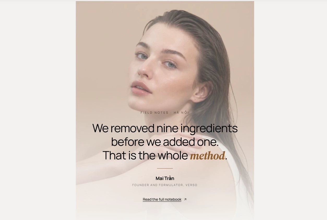
A single attributed quote that overlaps a large portrait. The portrait's lower edge dissolves into the background and it zooms out and fades as you scroll.
Features:
- Overline and quote, with italic wrapping for emphasis
- Portrait image with alt text
- Attribution name and role
- Scroll-driven zoom and fade on the portrait
- Button with label, style, size, URL, and new-tab option
Floating quote
A centered quote card with a signature, sitting above a stage where up to two stat chips and two photos drift independently on scroll. Positions are fixed by block order: the first stat sits top-left and the second bottom-right; the first photo is large top-right and the second small bottom-left.
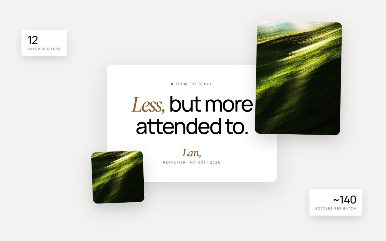
Features:
- Overline, quote, signature name, and signature line
- Up to 2 stat chips, each with a value and label
- Up to 2 photos, each with an image and alt text
- Every floating element has its own parallax motion
- Floating elements show on desktop only
- Blocks: Stat, Photo
Quote collage
A centered pull-quote card ringed by two stat chips and two photos, all configured directly in the section settings. Chips and photos drift on scroll and hide on mobile, where only the card remains.
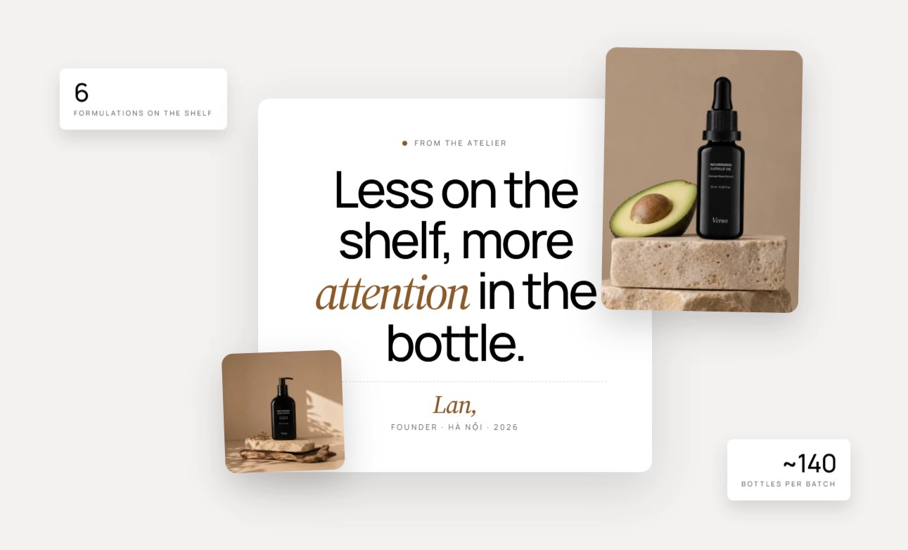
Features:
- Overline, quote, sign-off name, and sign-off line
- Two stats, each with a value and label
- Large photo top-right and small photo bottom-left, each with a ratio and alt text
- Parallax drift on every chip and photo
- Card-only layout on mobile
Manifesto
A pinned headline whose letters fly in horizontally as you scroll, while rounded product polaroids pop in around it. The section holds the page for a set scroll distance before releasing.
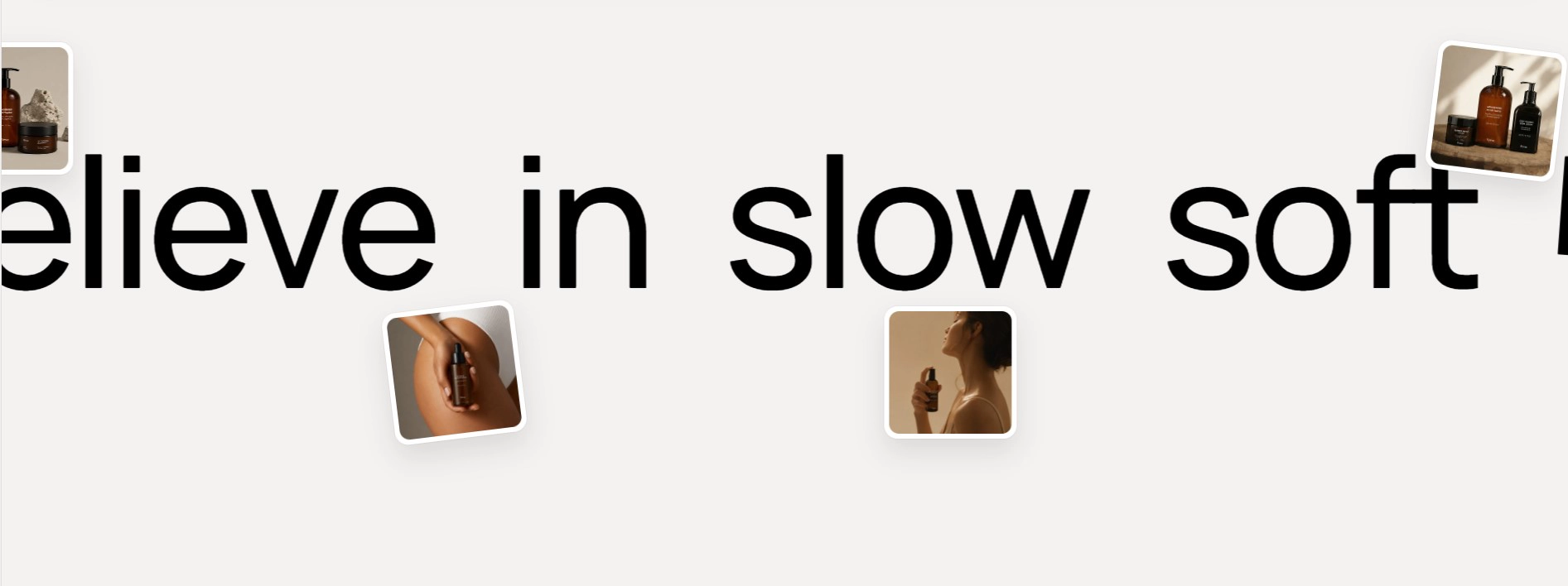
Features:
- Single-line heading animated letter by letter
- Scroll length sets how long the stage stays pinned
- Four decorative images that appear in sequence
- Letter timing recalculates for any headline length
- Decorative motion disabled on mobile
Manifesto marquee
A tilted, scroll-reactive band of large manifesto phrases on the primary color. Use it as a bridge between two full-bleed sections.
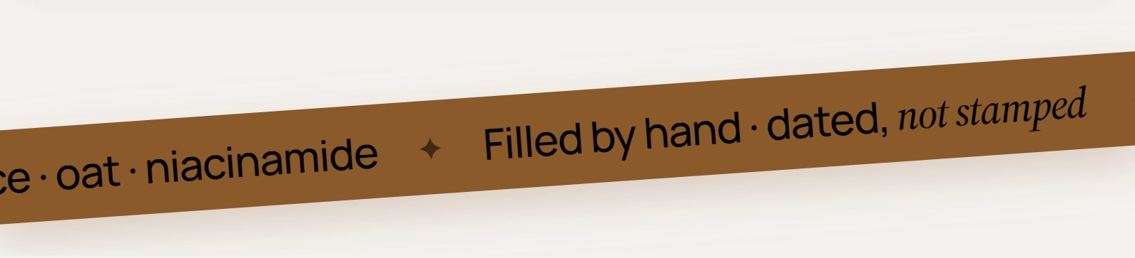
Features:
- Phrase blocks with inline formatting
- Separator glyph shown before each phrase
- Marquee speed and direction (right to left or left to right)
- Scroll speed controls how much page scrolling nudges the band
- Tilt angle of the band
- Pause on hover
- Blocks: Phrase
Marquee showcase
A full-viewport dark stage where a giant outlined brand statement scrolls behind a transparent product cutout that floats gently in the center.
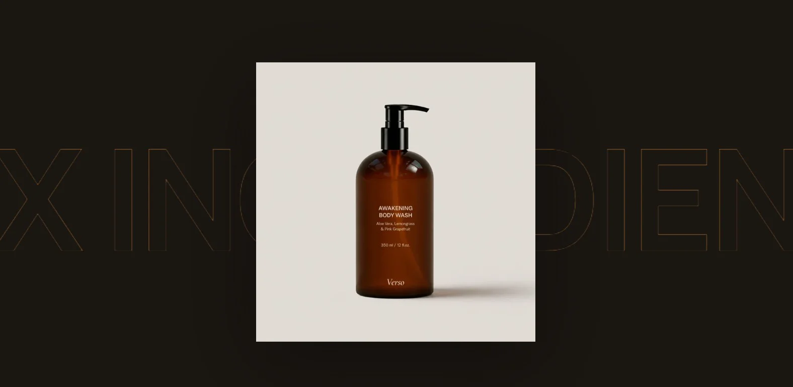
Features:
- Word blocks separated automatically by a ring dot
- Marquee speed and direction
- Scroll speed controls how much page scrolling nudges the text
- Pause on hover
- Cutout image with alt text and a vertical float animation
- Blocks: Word
Ethos
A brand-story band with a bordered head row, a two-line heading, a two-column lede pair, a strip of large mono stats, and a ghost button. A faded wordmark and thin wavy rule lines frame the top and bottom of the band.
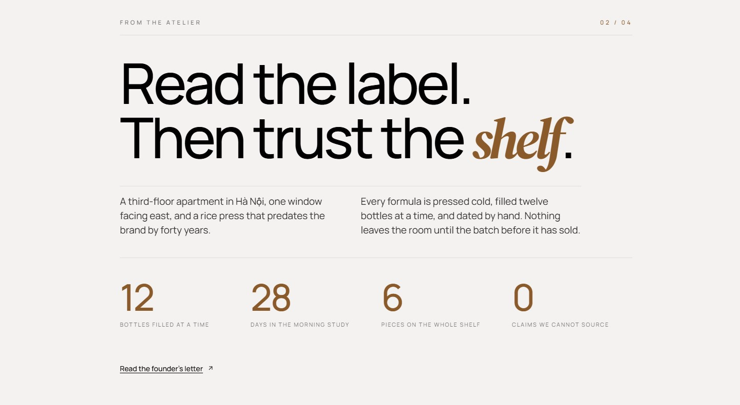
Features:
- Overline and index label aligned to the head row
- Heading line 1 and heading line 2 with inline formatting
- Lead paragraph and secondary paragraph in two columns
- Up to 8 stats, each with a number and label
- Button with label, style, size, URL, and new-tab option
- Blocks: Stat
Headline image reveal
A scroll-driven reveal: a full-viewport image shrinks and zooms as you scroll, settling into an inline slot in the middle of a centered headline.
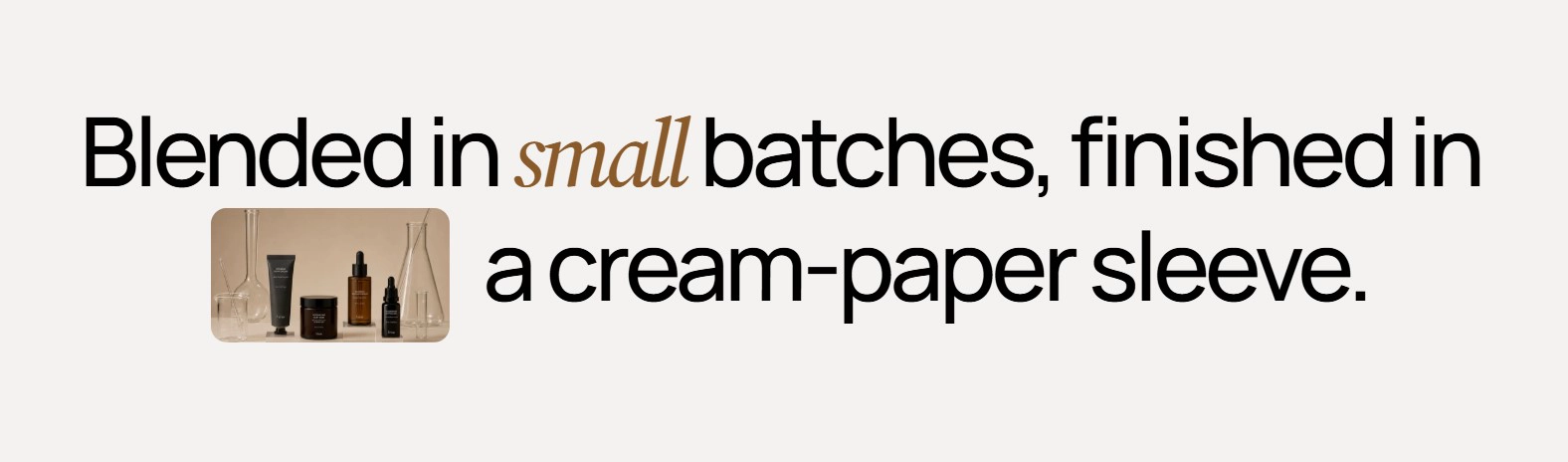
Features:
- Image with alt text
- Heading before image and heading after image
- Image fills the screen, then shrinks into the headline
- Smooth eased motion tied to scroll position
Scroll flip scene
A sticky stage where a small 3D card rotates 180 degrees while scaling up to fill the viewport, flipping between two images. A centered text overlay fades in at the end of the scroll.
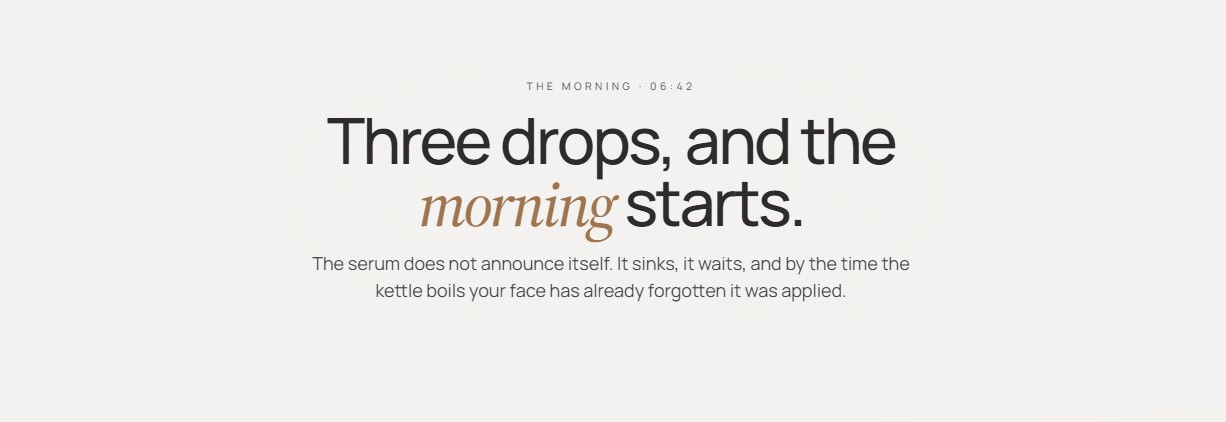
Features:
- Overline, heading, and text overlay that fades in at the end
- Front image shown first, then flipped away
- Back image revealed by the flip
- Full-bleed stage with scroll-scrubbed motion
- Alt text for both images
Composition notes
A large macro image with a tiered note pyramid overlaid as a card. On desktop the card sits bottom-right of the image; on mobile it overlaps the top of the image.
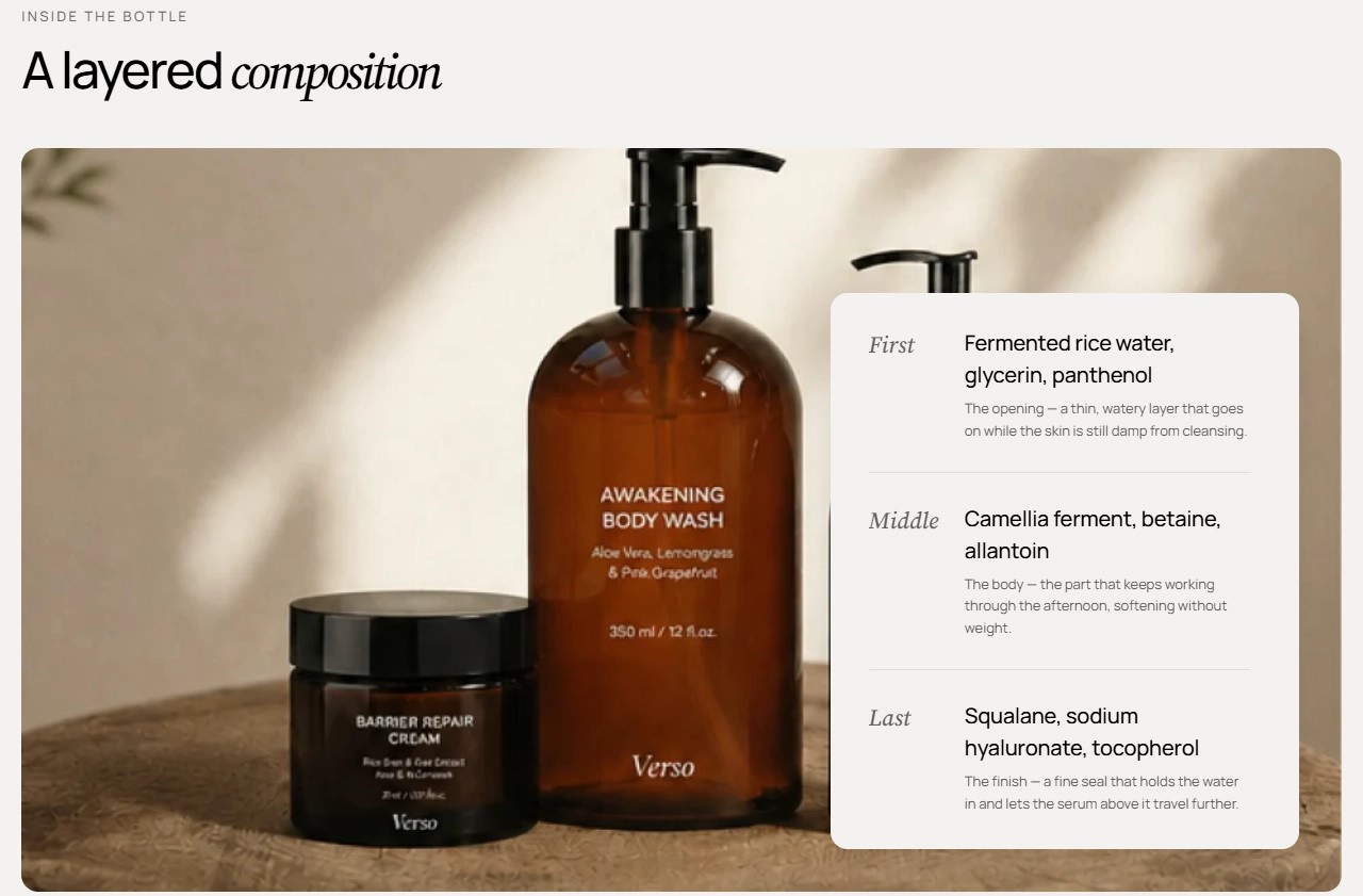
Features:
- Overline, heading, heading size, and alignment, with an option to accent the italic word
- Desktop and mobile images with separate ratios and alt text
- Mobile image falls back to the desktop image
- Up to 6 tiers, each with a label, notes line, and description
- Blocks: Tier
Notes pyramid
A stepped tower of notes that narrows toward the top, shown one scent at a time. Each scent is a tab, and switching tabs swaps the tower instantly.
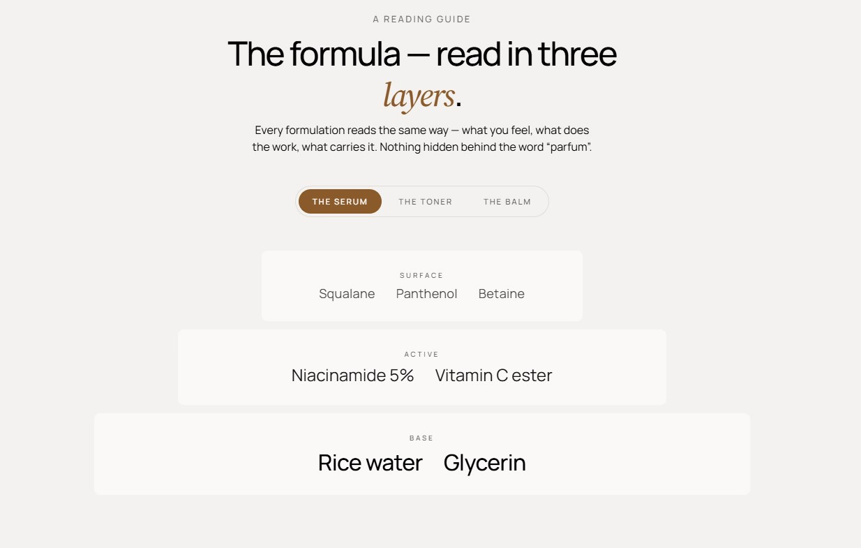
Features:
- Overline, heading, intro, heading size, and alignment
- Shared first, second, and third tier labels (for example Top, Heart, Base)
- Per-scent tab label and one-per-line notes for each tier
- Tiers reveal in a staggered cascade when a tab becomes visible
- Gentle ambient drift on desktop
- Up to 6 scents
- Blocks: Scent
For an About page, open with Headline image reveal or Scroll flip scene for impact, follow with About with stats and About values to state the facts, add Founder letter or Designer quote for a personal voice, and end with Ethos. Use Manifesto marquee to bridge two dark full-bleed sections, and reserve Composition notes and Notes pyramid for fragrance or ingredient stories. Practical follow-ups such as FAQs and newsletter signup live under Content Sections.