Universal Section Settings
Every section in Lotio ends with the same three groups of settings: Advanced (or General settings), Appearance, and Padding. They control how wide the section is, what sits behind its content, and how much space it takes above and below. You find them at the bottom of the section's settings panel in the theme editor, after the settings that are specific to that section.
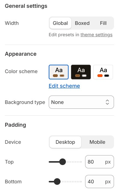
Most content sections label the first group General settings. The main page sections (Product information, Main collection, Main cart, and so on) label the same group Advanced, and the generic Section shows the width settings without a group label. The settings inside are identical.
Advanced
- Width: Choose how wide the section's content area is:
- Global: Uses the page width you set in Theme settings > Layout.
- Boxed: Uses a custom maximum width that you set with the next setting.
- Fill: Content spans the full browser width.
- Custom width: When Width is Boxed, set the maximum width of the content area from 1200px to 1800px, in 100px steps. The default is 1500px.
Appearance
- Color scheme: Pick one of the color schemes defined in Theme settings > Colors. The scheme sets the section's text, background, button, and accent colors.
- Background type: Choose what sits behind the section's content: None, Color, Gradient, Image, or Video. The settings below only appear when the matching type is selected.
- Background color: Pick a color role from the active color scheme (Primary, Secondary, Tertiary, Background, Button background, Layer, Error, Warning, and others), Transparent, or Custom.
- Background color opacity: Fade a scheme color from 5% to 100%.
- Custom background color: Pick any color, with alpha, when Background color is set to Custom.
- Background gradient: Build a linear or radial gradient when Background type is Gradient.
- Device: Switch between the desktop and mobile background image without leaving the panel.
- Background image desktop: The image shown on desktop screens.
- Background image mobile: An optional image for mobile screens. Leave it empty to reuse the desktop image.
- Use parallax: Move the background image or video slower than the page as you scroll.
- Video type: Choose whether the background video comes from a Video you upload to Shopify or from a Video URL.
- Video: Pick a video from your store's files. It plays muted and loops.
- Video URL: Paste a link to a hosted video instead of uploading one.
- Background overlay: Lay a Color or Gradient over an image or video background so text stays readable.
- Overlay color: The overlay color, with alpha. The default is black at 15% opacity.
- Overlay gradient: A gradient overlay, used when Background overlay is Gradient.
- Overlay blur: Blur the image or video behind the overlay, from 0 to 50.
Padding
- Device: Switch between the desktop and mobile padding values.
- Inherit desktop value: On mobile, reuse the desktop padding. Turn it off to set separate mobile values.
- Top: Space between the top edge of the section and its content, from 0px to 200px in 2px steps. The default is 50px.
- Bottom: Space between the content and the bottom edge of the section, with the same range and default.
Padding is the quickest way to tighten or loosen the rhythm of a page. Set the same Top and Bottom values on neighbouring sections so the gaps between them stay even.
Visibility
Sections only appear in the theme editor where they make sense. Each section declares in its schema where it can be added (enabled_on) or where it is hidden (disabled_on), and the editor applies those rules for you:
- Header, mega menu, announcement bar, and predictive search sections only appear in the Header group.
- Footer sections only appear in the Footer group.
- Popup sections only appear in the Popup Group, and the Floating sidebar only in the Features group.
- Product page layouts (Product backdrop, Product carousel vertical, Product gallery wall) only appear on product templates, and Article related only on the article template.
- Regular content sections are hidden from the header, footer, overlay, popup, and features groups, so they can only be placed in the page body.
You do not need to change anything for this to work. If a section is missing from the Add section list, you are on a page or in a group where that section is not allowed. See the Overview for the list of section groups.