Content Sections
Content sections carry the informational parts of your store: feature lists, promises, FAQs, blog teasers, newsletter signup, and the contact page. Lotio includes 17 content sections. Every one of them shares the universal width, color scheme, background, and padding controls described in Section Settings, so this page only lists what is specific to each section.
Highlight grid
A centered heading above a grid of bordered highlight cards, each with a decorative dot, a short heading, and one line of copy. Use it to list product benefits or key numbers.
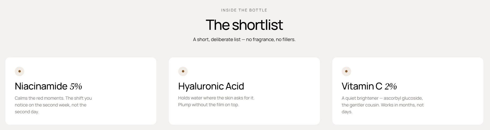
Features:
- Overline, heading, and intro with an option to accent the italic word
- Heading size and text alignment
- Switchable items layout: grid or carousel, with columns and gap per device
- Carousel controls: navigation arrows, pagination, autoplay, loop, and effect
- Up to 12 cards, each with a heading and text
- Blocks: Item
Feature rows
A vertical stack of alternating image and text rows. Each row swaps sides, the image pans horizontally as you scroll, and a row number ("01 / 04") is generated from the block order.
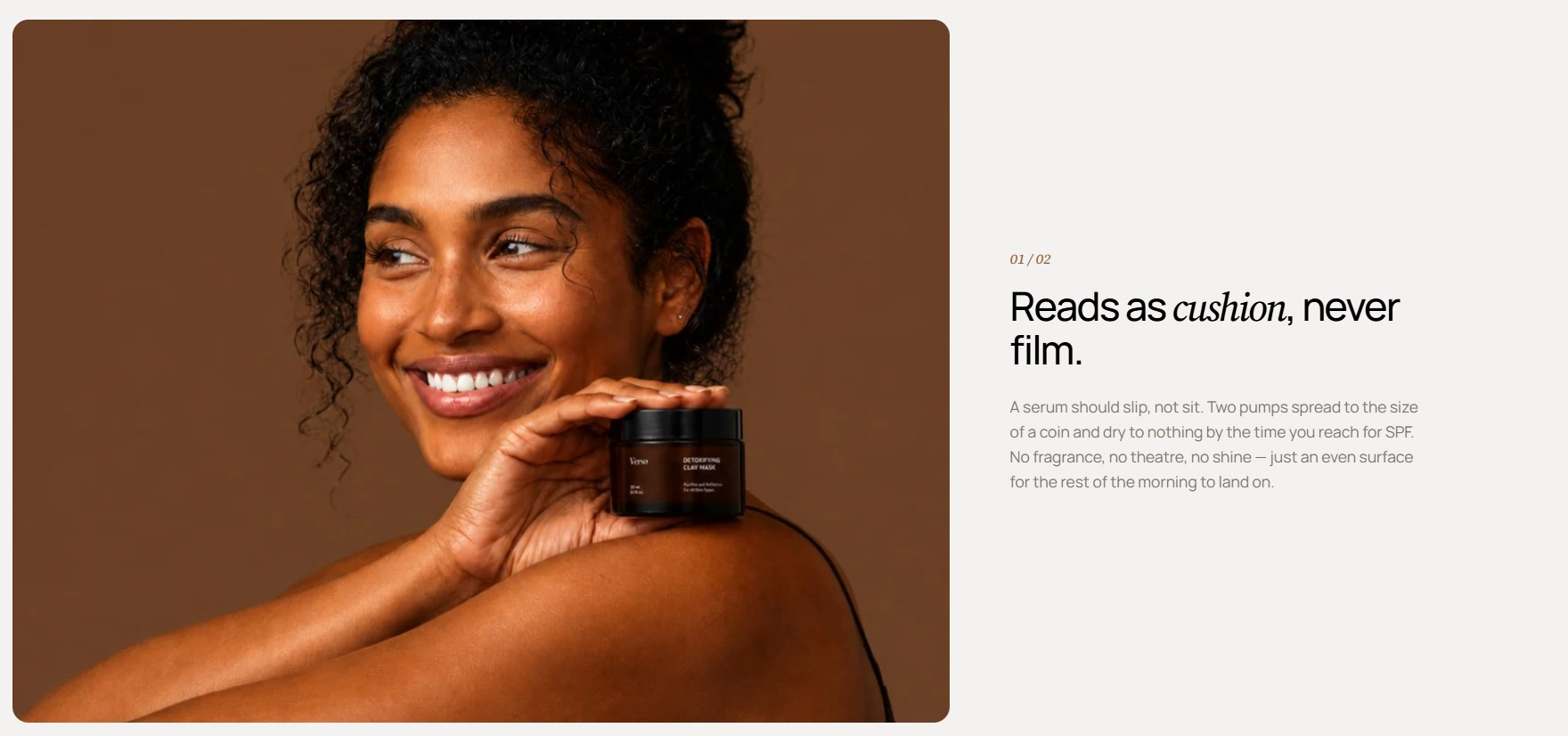
Features:
- Alternating left/right layout with parallax image motion
- Text row: framed photo, heading, and text
- Collection row: transparent product cutout, heading, text, and a feature list of up to four label/value pairs
- Collection row pulls the product count and link from the selected collection
- Optional button per collection row with style and size
- Up to 6 rows
- Blocks: Text row, Collection row
Feature pillars
A two-column editorial split with a portrait image on one side and a heading, intro, numbered list of pillars, and a call to action on the other.
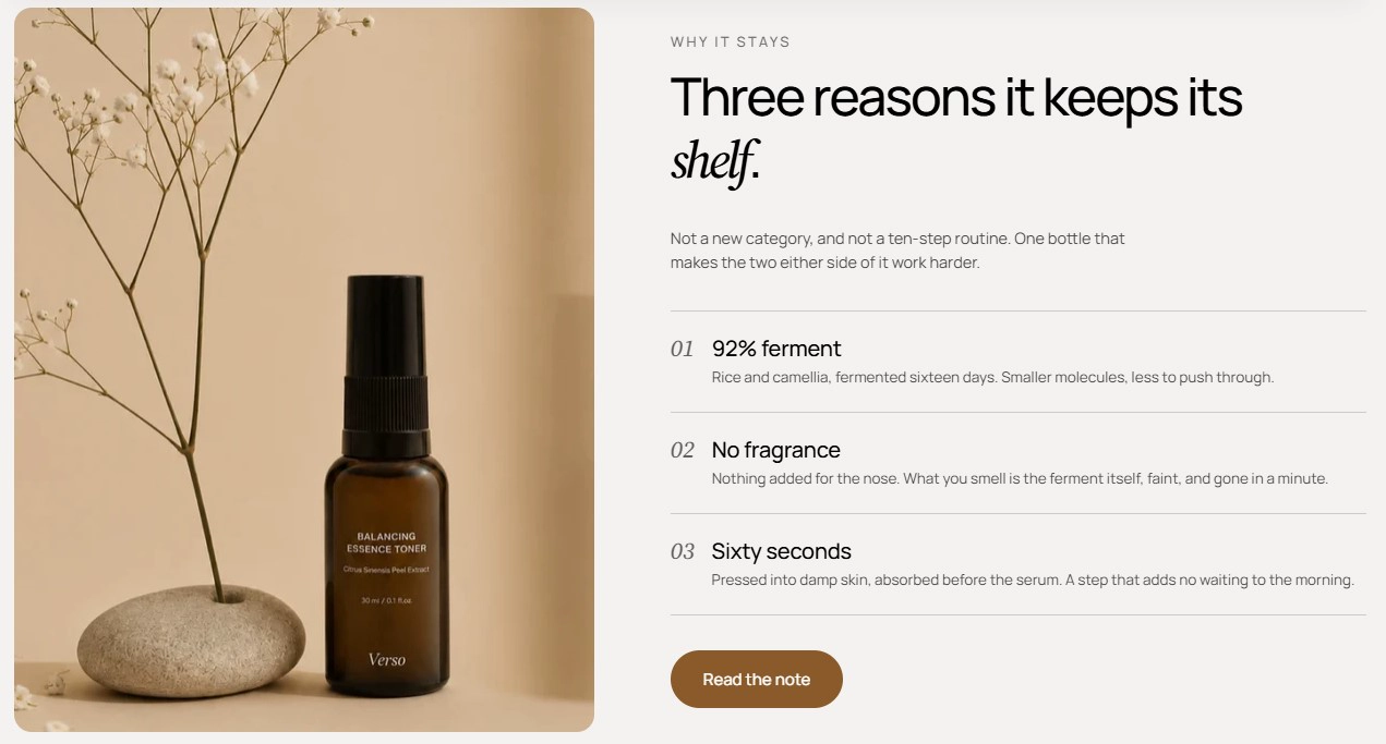
Features:
- Overline, heading, intro, heading size, and alignment
- Desktop and mobile images with separate aspect ratios
- Pillars auto-numbered 01, 02, 03…
- Button with label, style, size, URL, and new-tab option
- Up to 6 pillars, each with a heading and description
- Blocks: Pillar
Feature banner
A two-column banner with a framed product image on the left and heading content with a button on the right. Two shaped badges straddle the image frame and drift on scroll.
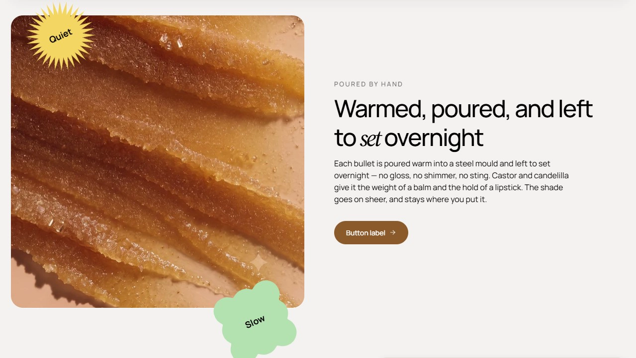
Features:
- Framed image with aspect ratio control
- Two badges, each with text, shape (Bloom, Sunburst, Flower, Scalloped square, Fluted pill), and shape color
- Badges animate with scroll parallax on desktop
- Overline, heading, intro, heading size, and alignment
- Button with label, style, size, URL, and new-tab option
Image callout
A tall band that places a large heading at the top and a small callout card at the bottom-left corner. Set the image through the section's background image settings so the heading and card sit over it.
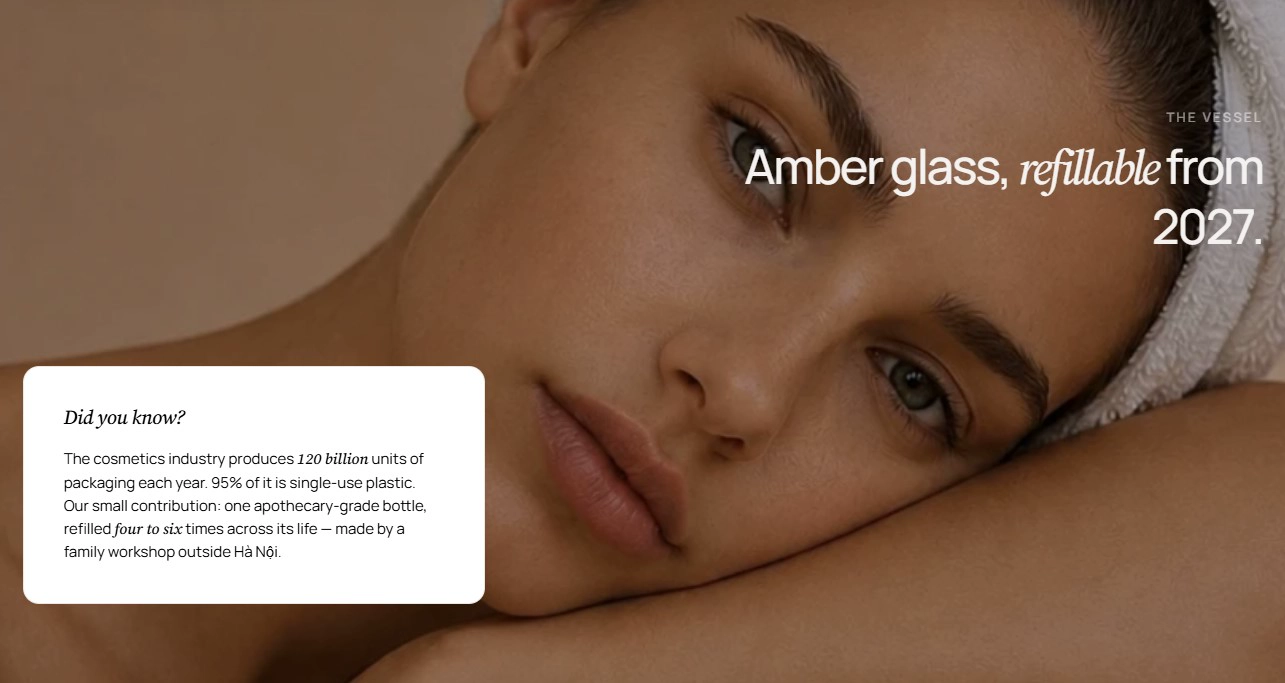
Features:
- Overline, heading, intro, heading size, and alignment
- Callout card with an eyebrow line and callout text
- Callout card uses the layer color of the active color scheme
- Two-column grid on desktop that stacks on mobile
- Pair with the universal background image and overlay settings
Image pair
An asymmetric photo pair with a portrait image beside a landscape image and a single centered caption underneath. On mobile the images stack above the caption.
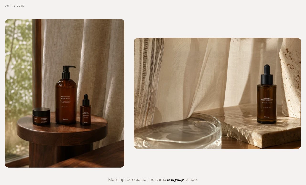
Features:
- Overline above the pair
- Portrait image with aspect ratio and alt text
- Landscape image with aspect ratio and alt text
- Caption with inline formatting
- Cascading reveal animation on scroll
Tagline with images
A large headline whose words are interleaved with small photo cutouts. Text and image blocks flow inline and wrap, so you can build a sentence with pictures inside it.
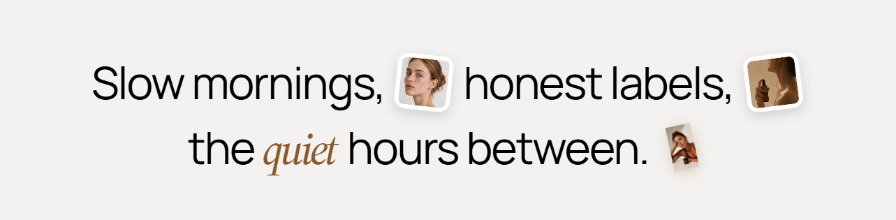
Features:
- Text blocks with an option to start on a new line
- Image blocks with a polaroid frame or no frame
- Per-image rotation angle
- Any number of text and image blocks in any order
- Blocks: Text, Image
Sticker grid
A centered heading over a four-column grid of pastel sticker-note cards. Each card sits slightly rotated and straightens on hover.
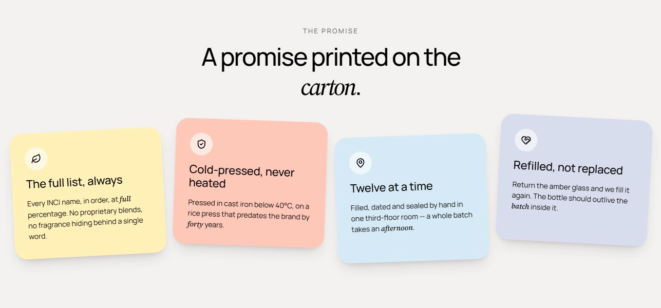
Features:
- Overline, heading, intro, heading size, and alignment
- Card icon chosen from a built-in set (leaf, shield check, fast shipping, gift card, and more)
- Card background color per block
- Card heading and text
- Up to 8 cards, four per row on desktop and two on tablet
- Blocks: Card
Promise grid
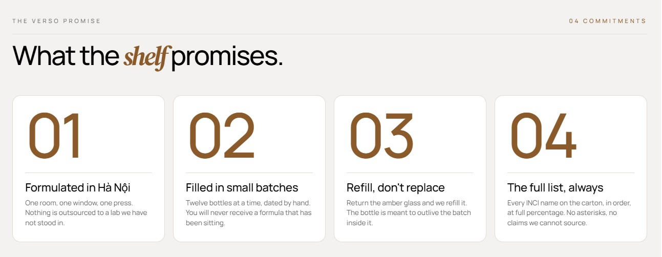
A brand-commitment grid led by giant numbers. The head row pairs an overline with an auto-counted index ("04 commitments") above the heading, and every card is numbered in order.
Features:
- Overline, index label, and heading
- Index label shown after the auto-counted number of cards
- Switchable items layout: grid or carousel, with columns and gap per device
- Carousel controls: navigation arrows, pagination, autoplay, loop, and effect
- Up to 12 cards, each with a label and text
- Blocks: Card
Promise tiles
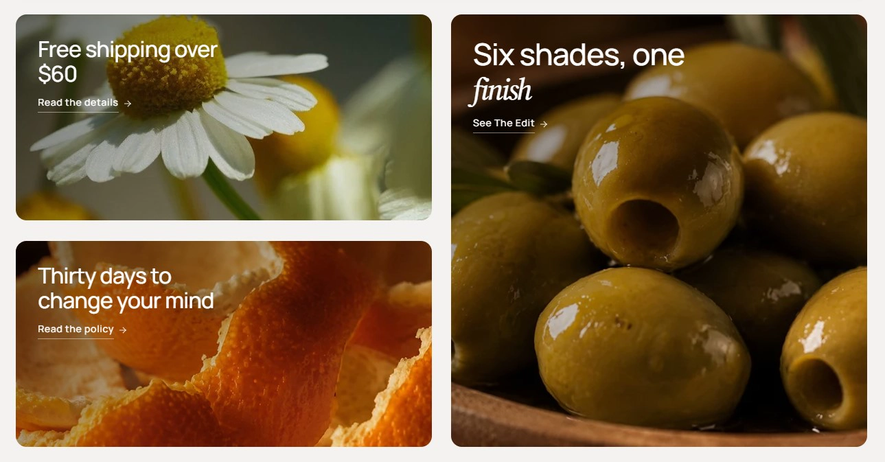
A three-tile image grid: two small tiles stacked on the left and one feature tile spanning both rows on the right. Every tile is a full-card link with a gradient overlay, title, and arrow.
Features:
- Tile image with alt text
- Tile heading, link label, and link
- Feature tile checkbox to make a tile span two rows with a larger heading
- Hover lifts the card, zooms the image, and slides the arrow
- Up to 6 tiles
- Blocks: Tile
Call to action card
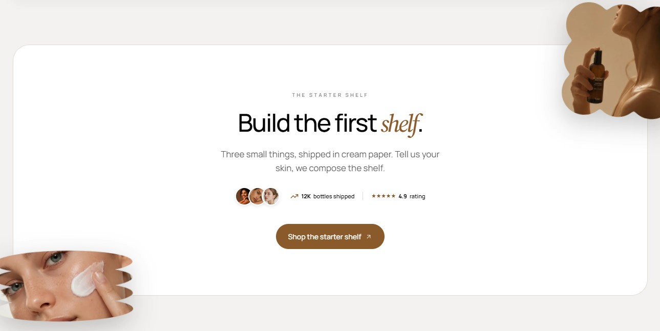
A centered card with an overline, headline, subheading, social-proof strip, and primary button. Two photo cutouts bleed outside the card and drift on scroll.
Features:
- Overline, heading, and subheading
- Button with label, style, size, URL, and new-tab option
- Trust strip with three avatars, a stat value and label, and a rating value and label
- Trust strip can be hidden
- Decorative images top-right and bottom-left with parallax motion on desktop
FAQ accordion
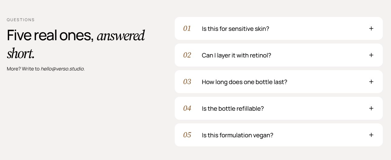
A numbered accordion where only one question opens at a time. Choose between a split layout with a sticky heading column or a centered layout with the accordion stacked below.
Features:
- Overline, heading, intro, heading size, and alignment
- Layout: split or centered
- Questions auto-numbered 01, 02, 03…
- Plus icon rotates to a cross when a panel opens
- Up to 12 questions, each with a question and rich-text answer
- Blocks: Question
Journal
A blog teaser that shows article cards from a chosen blog beneath a section heading. Suits the home page or any landing page that links to your journal.
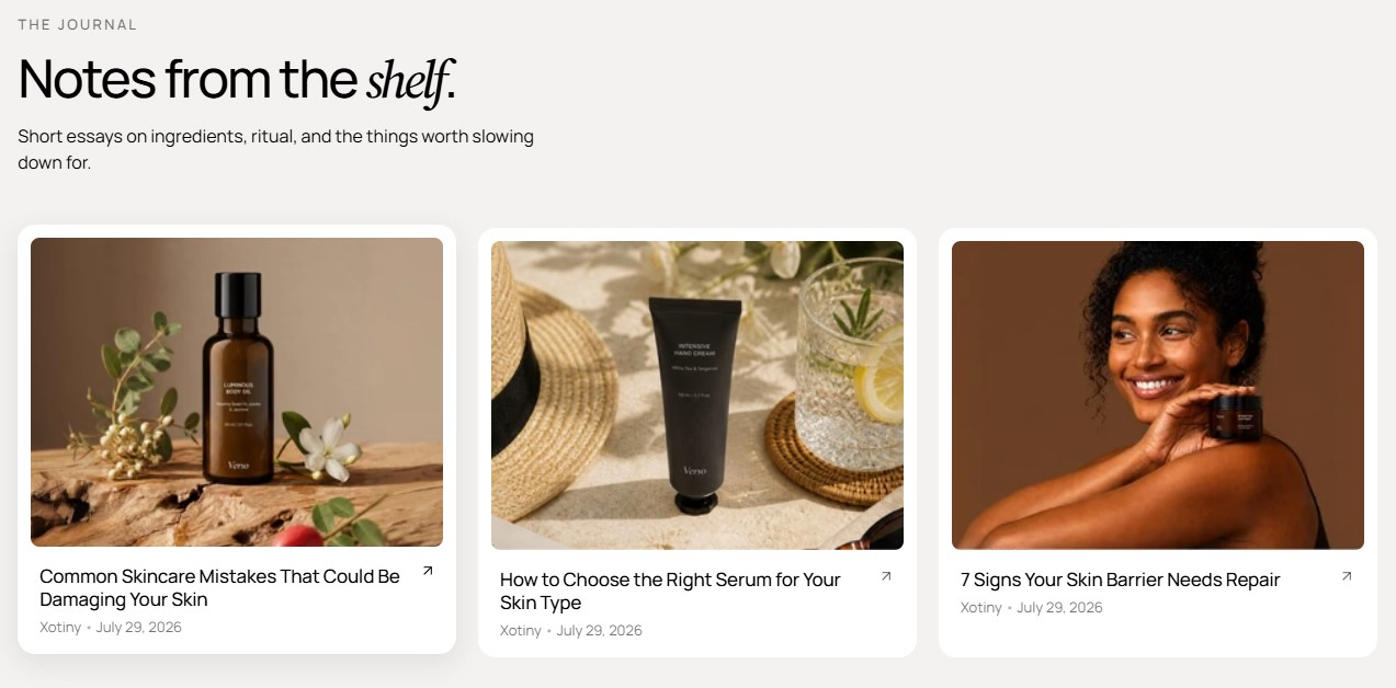
Features:
- Overline, heading, intro, heading size, and alignment
- Blog picker and number of articles to show
- Switchable cards layout: grid or carousel, with columns and gap per device
- Carousel controls: navigation arrows, pagination, autoplay, loop, and effect
- Article card color scheme and image aspect ratio
- Show or hide the description and published date
Article related
The "continue reading" tail of an article page. It shows other articles from the same blog and always excludes the one being read. Available on the article template only.
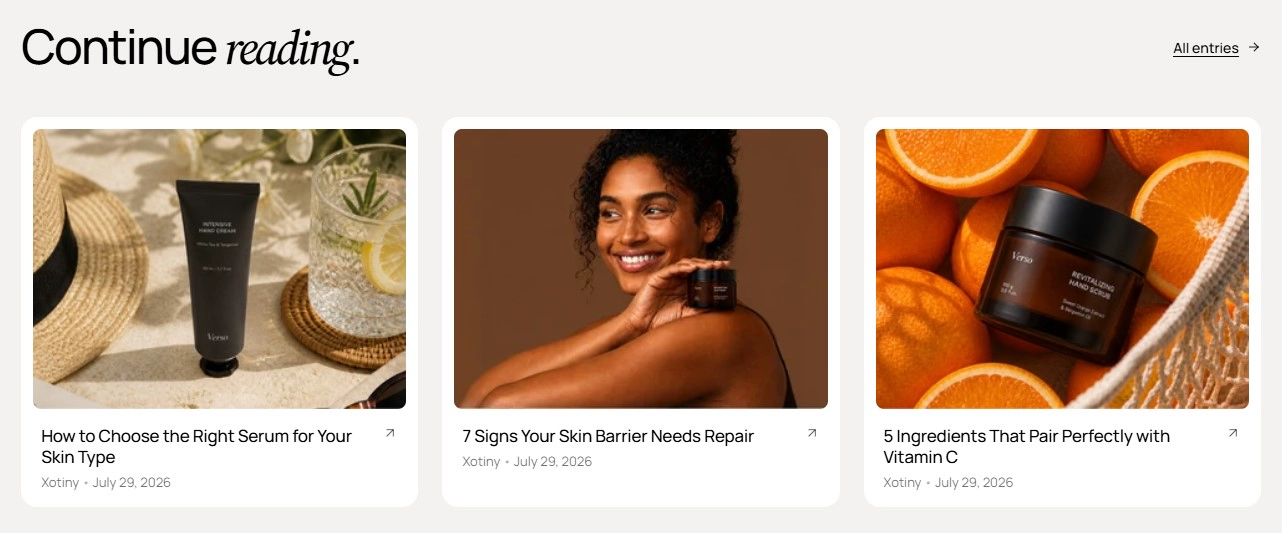
Features:
- Overline, heading, intro, heading size, and alignment
- Button beside the heading with label, style, size, URL, and new-tab option
- Number of articles to show
- Switchable cards layout: grid or carousel, with columns and gap per device
- Article card color scheme and image aspect ratio
- Show or hide the description and published date
- Placeholder cards appear in the Theme Editor only when the blog has no other articles
Search related
A centered heading over a row of pill-shaped chips, one per search term. Each chip links to its own search results page, which makes it useful on the search and 404 templates.
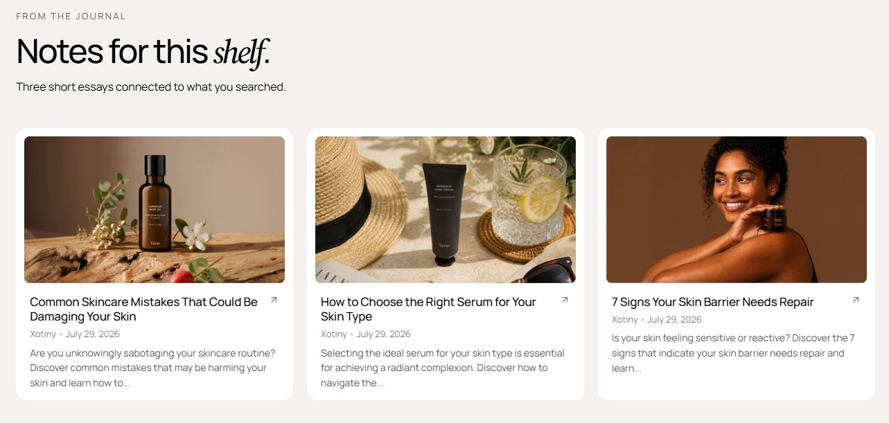
Features:
- Overline, heading, heading size, and alignment
- Terms entered one per line in a single text area
- Each term becomes a chip linking to search results
- Chips wrap to fit any width
Subscribe
A centered newsletter signup with a pill overline, heading, inline email form, and a microcopy line. Subscribers are tagged as newsletter customers.

Features:
- Overline and heading
- Email input with a submit button
- Button label, style, and size
- Microcopy line under the form
- Single-column centered layout
Contact
An editorial contact page with a breadcrumb, heading, and intro above a two-column layout: a sticky image on the left and a form card plus an info card on the right.
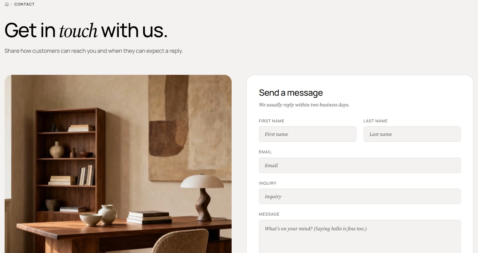
Features:
- Breadcrumb with a current page label (leave blank to hide)
- Heading and intro
- Image with ratio and alt text
- Form card heading and intro with first name, last name, email, inquiry, and message fields
- Info card heading and a quick help label
- Up to 4 info blocks for address, email, or hours
- Blocks: Info, Quick link
Open with Feature pillars or Feature banner to state what you stand for, follow with Promise grid or Sticker grid for a scannable list of commitments, and close with FAQ accordion and Subscribe. On the home page, Journal and Call to action card work well near the footer, while Search related belongs on the search and 404 templates. The brand-storytelling counterparts of these sections live under Editorial Sections.