Media & Interactive Sections
Media and interactive sections turn imagery, video, and product details into scroll-driven or clickable experiences. Lotio includes 11 media and interactive sections, ranging from pinned lookbooks and hotspot images to comparison sliders, video reels, and animated spec displays. Each one shares the universal section settings for width, background, and padding.
Lookbook
A pinned, chapter-by-chapter lookbook. Each chapter fills the viewport with an image, a numbered index, a quote, and two labelled details, and the scene advances as the visitor scrolls.
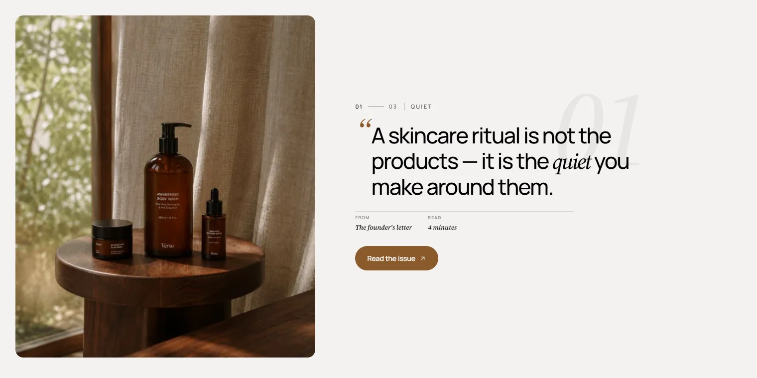 \
Features:
- Scroll-driven scene that pins each chapter while the visitor scrolls
- Automatic numbering with a current/total chapter index
- Chapter name and quote on every chapter
- Two labelled detail pairs per chapter (for example fabric and fit)
- Optional button with style, size, URL, and new-tab options
- Falls back to a stacked layout on mobile
- Blocks: Chapter
Editorial lookbook
A scattered editorial photo gallery that scrolls beneath a centered heading. The heading pins in the middle of the viewport while the images drift past it.
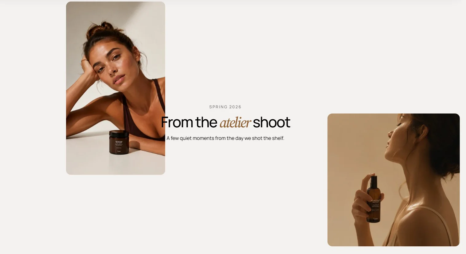
Features:
- Sticky heading with overline, heading, intro, size, and alignment
- Accent the italic word in the heading with your primary color
- Scattered four-image layout cycle that repeats as you add images
- Image ratio per image (Auto, 3:4, 1:1, 4:3, 16:9, or Custom)
- Caption label and description under each image
- Cascading reveal animation as images enter the viewport
- Blocks: Image
Hotspot
A single image with numbered product pins. Clicking a pin or an entry in the index list fades in the matching product card with a note, price, and add-to-cart button.
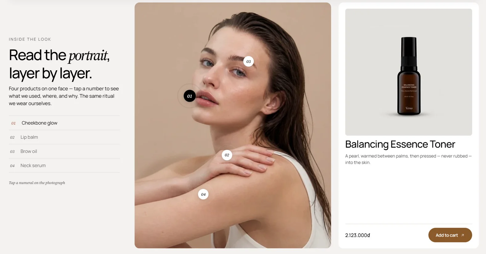
Features:
- One image with a configurable ratio (Auto, 3:4, 1:1, 4:3, 16:9, or Custom)
- Numbered pins placed by vertical and horizontal percentage
- Index list of all hotspots with an optional hint text on desktop
- Product card with image, title link, editorial note, and price
- Add-to-cart button on each card
- Index label per hotspot that falls back to the product title
- Blocks: Hotspot
Spec hotspots
An annotated product image with copy on the left and a cut-out product on the right. Each pin shows a short tag next to its dot and swaps to a full spec card on hover or focus.
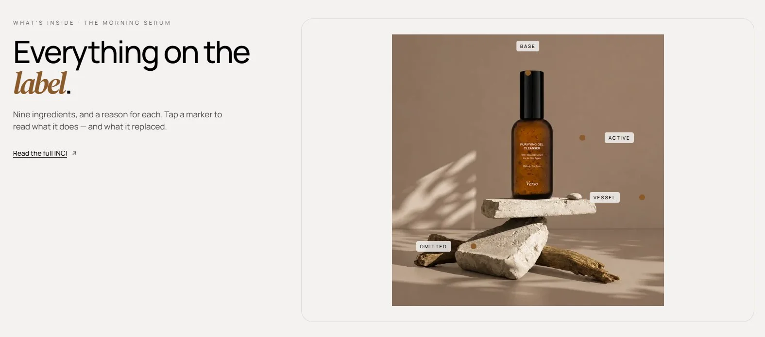
Features:
- Overline, heading, and text column beside the product image
- Button with style, size, URL, and new-tab options
- Product image with alt text (a cut-out on a transparent background works best)
- Up to 6 spec pins, each with a short label, spec name, and spec detail
- Tag direction per pin (Right, Left, or Up)
- Separate desktop and mobile pin positions
- Spec card expands to a full-width panel on mobile
- Blocks: Spec pin
Before and after
A draggable image comparison with a handle that reveals the before and after images. Field notes, a timeline axis, and a credit line sit alongside the comparison.
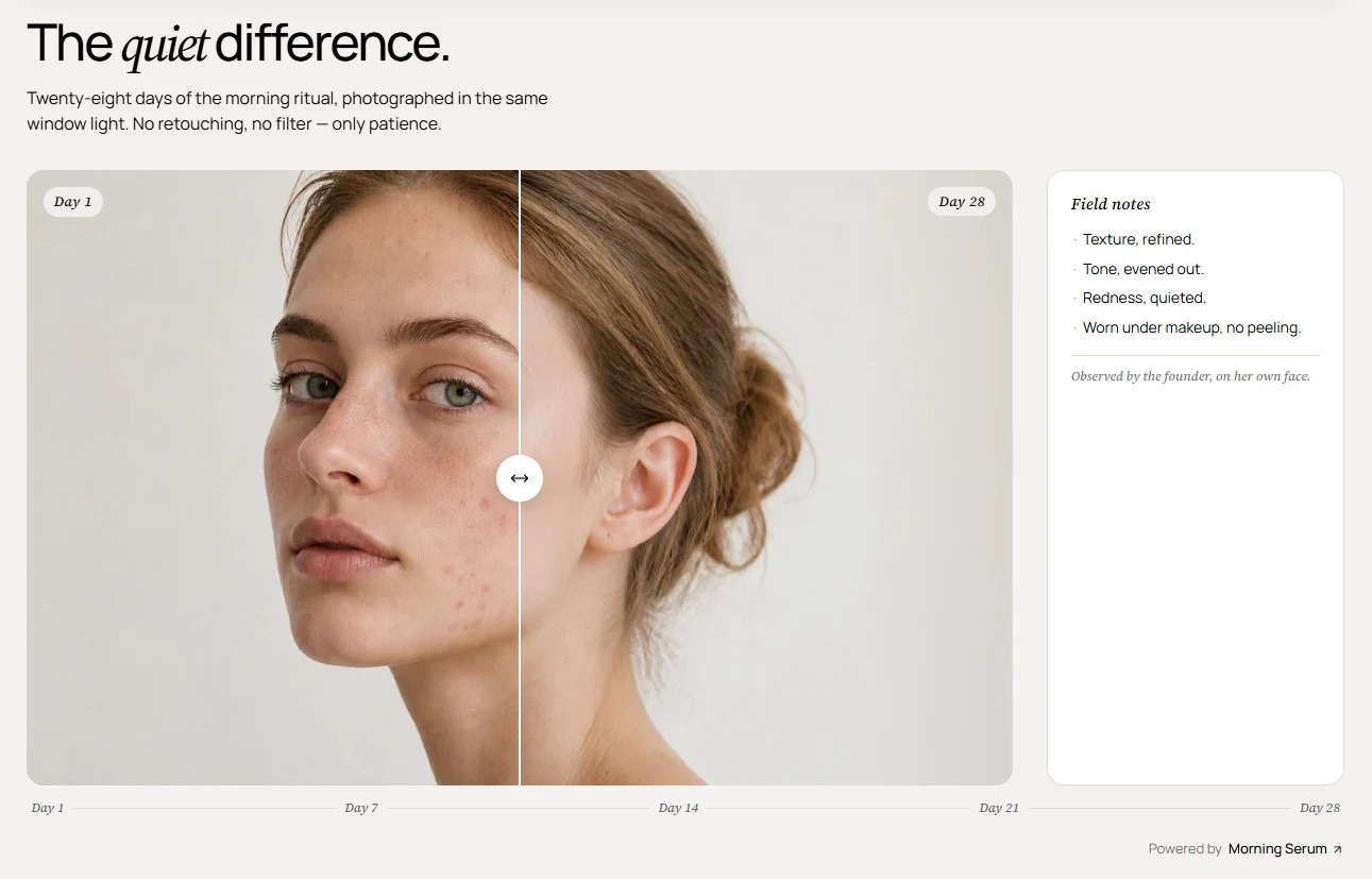
Features:
- Before and after images with their own labels
- Draggable, keyboard-focusable comparison handle
- Image ratio (Auto, 3:4, 1:1, 4:3, 16:9, or Custom)
- Field notes panel with label, rich-text notes, and footnote
- Comma-separated timeline labels rendered as an axis under the image
- Credit label with link text and URL
- Heading group with overline, heading, intro, size, and alignment
Video feature
A full-width featured video beneath a heading. The video shows a cover image and a play button until the visitor starts it.
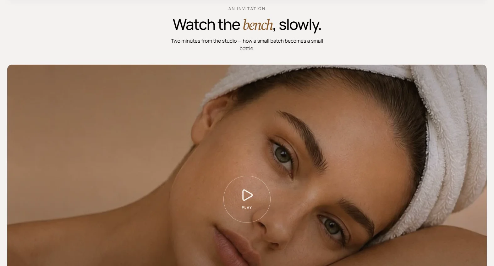
Features:
- Video source: hosted video or an external video URL
- Cover image shown before playback
- Custom play button label
- Loop video option
- Video alt text for accessibility
- Heading group with overline, heading, intro, size, and alignment
- Tinted overlay on the video frame
Social video
A carousel of vertical 9:16 video cards next to a heading column, designed for social-style clips. Each card plays and pauses on tap and shows a progress bar.
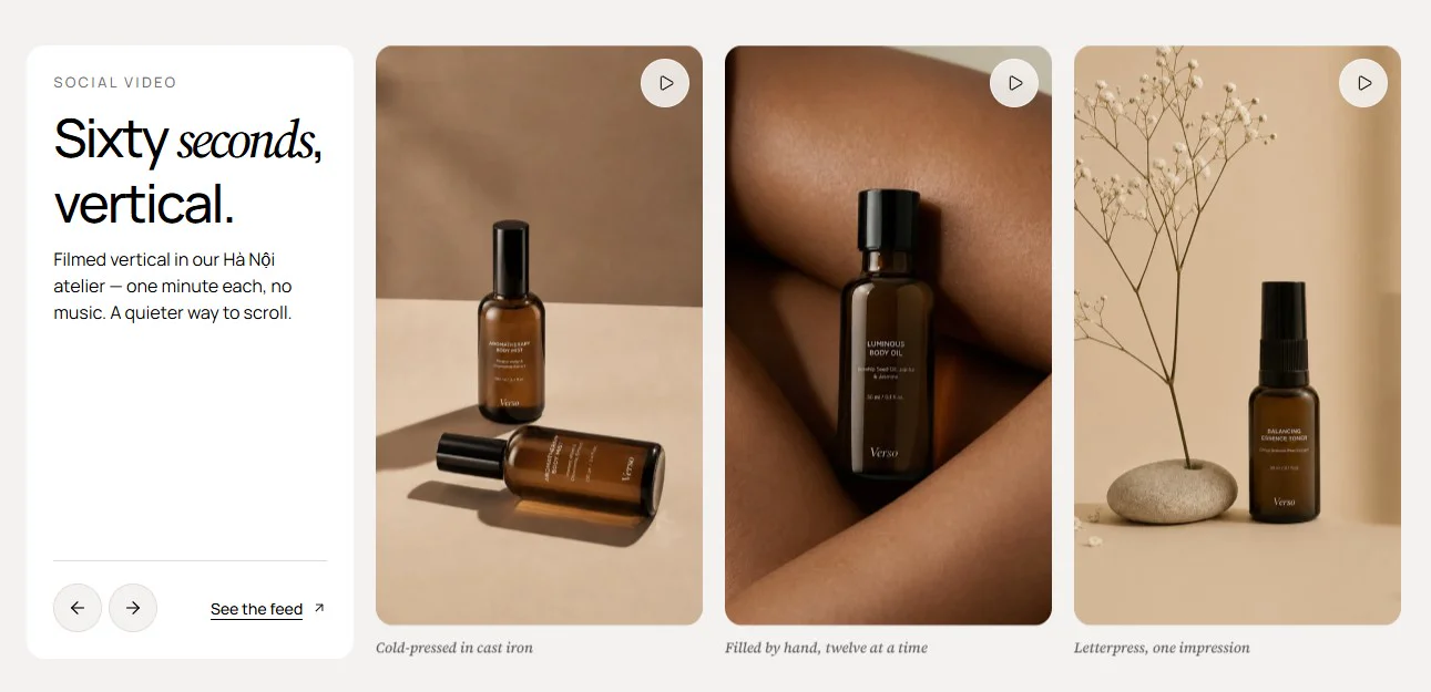
Features:
- Heading column with overline, heading, intro, size, and alignment
- Previous and next arrows for the video carousel
- Optional button with style, size, URL, and new-tab options
- Hosted video per card with a custom cover image
- Loop video option per card
- Caption with an optional link under each card
- Play/pause control and time bar on each video
- Blocks: Video
Kit scene
An "in the box" scene that pins to the viewport and reveals one item at a time. Each item wipes in with a framed thumbnail, a giant index numeral, and copy.
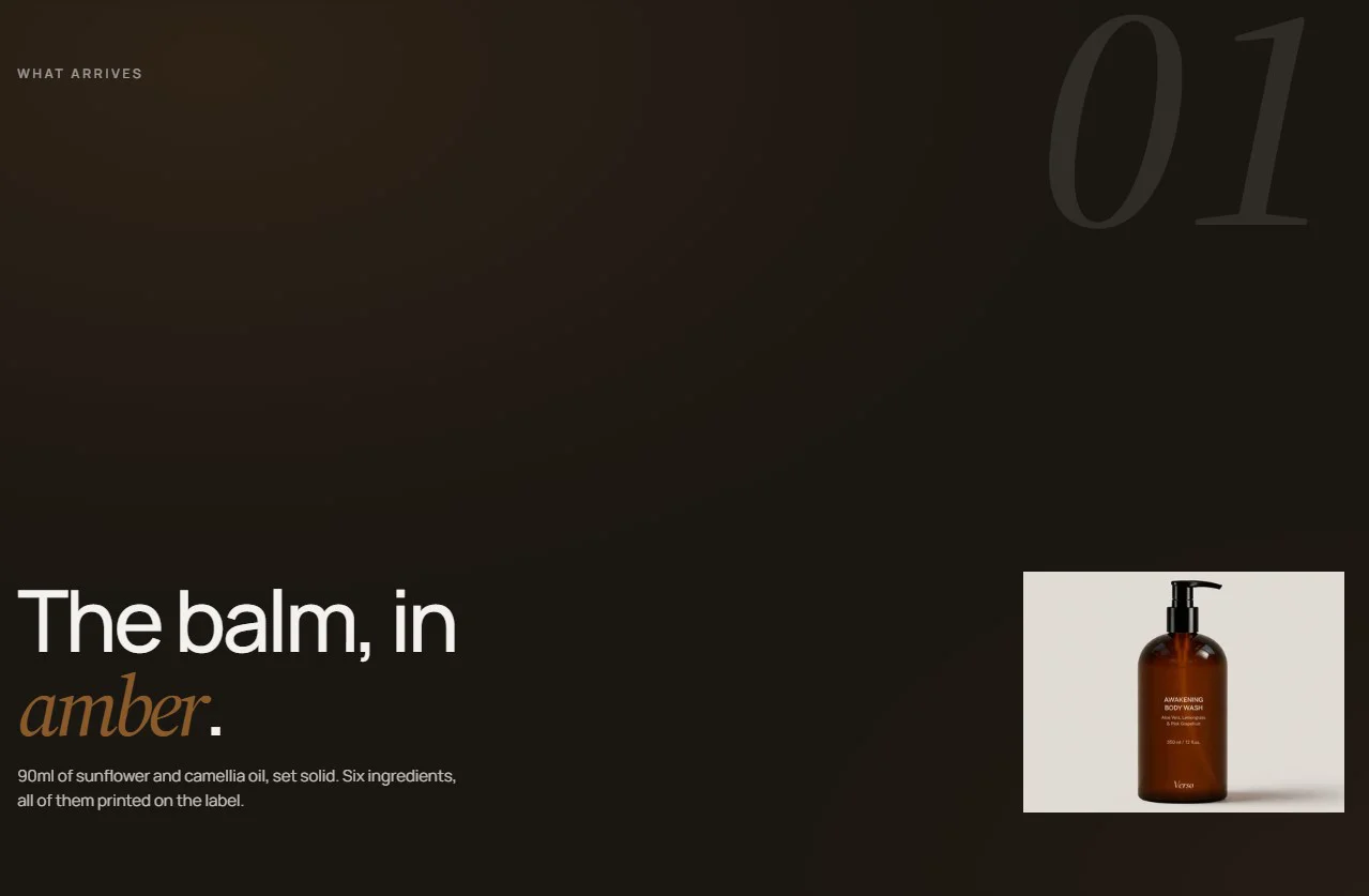
Features:
- Overline above the pinned scene
- Up to 6 items, each with an image, heading, and text
- Curtain-wipe transition between items driven by scroll
- Automatic large index numeral per item
- Wrap a word in italic in the heading to emphasise it
- Image alt text that falls back to the image's own alt text
- Stacks image, number, and text on mobile
- Blocks: Item
Spec sweep
A sticky, full-bleed image stage where spec cards and steps sweep diagonally across the screen as the visitor scrolls. Roughly one card is readable in the centre at a time.
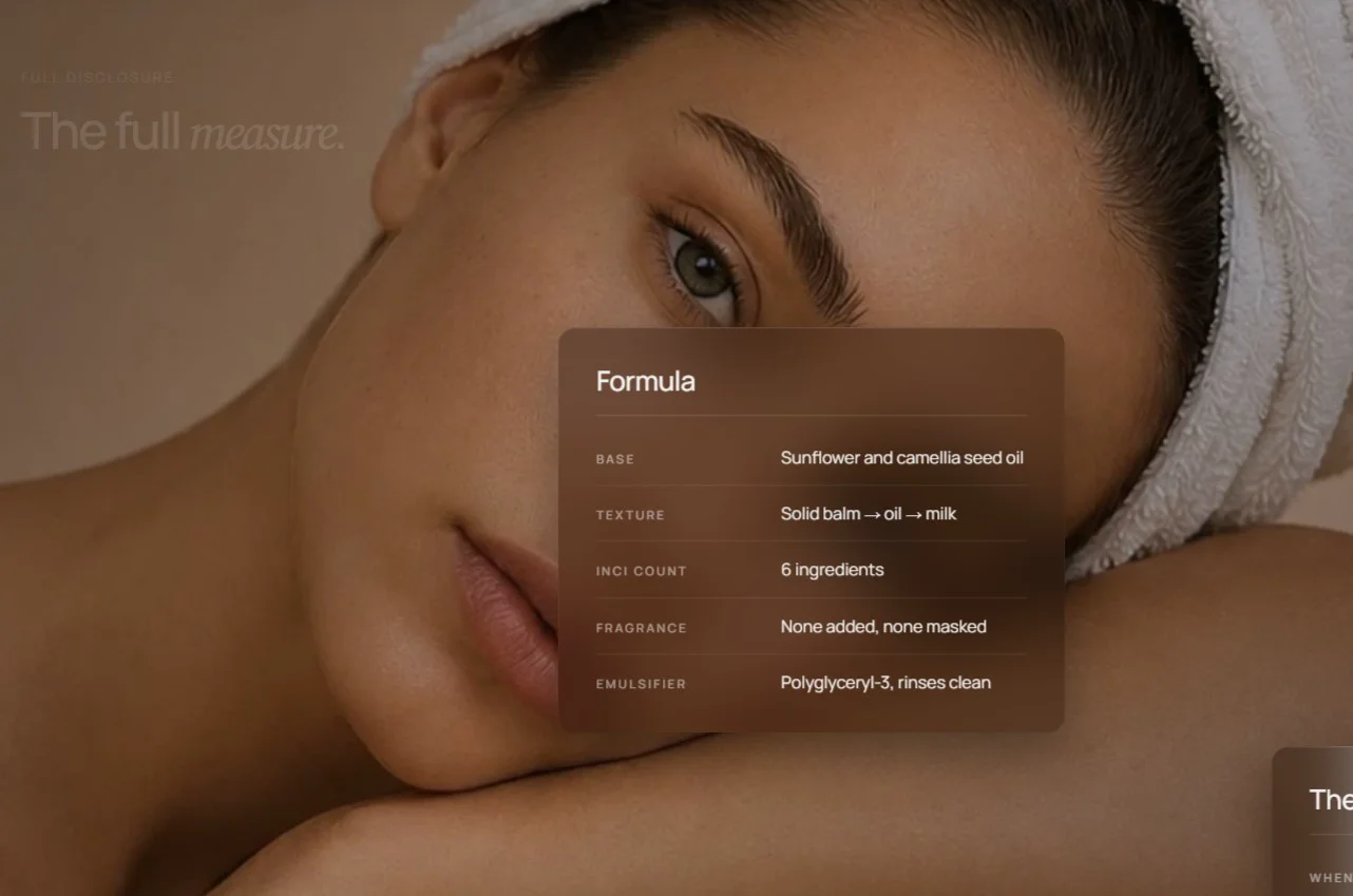
Features:
- Background image with a separate mobile image and alt text
- Heading with overline, size, alignment, and italic accent that fades as the first card arrives
- Up to 6 sweeping cards
- Spec card with a name and
Label | Valuerows, one per line - Step card with an automatic "Step 0N" pill, heading, and description
- Parallax disabled on mobile, where cards stack
- Blocks: Spec card, Step
Spec stats
A measured-spec band with a four-up strip of numbers that count up when they scroll into view, above a frequency curve that draws itself across the section.
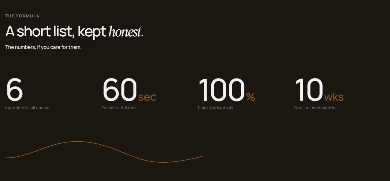
Features:
- Heading group with overline, heading, intro, size, and alignment
- Up to 8 stats
- Numeric value that animates from zero on scroll
- Optional prefix (for example − or +) and unit (for example mm or hrs)
- Label under each number
- Alternating parallax drift on desktop
- Blocks: Stat
Brand orbit
Partner or press logos riding two concentric, counter-rotating rings around a centre hub. Logos are spread evenly around whichever ring they are assigned to.
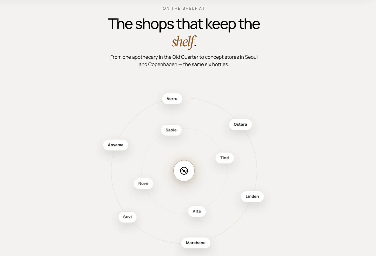
Features:
- Heading group with overline, heading, intro, size, and alignment
- Optional hub logo that falls back to a disc mark
- Up to 16 logos
- Logo image with a name label
- Ring assignment per logo (Outer ring or Inner ring)
- Even spacing that adapts to the number of logos on each ring
- Blocks: Logo
- Product storytelling: Lookbook or Kit scene for pinned, one-item-at-a-time scenes.
- Shoppable images: Hotspot links pins to products with add-to-cart; Spec hotspots annotates a single product with specifications.
- Proof of results: Before and after for a draggable comparison.
- Video: Video feature for one hero clip, Social video for a reel of short vertical clips.
- Technical specs: Spec sweep for a cinematic scroll, Spec stats for animated headline numbers.