Collection Sections
Collection sections help customers browse your catalog by category and surface products from a chosen collection anywhere on the store. Lotio includes 7 collection sections: four that showcase the collections themselves, two that pull products out of a collection, and the hero that sits at the top of every collection template.
Collection cards
A grid or carousel of compact collection cards, each linking to its collection. When you place it on a collection page, the card for the collection being viewed is highlighted, so it doubles as a "shop by collection" navigation row.

Features:
- Pick the collections to show from a collection list
- Cards layout: Grid or Carousel, with separate desktop and mobile column counts and a global or custom gap
- Carousel options: per-move count, navigation arrows, pagination, effect, speed, autoplay, and loop
- Card color scheme independent of the section
- Use full-width image with an Image ratio (Auto, 3/4, 1/1, 4/3, 16/9, or custom width and height ratio)
- Show product count on each card
- Two presets: Collection cards (a 4-column grid with full-width 16/9 images) and Collection cards: Row (a tight 5-column row on desktop, 2 on mobile, with images off and reduced padding, meant for a slim navigation strip)
Collection list
A straightforward list of collection cards with image, title, and optional description, using the standard collection card style. Use it for a "Shop by category" block on the home page.
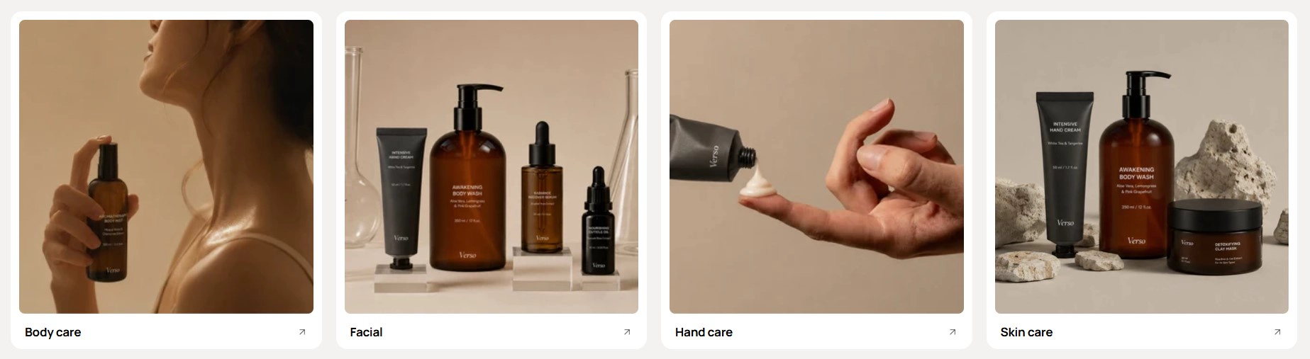
Features:
- Pick the collections to show from a collection list; empty slots render placeholders in the editor
- Cards layout: Grid or Carousel, with desktop and mobile column counts and gap
- Carousel options: per-move count, navigation arrows, pagination, effect, speed, autoplay, and loop
- Card color scheme
- Aspect ratio for the collection image, including a custom width and height ratio
- Show description and Show product count toggles
Category cards
An editorial category grid where each card pairs a heading and short description with a cutout image sitting on a decorative colored shape. Large cards group into a 2-column row and small cards into a 4-column row, so you can lead with two hero categories and follow with four smaller ones.
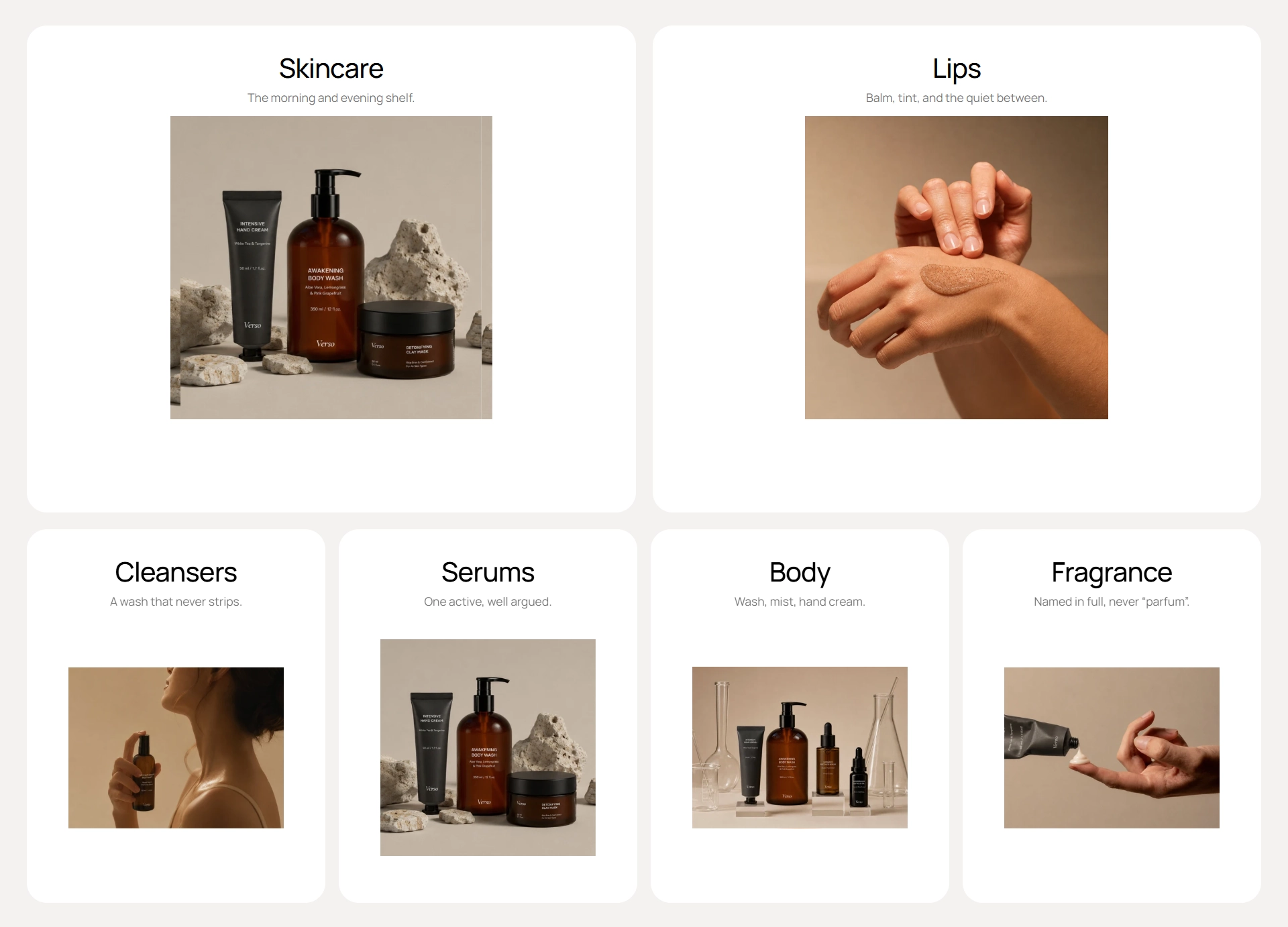
Features:
- Each card is a block linked to a collection; the heading and image fall back to the collection title and image when left empty
- Optional description line under the heading
- Background shape behind the image: Bloom, Sunburst, Flower, Scalloped square, or Fluted pill
- Shape color per card
- Card size: Large (2 per row) or Small (4 per row); rows stack on mobile
- Cards animate in with a cascade as they enter the viewport
- Blocks: Category card
Shop categories
A collection list with a full section heading above it. It combines an overline, heading, and intro with the same collection card grid as Collection list, so it works as a self-contained "Shop by category" section.
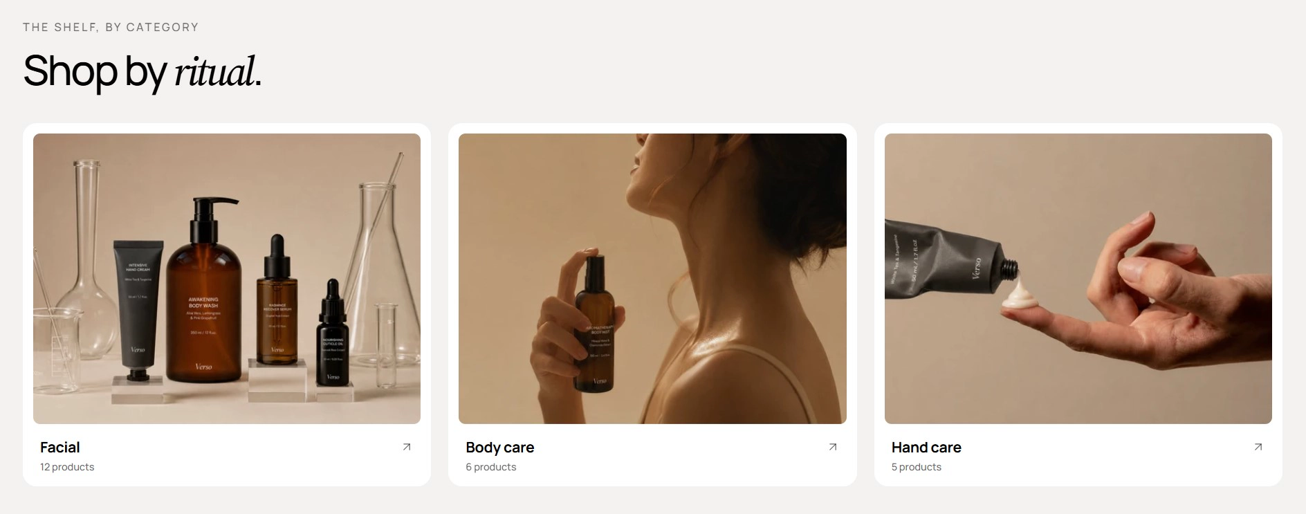
Features:
- Pick the collections to show from a collection list
- Heading area with Overline, Heading, Intro, Heading size, and Alignment; wrap a word in italics and enable Accent the italic word to tint it
- Cards layout: Grid or Carousel, with desktop and mobile column counts and gap
- Carousel options: per-move count, navigation arrows, pagination, effect, speed, autoplay, and loop
- Card color scheme and image Aspect ratio
- Show description and Show product count toggles
Featured products
A product grid or carousel fed by a collection or a hand-picked product list, with a section heading and an optional call-to-action button. This is the everyday "New arrivals" or "Best sellers" section.
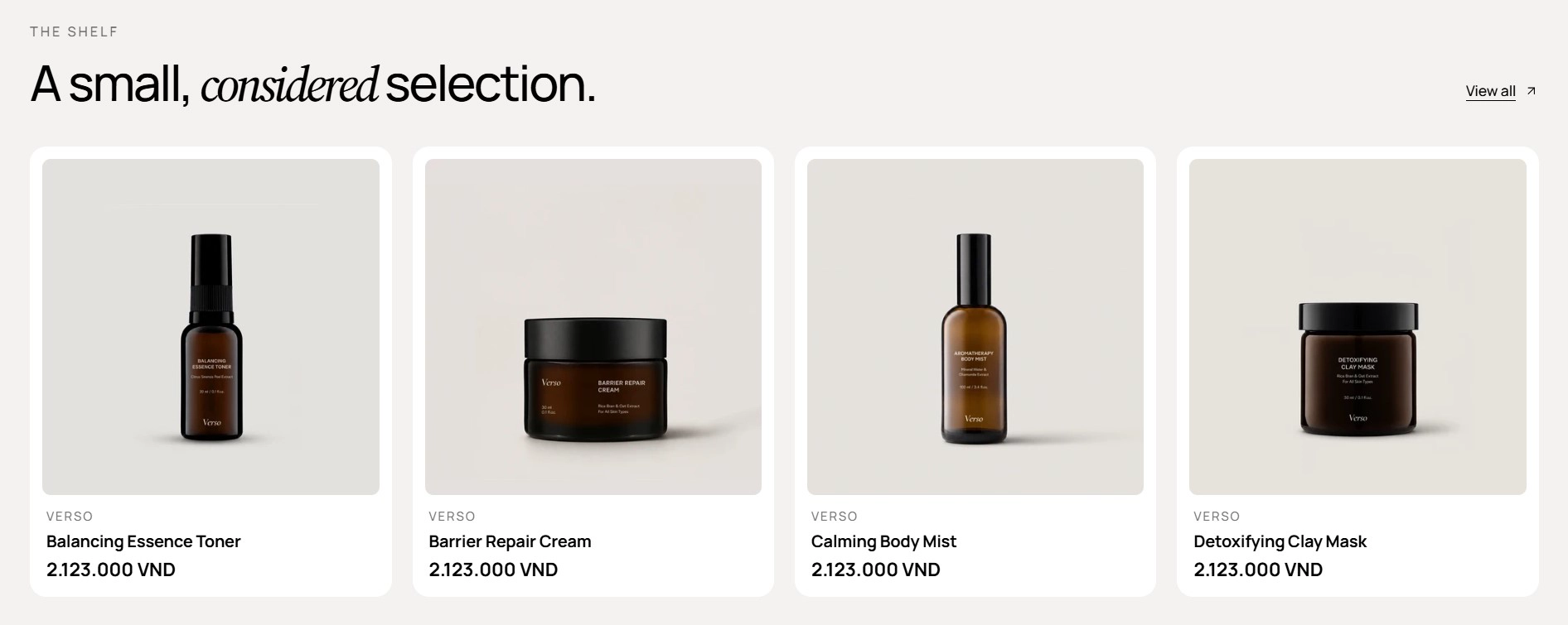
Features:
- Source products from a Collection or a specific Products list, with Number of products to show
- Heading area with Overline, Heading, Intro, Heading size, and Alignment, plus a Button with label, style, size, and URL
- Cards layout: Grid or Carousel, with desktop and mobile column counts and gap
- Carousel options: per-move count, navigation arrows, pagination, effect, speed, autoplay, and loop
- Product card: Color scheme and Product card type, with toggles for vendor, price, swatches, add to cart, quick view, compare, and badge
- Product media: Aspect ratio, hover effect, navigation style, and bullets for multi-image cards
- Variant display option and Option name for the swatches shown on cards (see Color swatches)
Featured products tabs
A tabbed product showcase where each tab is a collection. Customers switch tabs with pill buttons and the product grid swaps in place without a page reload.
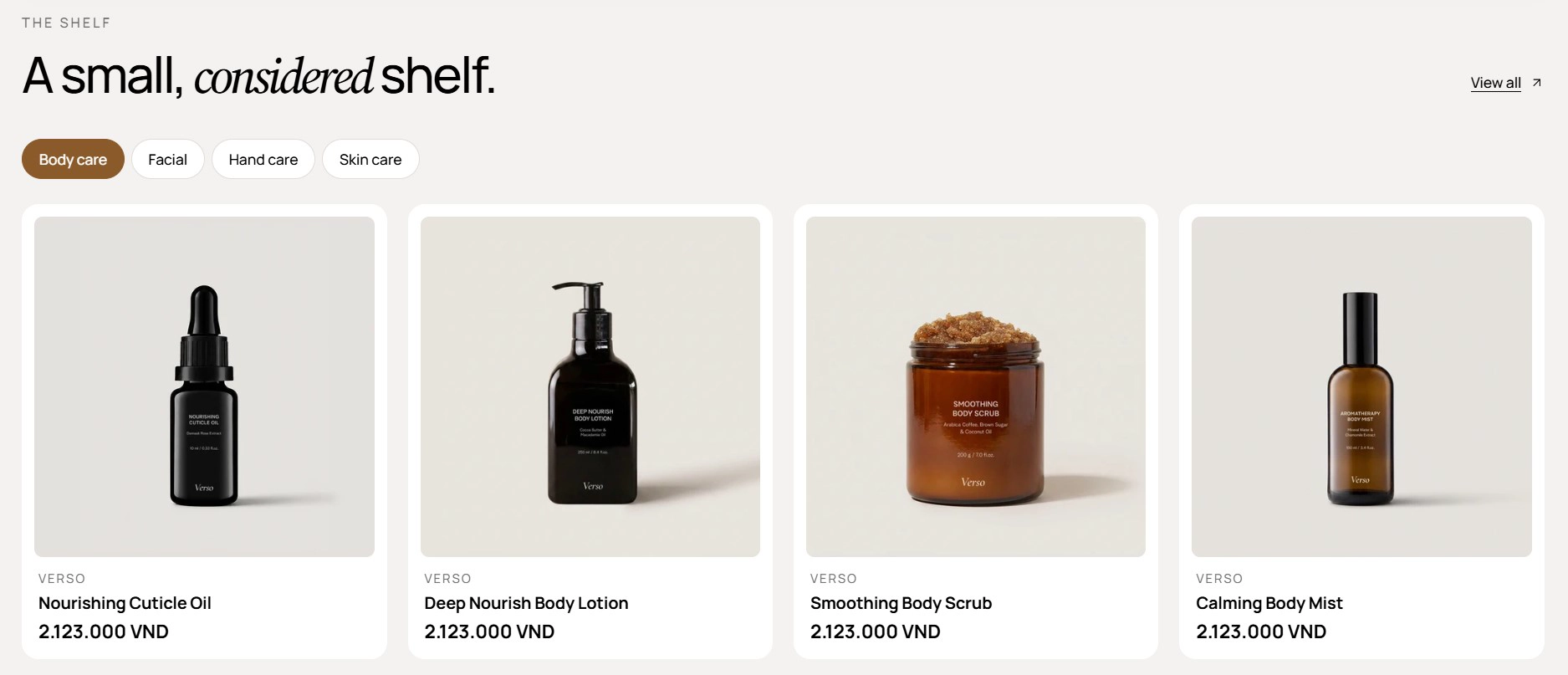
Features:
- One collection per Tab block, with an optional Tab label that falls back to the collection title
- Number of products per tab
- Heading area with Overline, Heading, Intro, Heading size, and Alignment, plus a Button with label, style, size, and URL
- Cards layout: Grid or Carousel, with desktop and mobile column counts and gap
- Trust line: a short reassurance sentence shown under the products, with a Show trust line toggle
- Product card: Color scheme, Product card type, and toggles for vendor, price, swatches, add to cart, quick view, compare, and badge
- Product media aspect ratio, hover effect, navigation style, and bullets; Variant display option and Option name
- Blocks: Tab
Collection page title
The hero at the top of collection templates. It shows the collection title, optionally the description, and an optional banner image with the text overlaid on it. This section has no preset; it is placed by the collection templates and you customize it from Sales channels > Online store > Themes > Customize with a collection page open.
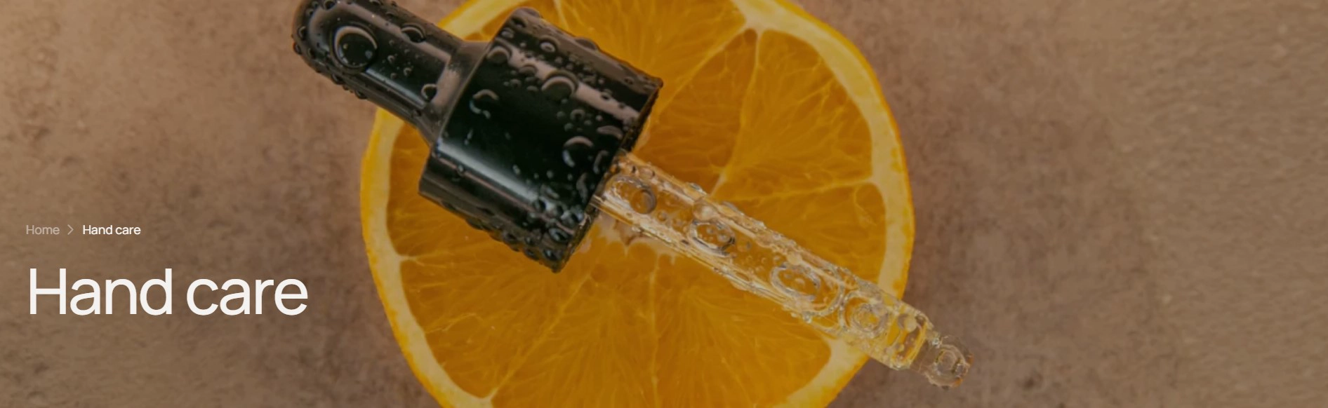
Features:
- Show description toggle for the collection description
- Show image toggle; the collection's featured image is used unless you upload a Desktop image or Mobile image override
- Desktop aspect ratio and Mobile aspect ratio (Auto, 3/4, 1/1, 4/3, 16/9, or custom width and height ratio)
- Text is positioned over the image when an image is shown and sits inline when there is none
- Section width, color scheme, background, and padding from the universal section settings
Lotio ships several collection templates that pair this hero with different product grid layouts. See Page Templates and the Change collection template guide.
- Navigate between collections: Use Collection cards (the Row preset makes a slim strip you can drop above the product grid on collection pages) or Collection list.
- A styled "Shop by category" block with a heading: Use Shop categories, or Category cards when you want cutout images on decorative shapes.
- Show products, not collections: Use Featured products for a single collection or hand-picked list, and Featured products tabs when you want customers to flip between several collections in one section.
- Collection page hero: Collection page title is already in every collection template; adjust its image and description toggles rather than adding another banner.