Hero Sections
Hero sections are full-width, high-impact openers designed for the top of your pages. Lotio includes 8 hero sections, from a classic slideshow to editorial split layouts and lightweight page headers, each with a different composition and level of motion.
Hero
The classic full-width slideshow with one image, overline, heading, and button per slide. Use it at the top of the home page when you want to rotate several campaigns.
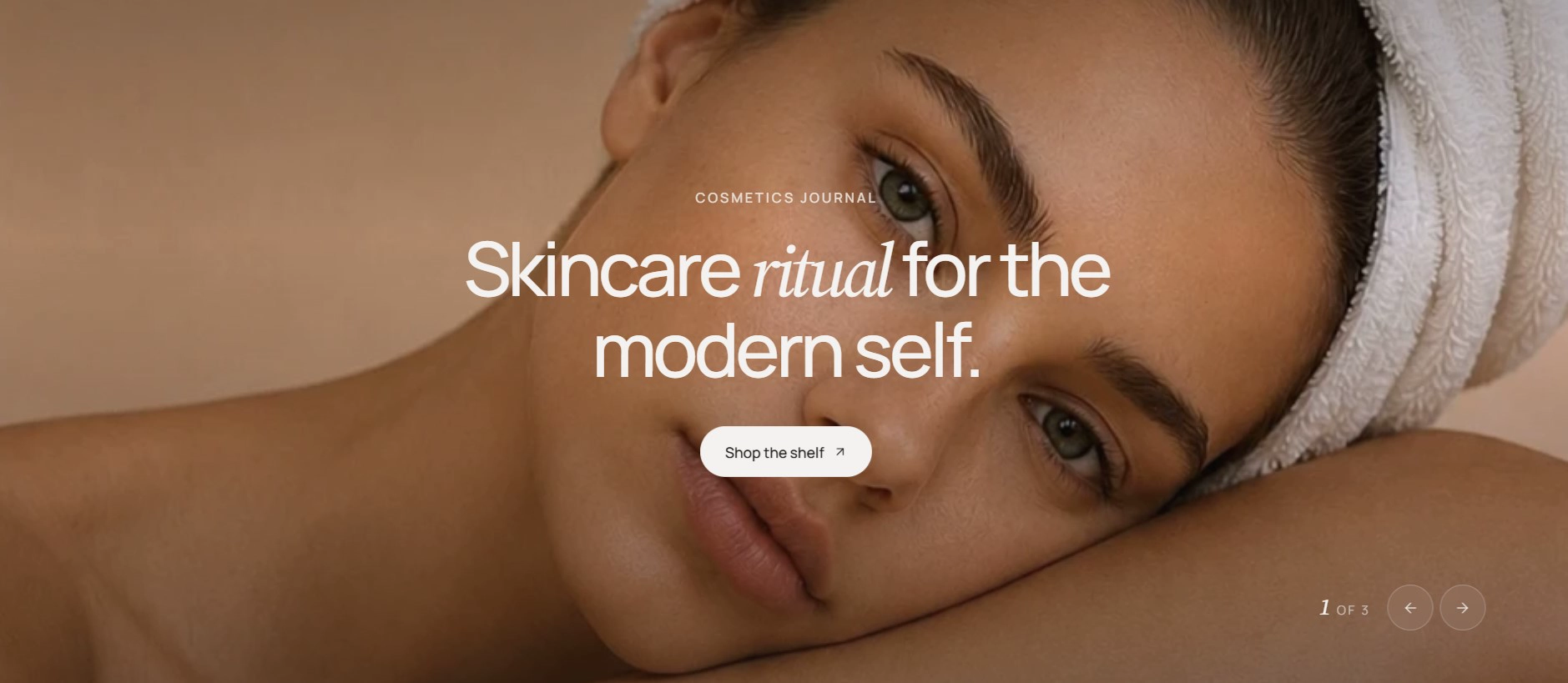
Features:
- Multiple slides with a "1 of N" counter and previous/next arrows when there is more than one slide
- Auto-rotate slides with an adjustable interval
- Desktop and mobile image per slide, each with its own image ratio (Auto, 3:4, 1:1, 4:3, 16:9, or Custom)
- Overline, heading (wrap a word in italics for emphasis), and button with style and size options
- Gradient overlay on the media, tinted with the color scheme background, for legible text
- Blocks: Slide
Hero banner
A single-image hero with a sticky, parallax-scrolling background and a large character-animated headline. It opens the second home page layout.
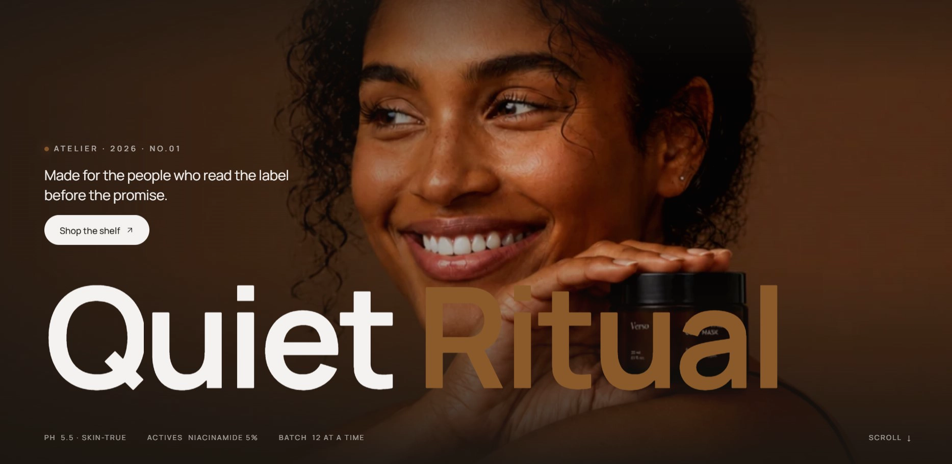
Features:
- Desktop image with an optional mobile image that falls back to the desktop one
- Parallax background that stays pinned while the page scrolls, with a vignette overlay
- Eyebrow line with a dot marker, introduction text, and a two-part heading where the accent part is shown in the accent color
- Button with style, size, URL, and new-tab options
- Meta row of label/value pairs across the bottom of the banner, with a scroll hint (label and text) on its right
- Blocks: Detail
Hero parallax
A centered text hero surrounded by floating shapes or image cutouts that drift as the visitor scrolls. It is the opener of the third home page layout.
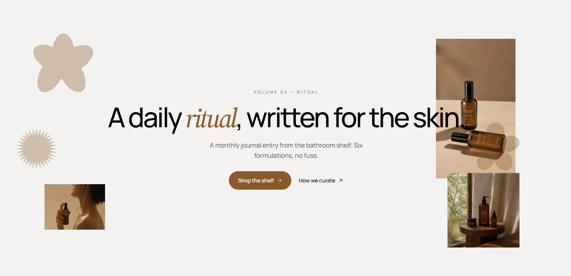
Features:
- Overline, heading, and introduction text centered on the stage
- Primary button plus a secondary text link with an arrow icon
- Up to 6 floating items, each either a shape (Bloom, Sunburst, Flower, Scalloped square, Fluted pill) or an image
- Per-item shape color, width, top, and left position
- Parallax drift driven by scroll
- Blocks: Floating item
Hero split
A two-column hero with copy on the left and a tall portrait image on the right, plus a smaller "aside" card underneath. It opens the fifth home page layout.
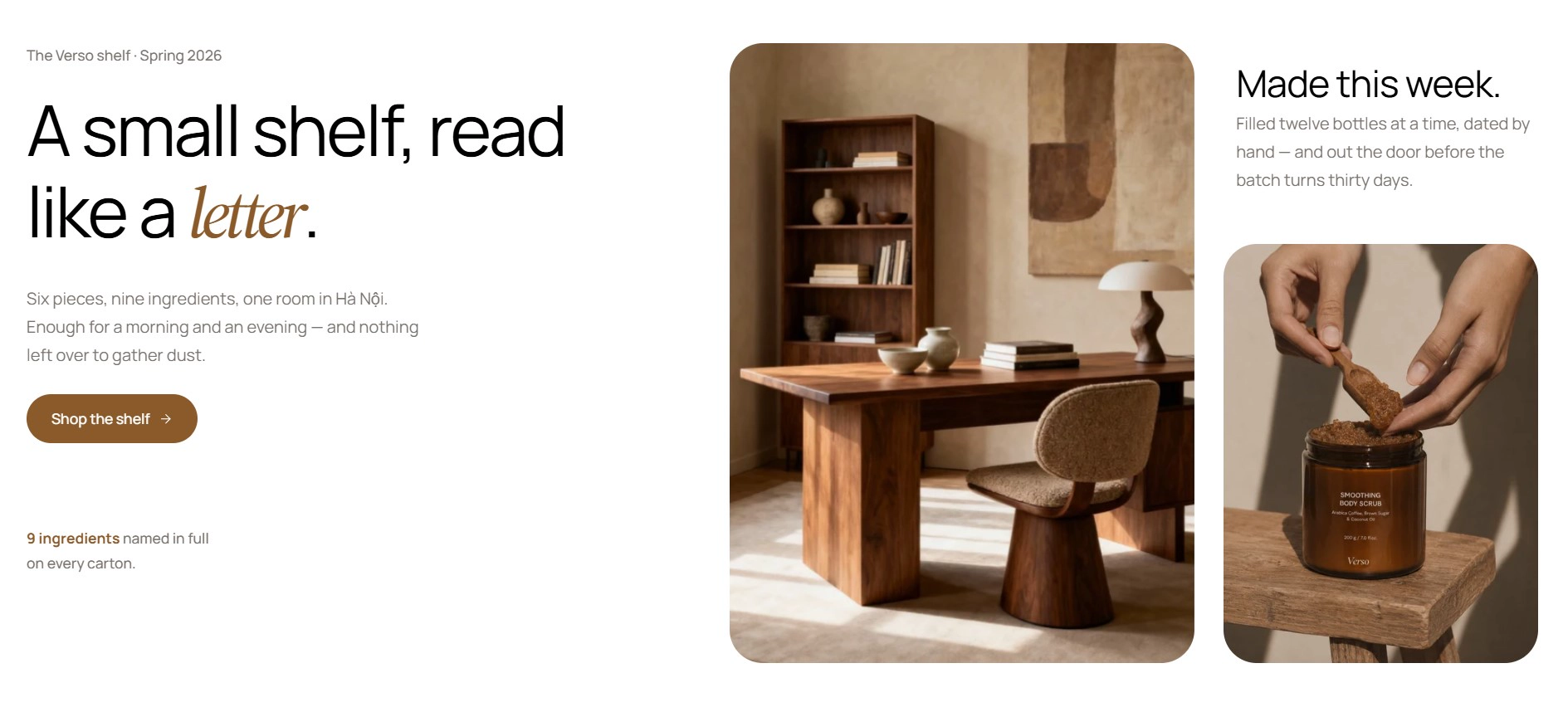
Features:
- Caption, heading, and subheading with a button
- Trust strip with up to three avatar images, a highlighted figure, and trust text
- Portrait image with a selectable ratio and alt text
- Aside heading, subheading, and a second image with its own ratio
- Cascading entrance animation on the copy
- Stacks vertically on mobile
Hero spotlight
A product-first hero that places a single product cutout under an oversized headline, with a strip of short notes underneath. It opens the fourth home page layout.
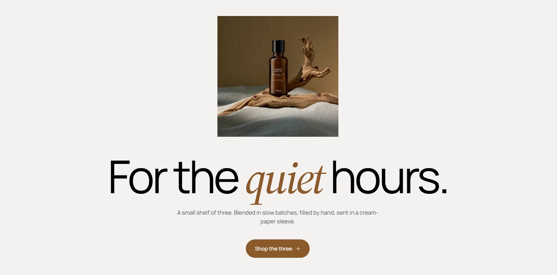
Features:
- Product image (a transparent cutout works best) with alt text; the headline overlaps the top of the image
- Heading, subheading, and button
- Highlights strip built from up to 8 short notes
- Cascading entrance animation
- Blocks: Note
Page hero
A compact editorial header for content pages such as About, pairing a portrait image with a heading, intro, and meta line. It is used by the page.about template.
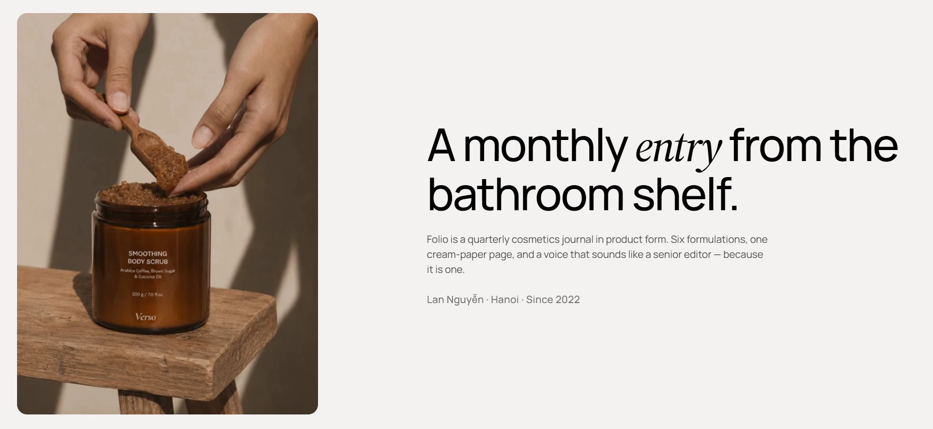
Features:
- Optional breadcrumb above the content
- Image with alt text and aspect ratio (Auto, 3:4, 1:1, 4:3, 16:9, or Custom)
- Heading (wrap a word in italic to emphasise it) and intro text
- Meta line for details like name, city, and founding year
Banner with text
The simplest hero: a heading over a background, with an optional breadcrumb. It sits at the top of the collections list template and works well on any utility page.
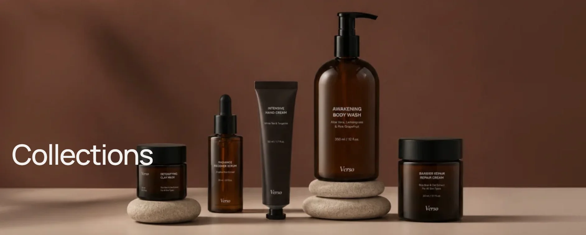
Features:
- Optional breadcrumb
- Heading with italic accent support
- Background color, gradient, image, or video with overlay controls (see Section Settings)
- Width and padding controls for desktop and mobile
Blog header
A heading block for the blog template with a row of topic pills that link to the pages you choose.
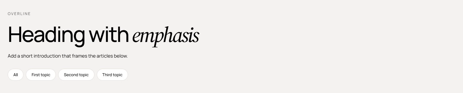
Features:
- Overline, heading, and intro with heading size and alignment
- Accent the italic word to tint it with your primary color
- Up to 12 topic pills, each with a label and link; the pill highlights automatically on its linked page
- Blocks: Topic
- Use Hero when you need to rotate several campaigns in one slot.
- Use Hero banner or Hero parallax for a single message with scroll-driven motion; Hero banner is image-led, Hero parallax is type-led.
- Use Hero split when you have a strong portrait photo and social proof to show, and Hero spotlight when one product should be the star.
- Use Page hero, Banner with text, and Blog header as lightweight openers for content, collection list, and blog pages rather than the home page.