Carousel
Carousel, also known as a slider or image slider is an effective way to present multiple items in a compact space and enhance user engagement by scroll and slide series of images or content.
Carousel Structure
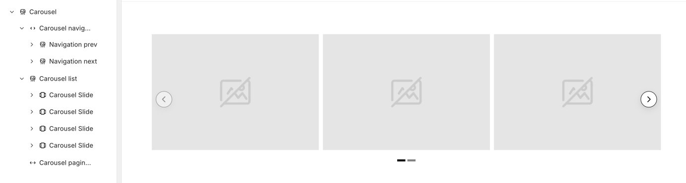
- Carousel wrapper: Container for the items list, navigation wrapper and pagination. The settings for most carousel behaviors can be adjust from here
- Carousel navigation: Container for both previous and next icon button. Change the position, spacing and alignment of buttons in here.
- Carousel list: Contain multiple Carousel Slide elements, and only Carousel Slide is allowed inside for the pagination function to work properly.
- Carousel slide: An image is placed inside by default, but you can delete it and add anything to your preference.
Carousel Setting
You can find the setting by clicking Carousel → Content
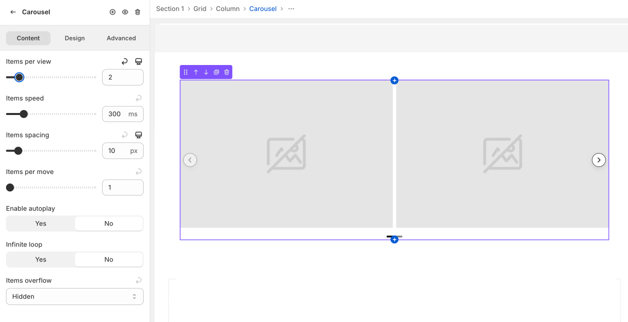
Items per view
Determines how many Carousels are displayed simultaneously in the view. You should set this number lower than the total number of Carousel Slides.
Items speed
The transition speed of the carousel when sliding horizontally. The smaller the number, the faster the slide transition, and vice versa.
Items spacing
The gap between each slides.
Items per move
The number of Slides that will scroll through when clicking pagination buttons or autoplay. You can set it equal to the Items per view to move an entire page view at once.
Enable autoplay
Enabling this will allow the Slide to auto-next without the user needing to press the prev or next button. This can be useful if you want to grab the user's attention with automatic movement.
Infinity loop
Enabling this will allow the slides to loop back to the first Carousel when reaching the last slide.
Item overflow
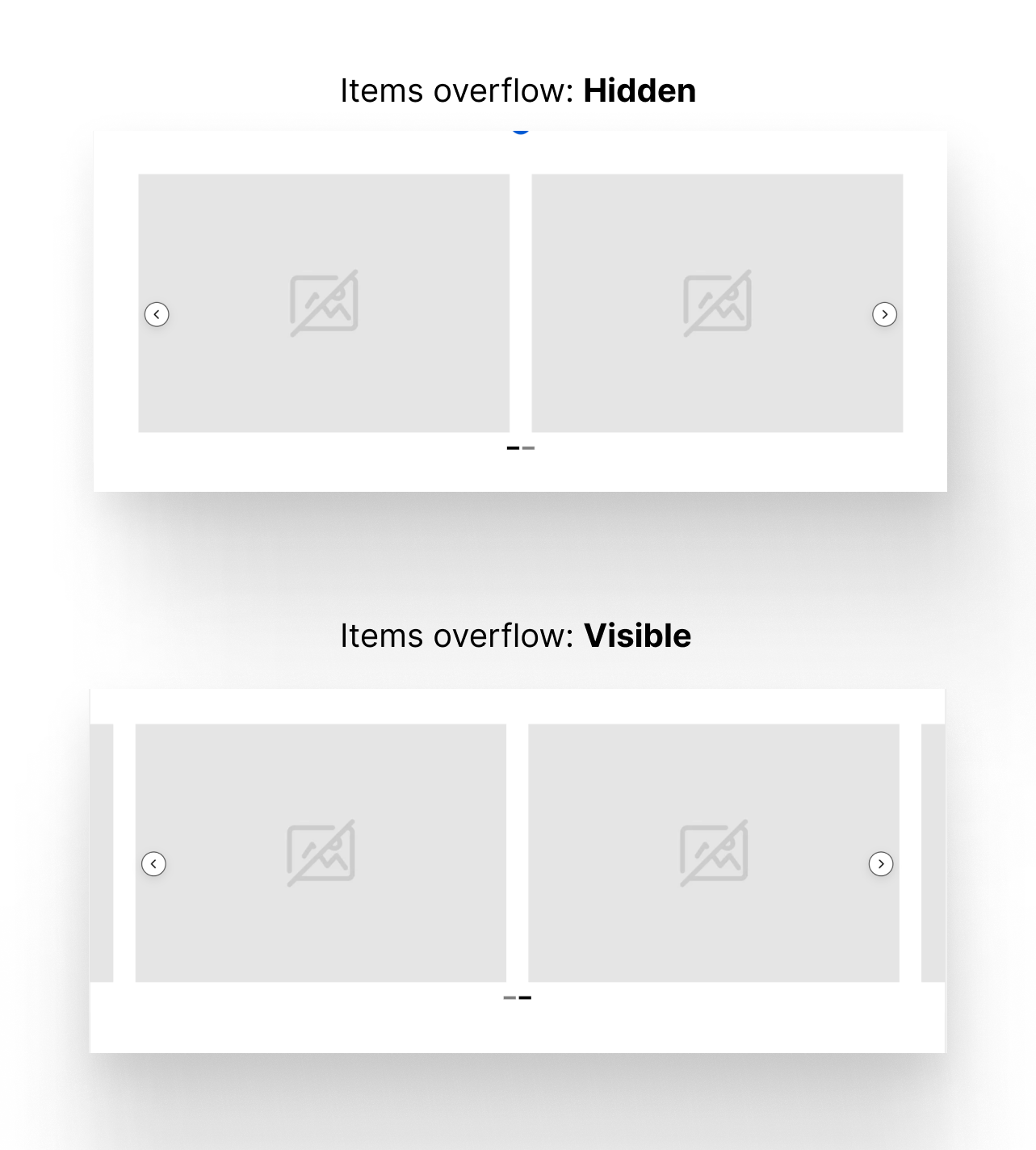
- Visible - allowing items outside the view to be seen when sliding
- Hidden - hiding any slides that are outside the view.
Depending on other cases, you can also choose Auto or Scroll.
Carousel Navigation Setting
You can find the setting in Carousel Navigation → Content
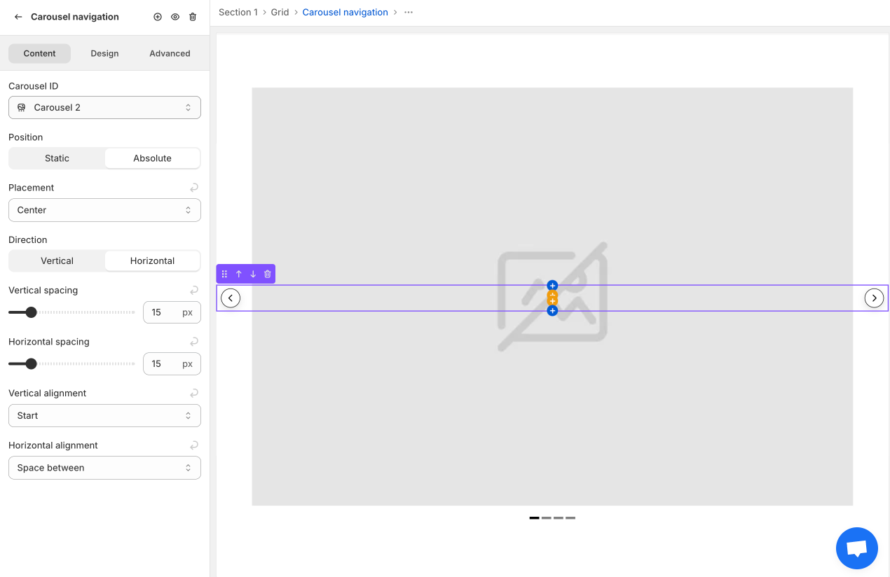
Carousel ID
- Auto: Only works if you place the Carousel Navigation inside the Carousel Wrapper. It will automatically detect and control its parent carousel.
- Carousel + Number: Use this when the Carousel Navigation is placed outside the Carousel Wrapper (for styling or special layout purposes). You can select which carousel element to control by choosing from the dropdown list.
Position
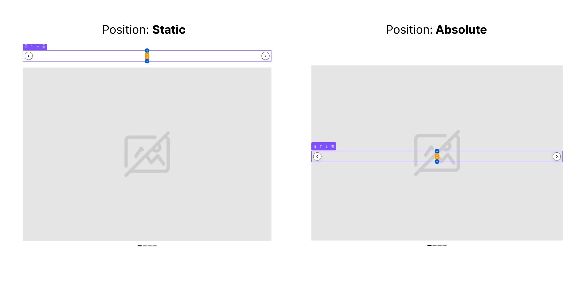
- Static: Navigation will take up space and not overlap with other elements.
- Absolute: Navigation will float over the Carousel as a top layer and overlap other elements.
Placement
Can only be selected when Position is Absolute. You can position the navigation vertically: at the top, center, or bottom of the view.
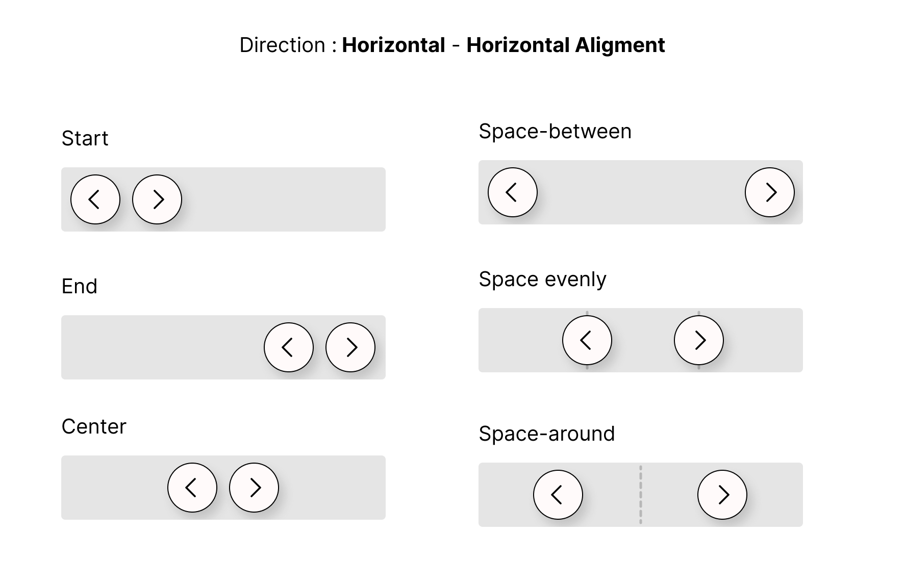
Direction, Spacing and Alignment
You can arrange the two prev and next buttons either vertically or horizontally. Depending on the arrangement, you can adjust the vertical or horizontal spacing of the slide transition buttons, as well as their corresponding alignment.
Carousel Pagination
You can find the settings in Carousel Pagination → Content.
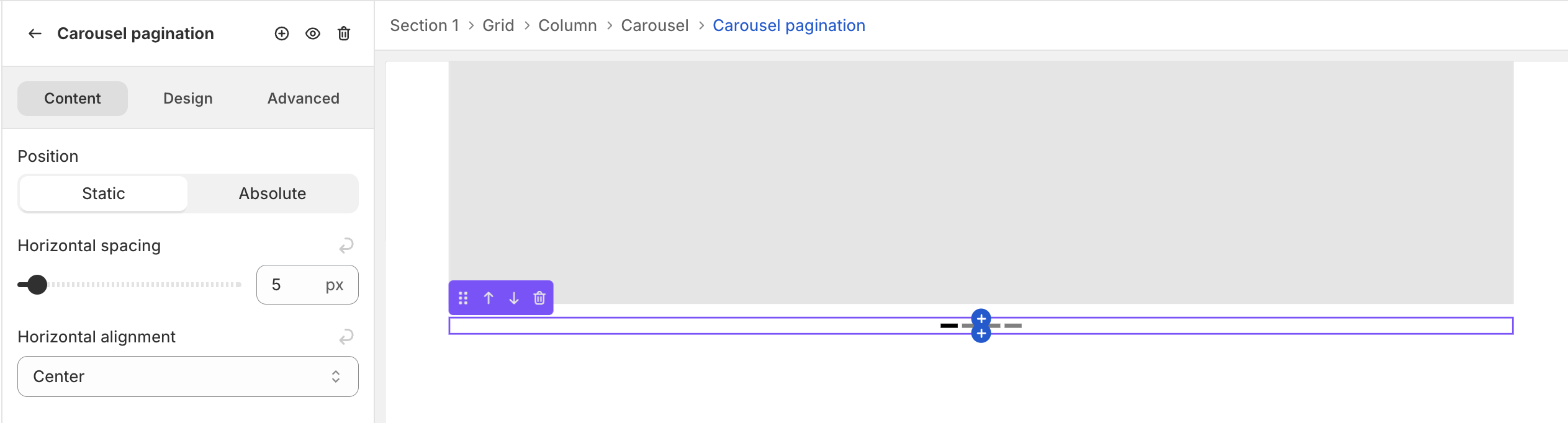
Position
- Static: Pagination will take up space and not overlap with other elements.
- Absolute: Pagination will float over the Carousel as a top layer and overlap other elements.
Horizontal spacing
The gap between each indicator. The higher the number, the bigger the gap.
Horizontal alignment
Align the pagination to start, center or end of the carousel.
Pagination Style
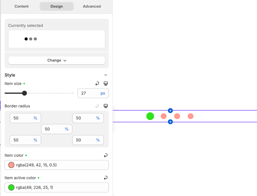
You can find the styling settings in Carousel Pagination → Design.
Prebuilt Style
Select Change button → Change Styles → Choose the style to preview → Hit Select at the bottom. We provide some rectangle and rounded style for the pagination indicator.
Item size
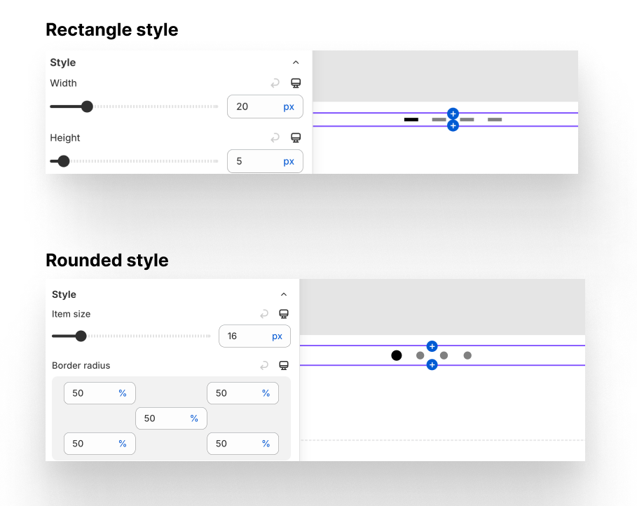
Depend on the style, you can have option to change the size of each indicator item in the Pagination like width, height, item size and border radius.
Item color
Base color of item when it’s not active.
Item active Color
Color of active indicator, which mean the carousel is highlight the Slide number that match the item order.