Accordion
Accordion Element allow you to expand or collapse individual items to reveal or hide the content when you click. It’s used for organizing large amounts of information or structure content for easy navigation.
Accordion Structure
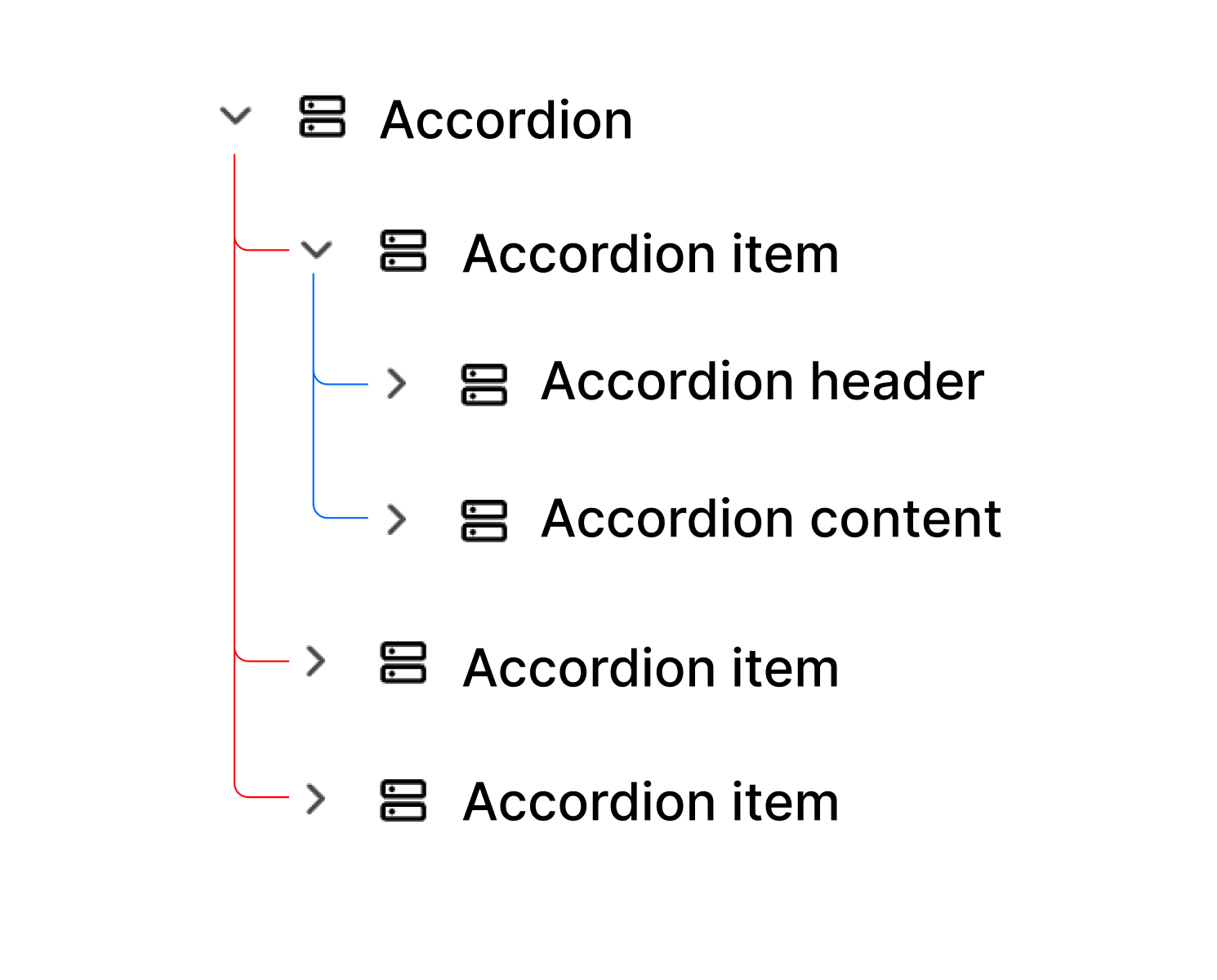
- Accordion Wrapper: A container for multiple accordion items.
- Accordion Items: Each accordion has a header and content to function properly.
- Accordion Header: By default, includes an icon and text; this part is always visible.
- Accordion Content: Contains collapsible information that appears only when the user focuses on the item.
Accordion Items must be placed inside the Accordion Wrapper to customize the style and other settings shown below.
Prebuilt Style
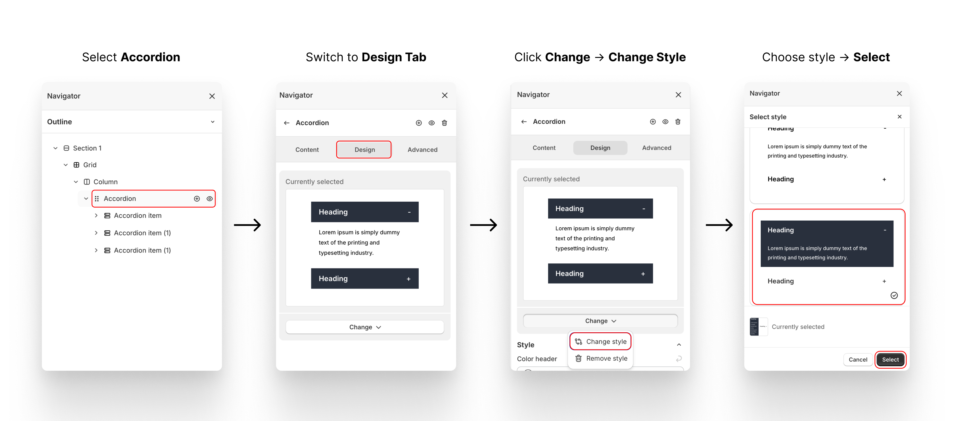
XO Builder offers several accordion styles. To apply a style to all items, select the Accordion Wrapper and switch to the Design tab.
Custom Color
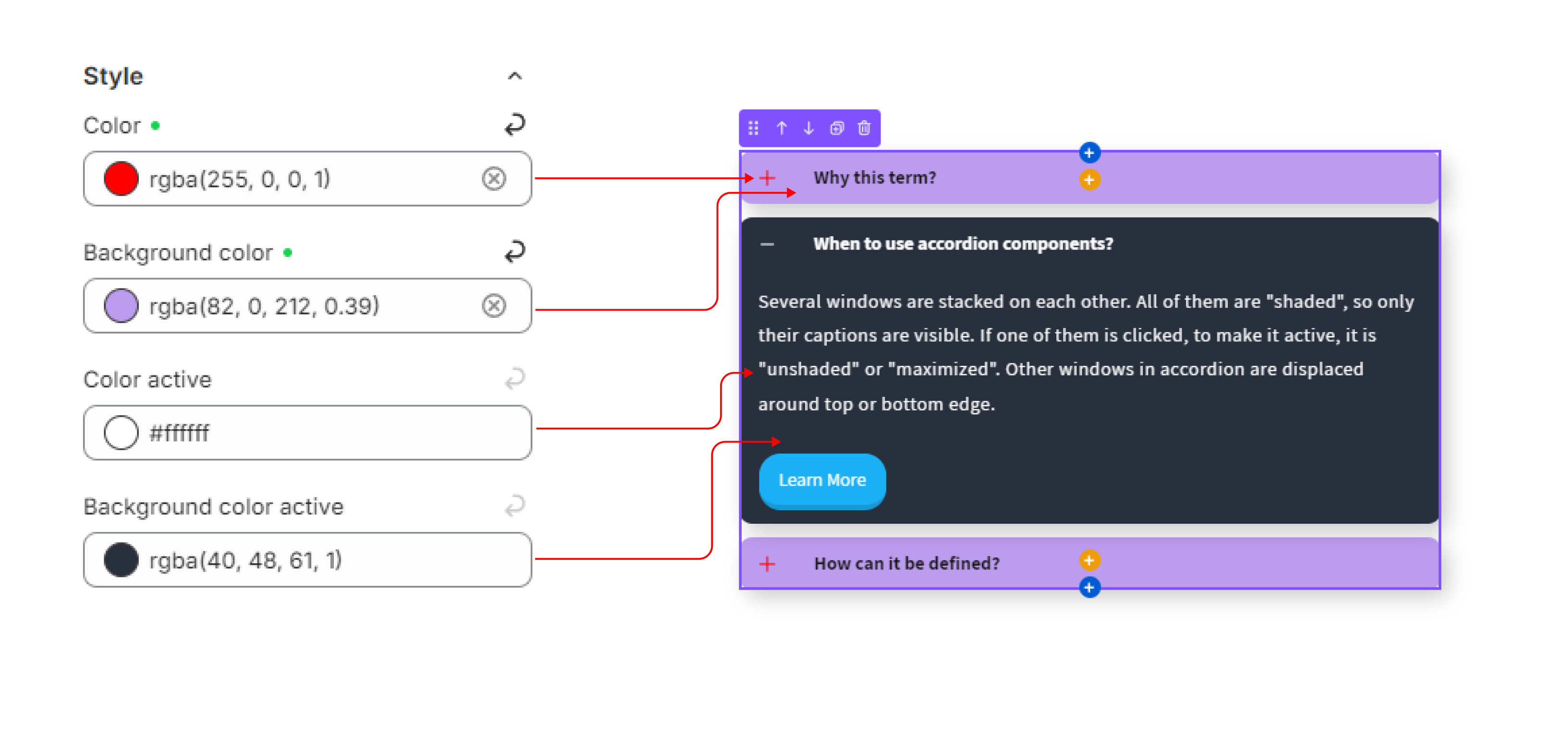
After selecting a style, you can change the color of each part in Accordion → Design → Style, including:
- Color & Background Color: The color of the content (text, icon) and background when the item is collapsed.
- Color Active & Background Color Active: The color of the content (text, icon) and background when the item is expanded.
Allow Multiple Expanded Items
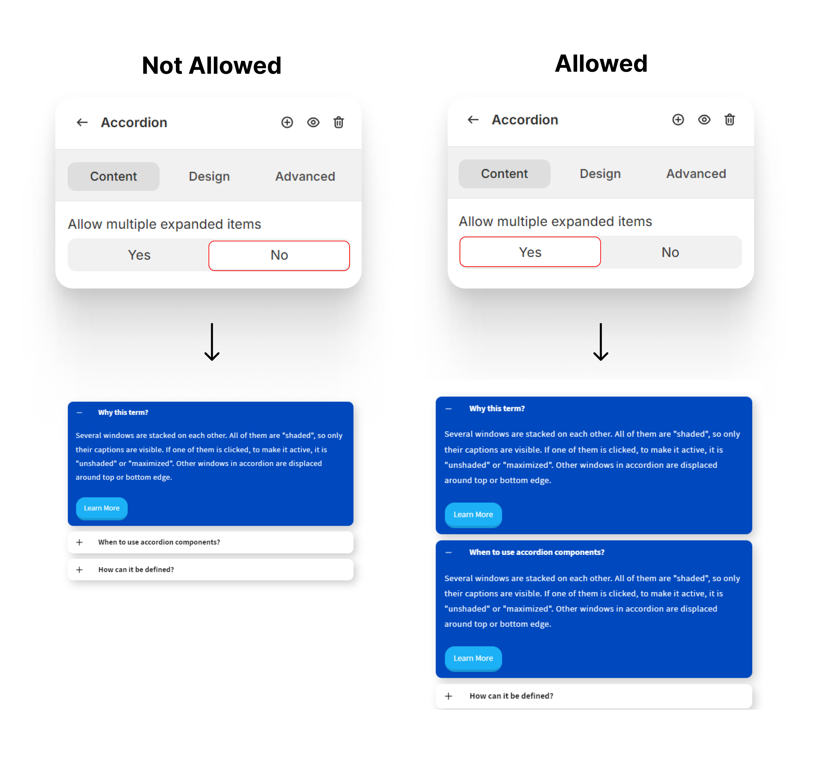
By default, only one item can be expanded at a time. To allow multiple items to expand, go to Accordion → Content and adjust the settings.
Accordion Items Setting
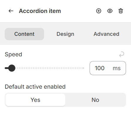
The setting can be found in Accordion Item → Content. Each Items in a accordion group can have different setting.
Speed
The duration of expand/collapse transition for each items in millisecond.
Default active enabled
Each Item can be active (already expand) by default without click on it. It a good indicator for user to know they can expand and collapse the element to view content.
Accordion Header
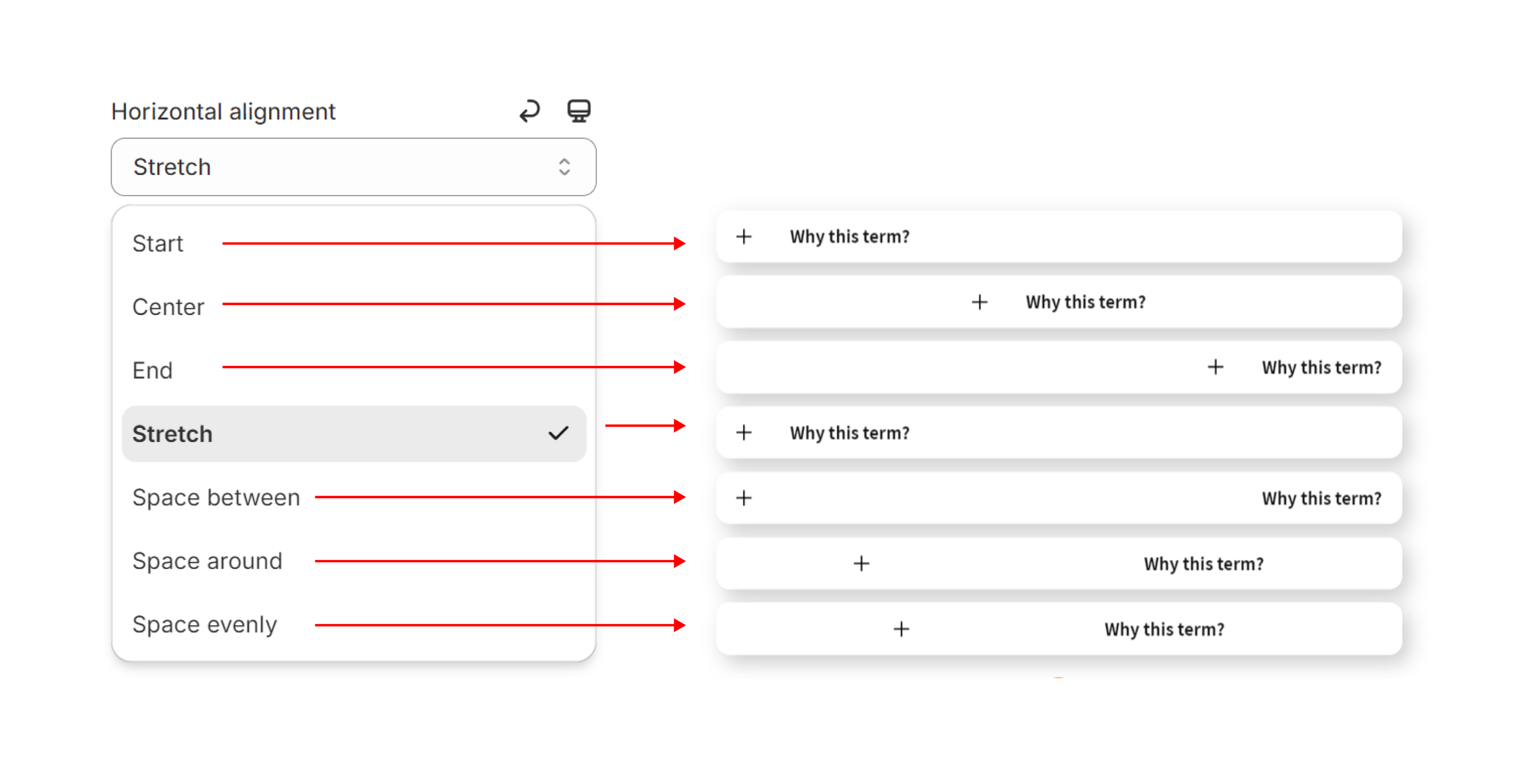
The setting can be found in Accordion Header→ Content. The contents inside Accordion Header can be distributed horizontally in various ways. By default, it’s aligned to start.