Product Blocks
Product blocks are specialized for displaying e-commerce content — product cards, pricing, variant pickers, and add-to-cart functionality.
Product Card
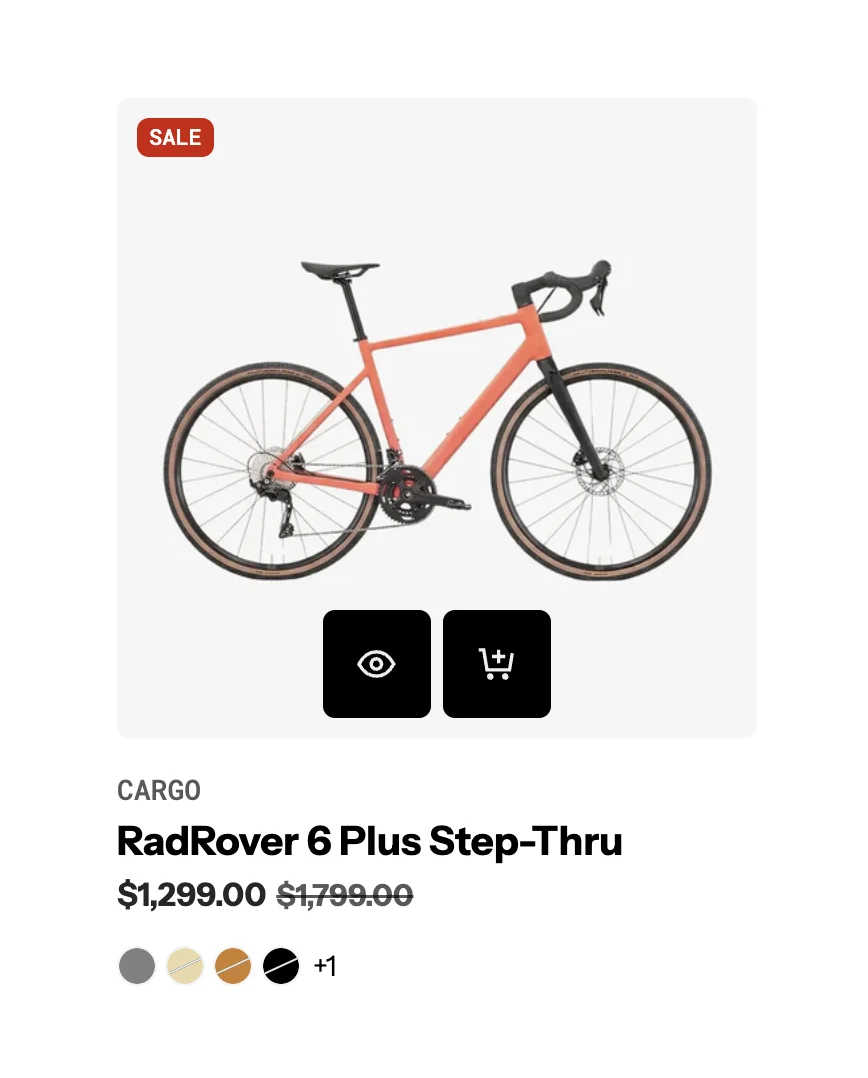
The Product Card block displays a product with its image, title, price, and quick-action buttons. This is the primary block for showcasing products throughout your store.
Settings:
- Product: Select a specific product (or use dynamic product from the section context).
- Card type: Choose from multiple card layout styles. Product card type
- Color scheme: Apply a color scheme to the card.
- Background: Color, gradient, or transparent.
- Border radius: Corner roundness.
- Animation: Entrance animation effect.
Product cards automatically display information from your product data — title, price, images, and sale badges. The card style can be customized globally in Theme settings > Product cards.
- Product Card Type: Global is used when you want all product sections to share the same card style instead of setting it manually for each section.
- Set Product Card Type = Global in the section
- Go to Theme Settings → Product Cards → Card Presets
- Choose your preferred card style
- Save changes
Product Card Bundle
A specialized product card variant for displaying product bundles with multiple items.
Settings:
- Product: Select the bundle product.
- Card type: Bundle-specific layout style.
- Color scheme & background: Visual styling controls.
Product Media
Displays a product's media (images, videos, 3D models) with gallery functionality.
Settings:
- Product: Source product for media.
- Aspect ratio: Control the media display ratio.
- Gallery style: Thumbnail, slide, or scroll navigation.
Product Title
Displays the product title as a heading.
Settings:
- Product: Source product.
- Tag: HTML heading tag (H1-H6).
- Typography: Font, size, weight, color controls.
- Link: Optionally link to the product page.
Product Description
Displays the product's description text.
Settings:
- Product: Source product.
- Line clamp: Limit visible text lines.
- Typography: Font, size, color controls.
Product Vendor
Displays the product vendor/brand name.
Settings:
- Product: Source product.
- Typography: Font, size, color controls.
Price
Displays product pricing with sale price and compare-at-price support.

Settings:
- Product: Source product.
- Typography: Custom font, size, weight, line height, letter spacing for the price.
- Price color: Color for the current price.
- Compare-at price color: Color for the original/compare-at price (strikethrough).
- Show tax info: Display tax inclusion/exclusion information.
- Alignment: Left, center, or right alignment.
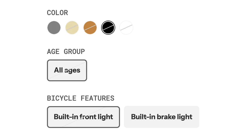
Variant Picker
Allows customers to select product variants (size, color, material, etc.).
Settings:
- Product: Source product.
- Style: Dropdown, buttons, or pill-style selectors.
- Enable swatches: Show color swatches for color options.
- Show selected value: Display the name of the currently selected option.
- Typography: Custom font, size, weight controls.
- Direction & alignment: Horizontal or vertical layout.
Add to Cart
The Add to Cart button block allows customers to add products to their cart.

Settings:
- Product: Source product.
- Button type: Primary or secondary.
- Button variant: Filled, outline, or ghost.
- Tooltip: Enable/disable tooltip on hover.
- Size: Small, medium, or large.
- Width: Fit content or fill available space.
- Icon: Optional cart icon.
Quantity Selector
Allows customers to set the quantity before adding to cart.

Settings:
- Style: Input field or plus/minus buttons.
- Min/Max values: Set quantity limits.
Quick View
Opens a quick preview modal of the product without navigating away from the current page.
Settings:
- Button style: Icon only or text button.
- Modal content: What product info to show in the quick view.
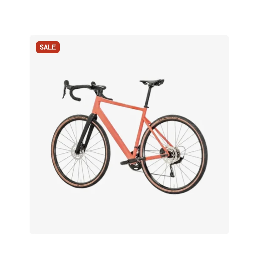
Sale Badge
Displays a sale/discount badge on the product.
Settings:
- Style: Percentage off, amount off, or custom text.
- Position: Top-left, top-right, or custom positioning.
- Color scheme: Badge colors.
Inventory Status
Shows the product's stock status (in stock, low stock, out of stock).

Settings:
- Show count: Display the actual inventory count.
- Low stock threshold: Number at which "low stock" is shown.
Variant Option Links
Displays variant options as clickable links that navigate to the selected variant.
Settings:
- Product: Source product.
- Option name: Which variant option to display (e.g., Color, Size).
- Style: Text links, swatches, or buttons.