Basic Blocks
Basic blocks are the fundamental content elements in Wave. These are the blocks you'll use most often to build your store's pages.
Heading
The Heading block displays a text heading with rich typography controls.
Settings:
- Text: The heading text content.
- Tag: Choose the HTML tag (H1-H6) for SEO and hierarchy.
- Highlight decoration: Add underline, circle, or stroke decoration to specific words.
- Typography: Custom font, size, weight, color, opacity, letter spacing, and text case.
- Animation: Fade, slide, zoom, or rotate entrance effects.
Text
The Text block displays rich text content with formatting options.
Settings:
- Rich text: Full rich text editor with formatting.
- Link: Optional link wrapping the text.
- Reveal text: Enable a gradual text reveal effect.
- Typography: Custom font, size, weight, color, opacity, line height.
- Line clamp: Limit the number of visible text lines.
- Hover effects: Change color or opacity on hover.
Image
The Image block displays an image with aspect ratio and animation controls.
Settings:
- Image: Select an image from your store's library.
- Dark mode image: Optional alternate image for dark mode.
- Aspect ratio: Auto, square, portrait, landscape, or custom ratio.
- Border radius: Control corner roundness.
- Animation: Default zoom-out animation; also supports fade, slide, and more.
Button
The Button block creates a clickable button with flexible styling.

Settings:
- Text: Button label text.
- Link: The URL the button links to.
- Button type: Primary or secondary style.
- Button variant: Filled, outline, or ghost.
- Size: Small, medium, or large.
- Width: Fit content or fill available space.
- Icon: Optional icon displayed alongside the button text.
- Border radius, shadow: Additional visual controls.
Icon
The Icon block displays an icon from Wave's built-in icon library or a custom image.

Settings:
- Icon type: Built-in icon or custom image.
- Icon style: Preset style or fully custom.
- Size: Set the icon width and height.
- Link: Optional link wrapping the icon.
- Color: Icon color and background color.
- Background: Color, gradient, or transparent background.
Video
The Video block embeds a video from Shopify's media library or an external URL.
Settings:
- Video source: Shopify-hosted video or external URL (YouTube, Vimeo).
- Cover image: Thumbnail displayed before the video plays.
- Autoplay: Enable automatic playback.
- Loop: Enable continuous loop playback.
- Controls: Show/hide video player controls.
- Aspect ratio: Auto or custom aspect ratio.
- Play button: Customize play button icon size and color.
Divider
The Divider block adds a horizontal line separator between content.

Settings:
- Color: Divider line color.
- Width: Divider line thickness.
- Style: Solid, dashed, or dotted.
Spacer
The Spacer block adds vertical spacing between blocks.

Settings:
- Height: Set the spacer height (desktop).
- Mobile height: Set a different height for mobile screens.
Badge
The Badge block displays a small label or tag element.

Settings:
- Text: Badge label text.
- Color scheme: Badge color styling.
- Size: Badge size variant.
Countdown
The Countdown block displays a countdown timer to a specific date or an evergreen timer.

Settings:
- Timer mode: Fixed date or evergreen (recurring).
- Fixed time: Set the target date and time (for fixed mode).
- Evergreen unit & value: Set the countdown duration (for evergreen mode).
- Ended text: Text shown when the countdown reaches zero.
- Typography: Separate controls for numbers and labels (font, size, weight, color).
Count To
The Count To block animates a number counting up to a target value, useful for statistics and impact sections.

Settings:
- Target number: The final number to count to.
- Duration: How long the counting animation takes.
- Prefix/Suffix: Text before or after the number (e.g., "$", "%", "+").
Marquee
The Marquee block creates a scrolling text or icon ribbon.

Settings:
- Direction: Forward or backward scrolling.
- Speed: Scroll speed (1-10).
- Pause on hover: Stop scrolling when hovered.
- Gap: Space between repeating items (desktop and mobile).
- Child blocks: Add Text and Icon blocks inside the marquee.
Shape
The Shape block adds a decorative SVG shape element.

Settings:
- Shape: Select from built-in shape options.
- Color: Shape fill color.
- Size: Shape dimensions.
Tabs
The Tabs block creates a tabbed interface to organize content.
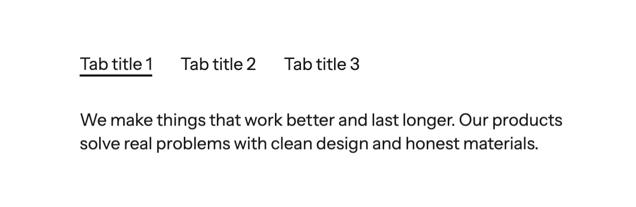
Settings:
- Active tab: Set which tab is active by default.
- Direction: Horizontal or vertical tab layout.
- Gap: Space between tab items.
- Child blocks: Add Tab Item blocks, each containing its own content blocks.
Collapse / Accordion
The Collapse block creates expandable/collapsible content sections, perfect for FAQs.
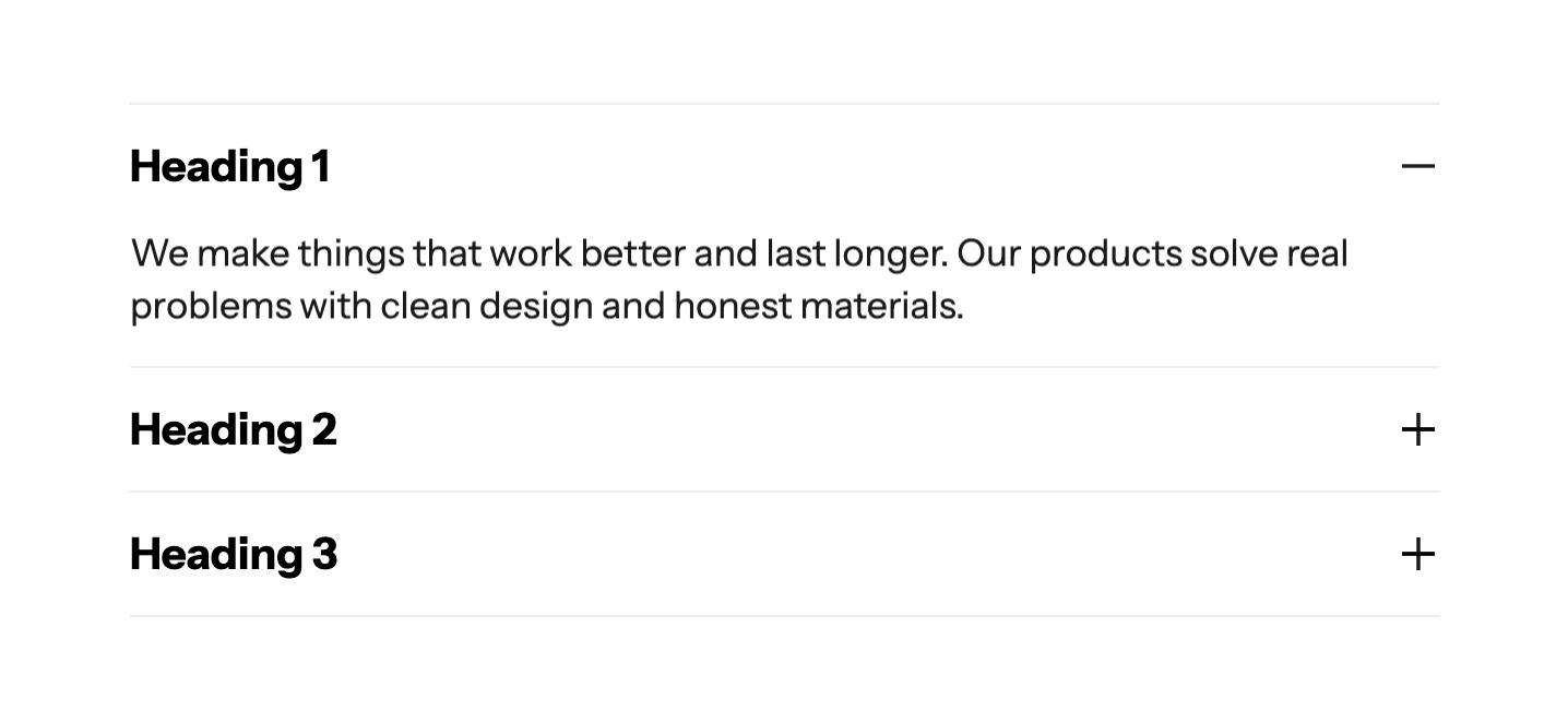
Settings:
- Accordion mode: When enabled, only one item can be open at a time.
- Divider: Show/hide dividers between items.
- Divider color & opacity: Customize divider appearance.
- Child blocks: Add Collapse Row blocks, each with a title and expandable content.
Additional blocks
Wave also includes these utility blocks:
| Block | Description |
|---|---|
| Custom Liquid | Add custom Liquid code directly |
| Newsletter Form | Email signup form |
| Contact Form | Contact form with customizable fields |
| Social Media | Social media icon links |
| Star Rating | Display a star rating (1-5) |
| Circle Bar | Circular progress bar for statistics |
| Image Comparison | Before/after image slider |
| Link List | A list of navigation links |
| Input | Form input field |
| Submit Button | Form submit button |