Collection Blocks
Collection blocks display your store's collections — collection cards, images, titles, and product counts. Use them to help customers browse and discover your product categories.
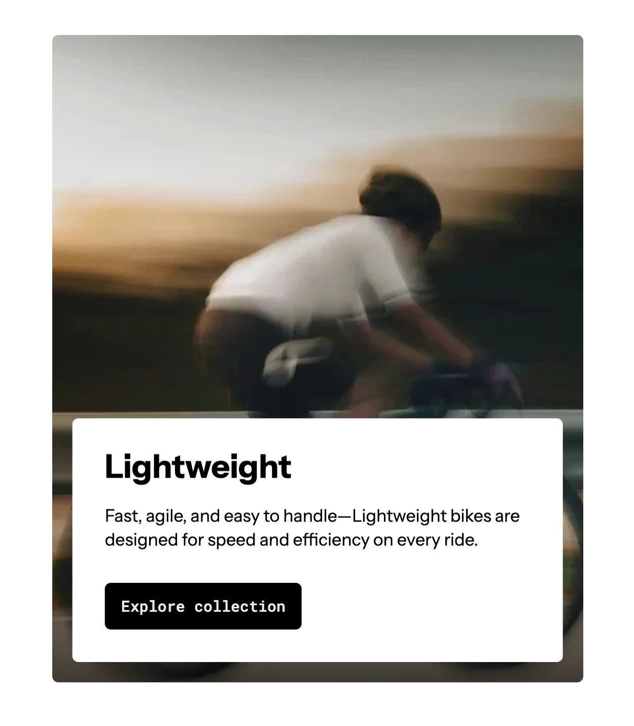
Collection Card
The Collection Card block displays a collection with its image, title, and optional product count in a card format.
Settings:
- Collection: Select a specific collection or use dynamic context.
- Direction: Column (vertical) or row (horizontal) layout.
- Alignment: Content alignment within the card.
- Gap: Space between child elements.
- Wrap: Enable content wrapping.
- Size: Width and height controls.
- Background: Color, gradient, or image background.
- Border radius & border style: Card edge styling.
- Hover effects: Change background, border, or shadow on hover.
- Animation: Entrance animation effect.
Accepts child blocks: Collection Media, Collection Title, Collection Description, Collection Product Count, Group.
Collection cards are highly flexible — use the accepted child blocks to build any card layout you need. Add a Group block inside for more complex arrangements.
Collection Media
Displays the collection's featured image.
Settings:
- Aspect ratio: Auto, square, portrait, landscape, or custom.
- Border radius: Corner roundness.
- Overlay: Optional color overlay on the image.
- Animation: Image entrance effect (e.g., zoom-out).
Collection Title
Displays the collection's title.
Settings:
- Tag: HTML heading tag (H2-H6).
- Typography: Font, size, weight, color, letter spacing.
- Link: Automatically links to the collection page.
Collection Description
Displays the collection's description text.
Settings:
- Typography: Font, size, color controls.
- Line clamp: Limit visible text lines.
Collection Product Count
Displays the number of products in the collection.
Settings:
- Format: "X products" or just the number.
- Typography: Font, size, color controls.
- Add a Section with a Layout block (type: Grid, 3 columns).
- Inside each Layout item, add a Collection Card block.
- Inside each card, add Collection Media, Collection Title, and Collection Product Count.
- Customize each block's appearance independently.