Gallery editor
The editor is organized into four key areas to streamline your workflow and make gallery management intuitive and efficient:
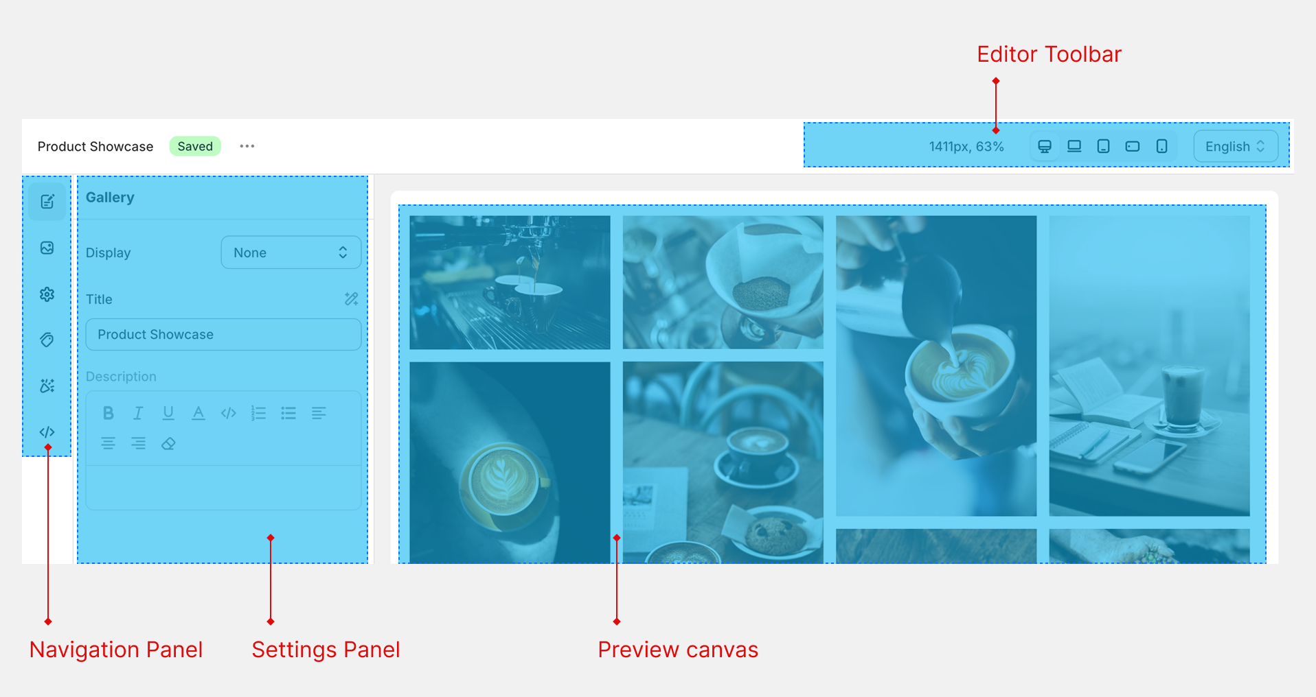
Editor Toolbar
The Editor toolbar at the top right provides essential controls, including previewing the gallery on different devices, selecting language for translation.
Navigation Panel
Located on the far left, the Navigation panel features icon-based tabs allowing you to switch between major sections, such as Info, Images, Settings, Hotspot, Design, and Custom Code. This layout ensures you can quickly access and navigate all available functionalities.
Settings Panel
The Settings panel appears immediately to the right of the navigation, showing all configuration options relevant to your current selection. Use this panel to fine-tune gallery properties, manage images, configure hotspots, adjust design settings, or integrate custom code.
Preview Canvas
The expansive Preview canvas on the right provides a real-time, interactive view of your gallery. Here, you can easily drag and drop images, resize elements, and modify hotspot positions, ensuring your gallery appears exactly as intended before publishing.
Each of these areas has been designed for professional ease-of-use, giving you granular control over every aspect of your gallery creation process.
Settings fields
The XO Gallery App lets users customize gallery settings with responsive values and custom styles. When a field in the settings panel shows a desktop icon, this means you can set different values for that field depending on the device size or responsive breakpoint, like desktop, tablet, or mobile. If you see a magic wand icon, you can configure or input custom styles for that field.
Responsive Breakpoint Configuration
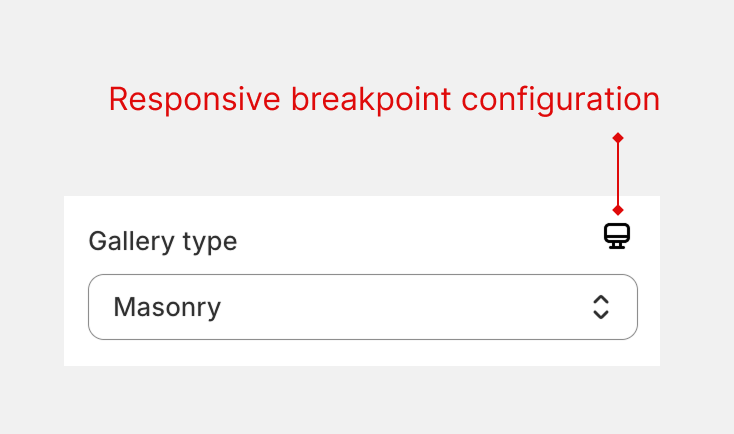
- Fields with a desktop icon let you adjust the value for various device sizes—desktop, tablet, or mobile.
- This helps optimize galleries for any screen and enhances the user experience by making layouts, spacing, and image arrangements adapt to the viewing device
Custom Styles Feature
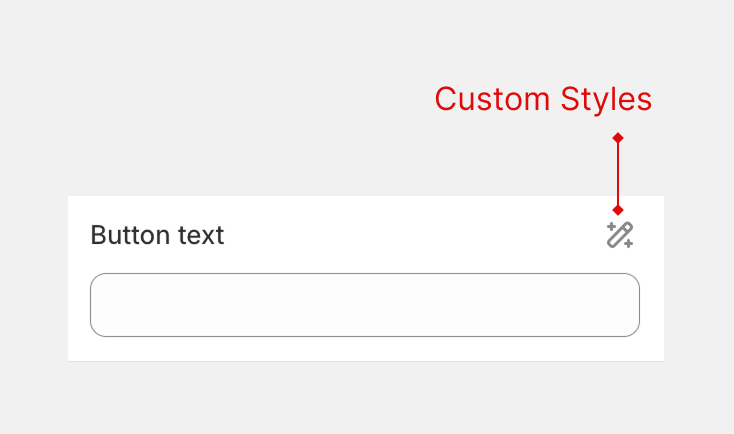
- Fields with a magic wand icon allow setting custom styles
- You can use these fields to define unique visual elements, like colors, borders, spacing, or effects, for the gallery, giving you creative control over its appearance.
- This feature is ideal if you want to match your gallery design with your store branding or add extra visual polish
Translate Gallery Content
You can easily translate your gallery titles, descriptions, and other fields by using the language selector in the editor toolbar.
How to Translate
- Open the gallery you want to edit.
- In the editor toolbar, select the language you want to translate to.
- Enter the translated text into any available field.
For example: If your gallery title in English is “Product showcase” and you want to add a Vietnamese translation, select Vietnamese from the language menu, then type “Giới thiệu sản phẩm”.
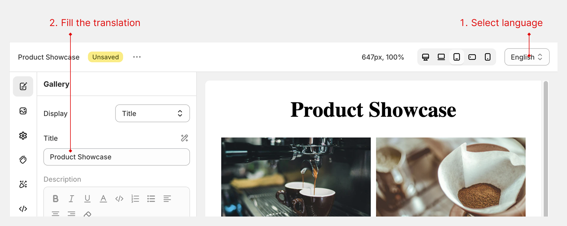
How It Works
Once you add translations, the app automatically shows the appropriate language version to visitors based on the language selected in your Shopify store.