Hotspot product list
Show every product tagged on an image as a list right next to it. Shoppers see all the products at once and don't need to hover or tap each hotspot to find them.
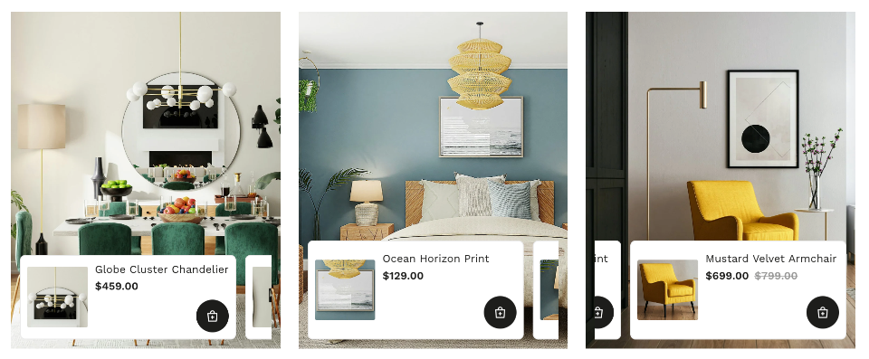
The product list shows the products you tagged on your images. Tag products first, as described in Shoppable galleries.
Turn on the product list
- Open your gallery in the editor and go to the Hotspots tab.
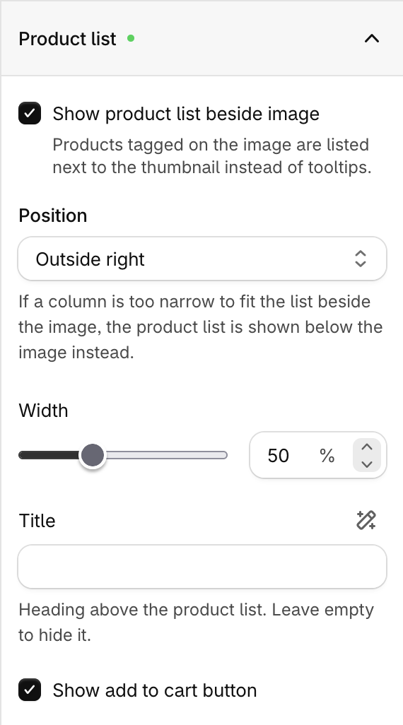
- Open Settings and expand the Product list section.
- Check Show product list beside image.
- Click Save.
Settings
| Setting | Description |
|---|---|
| Show product list beside image | Turns the product list on or off. |
| Position | Where the list appears relative to the image. See Positions. |
| Width | How much of the row the list takes up, from 40% to 70%. Only shown for Outside left and Outside right. |
| Title | Heading above the list, for example "Shop the look". Leave it empty to hide the heading. Click the style icon next to the field to change its font, size and color. |
| Show add to cart button | Adds an Add to cart button to each product in the list. |
Positions
| Position | Where the list appears |
|---|---|
| Inside top | Over the image, along the top edge |
| Inside bottom | Over the image, along the bottom edge |
| Outside top | Above the image |
| Outside bottom | Below the image |
| Outside left | To the left of the image |
| Outside right | To the right of the image |
Grid, Justified and Marquee layouts support only Inside top and Inside bottom. These layouts use Inside bottom by default. Other layouts use Outside right by default.
If you switch to a layout that doesn't support the position you chose, the gallery uses that layout's default position.
When you use Outside left or Outside right and the column is too narrow to fit the list beside the image (for example, on mobile), the list moves below the image.
Customize the product card
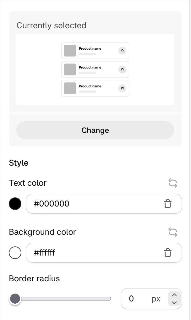
Each product in the list is shown as a card.
- In the Hotspots tab, open Styles.
- Find Product list card style and click the Custom (wand) icon.
- Click the current style to pick another card style.
- Adjust the Text color, Background color, Border radius and the add to cart button colors to match your store.
- Click Save.
Tips
- Use outside positions on wide layouts like Slider or Carousel. Shoppers can see the image and the products side by side.
- Use inside positions on Grid and Masonry, where each image is small. The list stays inside the image.
- Add a short title such as "Shop this look" so shoppers know the products are part of the image.
- Turn on the add to cart button so shoppers can buy without leaving the gallery.