Collection gallery
Turn any Shopify collection into a gallery. Products from the collection appear as product cards with their image, title, price and an add to cart button. When you add or remove products in the collection, the gallery updates automatically.
Good for:
- Collection pages where you want a gallery layout instead of the theme's default product grid
- "New arrivals" or "Best sellers" sections on the homepage
- Lookbooks that stay in sync with your catalog
Collection gallery requires a Pro plan subscription.
How it works
The images in your gallery act as a template. On your store, each gallery item is replaced by a product from the collection, in order, and keeps the item's layout and style settings. Placeholder images are fine.
To keep an image in place, for example a banner between products, open the image's settings in the Images tab and check Keep image. That image stays in its position and isn't replaced by a product.
Step 1: Set up the gallery
- Open the XO Gallery app.
- Create a new gallery or edit an existing one.
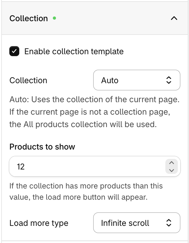
- Go to the Settings tab and expand the Collection section.
- Check Enable collection template. The default product card style is applied, and a new Product card tab appears in the editor sidebar.
- Choose a Collection:
- Auto: uses the collection of the page the gallery is on. If the gallery is not on a collection page, the All products collection is used.
- A specific collection: always shows products from that collection, on any page.
- Set the other options (see Settings) and click Save.
Step 2: Add the gallery to your theme
- Go to Online Store > Themes and click Customize.
- Open the page you want, for example the Default collection template if you use Auto.
- Click Add block or Add section and select XO Gallery.
- In the block settings, select your gallery.
- Click Save.
Collection gallery works only with the XO Gallery theme app block.
Settings
| Setting | Description |
|---|---|
| Enable collection template | Turns the collection gallery on or off. |
| Collection | Auto or a specific collection. See Step 1. |
| Products to show | How many products load at first, from 1 to 20. If the collection has more products, a load more button or pagination appears. |
| Load more type | How shoppers load more products: Button or Pagination. |
Button
Shows a button below the gallery that loads the next set of products.
- Button text: The label on the button, for example "Load more". Click the style icon next to the field to change the button style.
- Loading text: The text shown while products load, for example "Loading...".
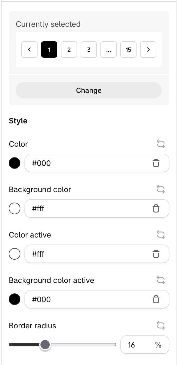
Pagination
Shows page numbers below the gallery. Click the Custom (wand) icon next to Pagination style to change how the page numbers look.
Customize the product card
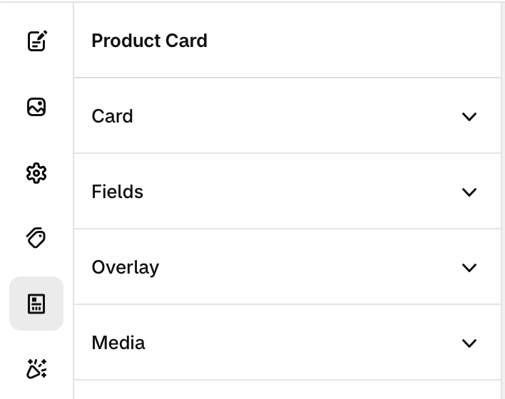
Open the Product card tab in the editor sidebar. It is only shown when the collection template is enabled.
Card
Pick a card Style, then adjust the Background color, Padding, Border width, Border style, Border color and Border radius.
Fields
Choose what each card shows and in which order. The available fields are:
- Title: the product name. Turn on Link to product to make it clickable.
- Price: the product price. Turn on Compare at price to show the original price next to a sale price.
- Button: an add to cart button. You can change its text and style.
Drag fields to reorder them, and click a field to set its Position, Alignment and Animation (type, duration and delay).
Media
| Setting | Description |
|---|---|
| Border radius | Rounds the corners of the product image. |
| Default image position | Which product image to show, for example 1 for the first image. |
| Hover image position | Which product image to show on hover. Set it to 0 to turn off the hover image. |
| Shuffle product images | On hover, the card cycles through product images at random. When this is on, the two fields above become Start position and End position and set the range of images to cycle through. |
Overlay
- Solid color: adds a color overlay on top of the product image.
- Image hover: changes the image on hover: Color to grayscale, Grayscale to color or None.
Tips
- Use Auto on the collection template so one gallery works for every collection in your store.
- Keep "Products to show" small (8–12) so the page loads fast. Shoppers can load the rest.
- Use Keep image to add banners or promo images between products.
- To translate the button and loading text, switch the editor language and enter the text for each language.