Image guide
How does the theme compress images?

Image compression in our themes is managed as follows:
- Dynamic Sizing: The theme will request the appropriately sized and compressed image based on the screen size of the user. This ensures that users receive optimized images suitable for their device, promoting faster loading times and a better browsing experience.
- Shopify Handling: The actual compression of the image is handled by Shopify. Shopify automatically optimizes images to ensure they are compressed and delivered efficiently to your customers. For more detailed information on image compression and file format selection, we recommend referring to Shopify's documentation on this topic.
What is the ideal image size?
When uploading images, prioritize the largest version possible. The theme will then automatically utilize an appropriately sized version of the image based on the width of the screen.
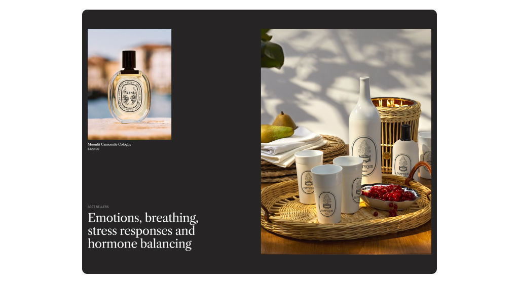
However, it's crucial to consider the appropriate dimensions of the images you upload. For instance, if your Slideshow section is designed to be landscape-oriented, avoid uploading portrait images. Similarly, if your product cards are set to display portrait images but you upload landscape ones, a significant portion of the image may not be displayed correctly.
To ensure optimal display, always upload images in dimensions that align with their intended presentation within your store. Alternatively, shape your sections to be roughly the appropriate size for the image you plan to upload. This practice helps maintain consistency and enhances the visual appeal of your store.
Does the theme have a separate image for mobile?

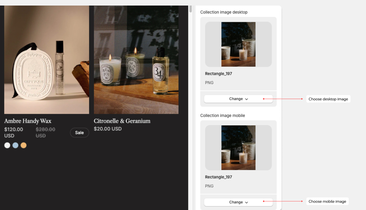
Yes, and the size of the device is crucial for optimizing image display. Since mobile devices are usually held in portrait mode while desktop screens are typically landscape-oriented, it's essential to ensure that images fit appropriately within their respective containers.
If a mobile-specific image isn't specified, the loaded image will be scaled down in size but still displayed as a landscape image within a portrait container on mobile devices. This can lead to unnecessary loading of parts of the image that won't be visible.
To address this issue, it's advisable to upload square images for mobile devices. This approach ensures that the entire image is displayed efficiently within the available space, optimizing the user experience and reducing unnecessary loading times.
Why do some sections crop the image?
In many sections, you have the option to specify the height of the section. When you do this, the image will adjust to cover the entire background of the section, expanding or shrinking as needed.

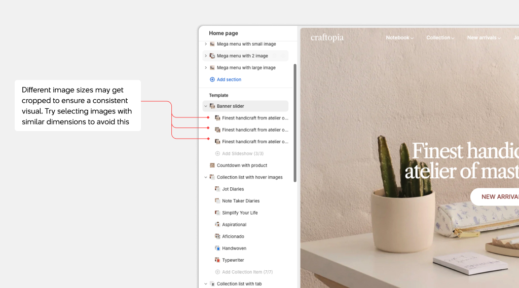
Let's take the Slideshow section as an example. It typically contains several different images, all displayed within the same sized space. While you may set up your slideshow such that the first image displays perfectly, subsequent images with different dimensions may not fit as well, leading to parts of the images being cropped.
To ensure consistency and avoid cropping, consider selecting images with similar dimensions for your slideshow or adjusting the section height to accommodate variations in image sizes. This helps maintain a polished and seamless appearance throughout your slideshow presentation.
For further insights into image aspect ratios, I recommend consulting the "Understanding Image Aspect Ratio" guide provided by Shopify
Where to find the favicon settings?

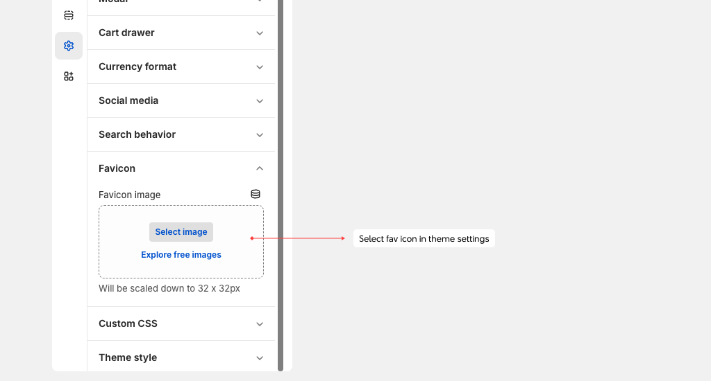
The favicon settings for all Xotiny themes can be found in Theme Settings > Favicon
Why do the colors of my image look wrong?
If you're noticing that the color of your image appears incorrect, it could be due to the presence of a color profile in the image data. Shopify may strip out this color profile because some devices do not support it. It's important to note that this is not something controlled by the theme; instead, it's managed by Shopify.
For further insights into color profiles and how they can affect your images on Shopify, I recommend referring to the "Color Profiles" guide available on the Shopify site. This resource provides detailed information on color profiles and their implications for your online store's images, helping you understand and address any color-related issues effectively.
What is the largest size of image to upload?
The largest image you can upload to Shopify is 20MB. This limit is set by Shopify and cannot be exceeded. For more detailed information on file upload size limits, I recommend reading Shopify's documentation on this topic.
What are 3D models?
A 3D model is a digital representation of an object in three-dimensional space. In our themes, 3D models are showcased as a media type on product pages and are fully functional on both desktop and mobile devices. Read Shopify's 3D model guide for more information.