Product information
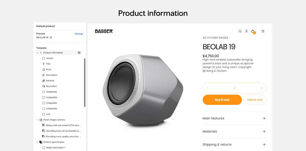
The Product information section stands as one of the most critical pages on any store. Here, customers delve into detailed product information and explore related items they may fancy. This page is where purchases are often finalized, making an effective Product information section indispensable for any Shopify store.
A well-constructed information section serves multiple purposes: it not only boosts conversion rates and encourages up-selling but also strengthens brand identity and enhances search engine rankings.
How to set up the Product information section

- Open the Theme Editor
- Navigate to Products > Default product from the dropdown at the top
- Select the Product information section to edit or add blocks.
Layout
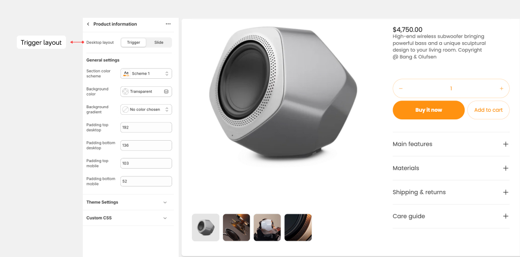
Trigger layout

The Trigger layout displays all product images as . This layout is ideal when your product images are consistently sized and when you want customers to view all available images at once.
In the Trigger layout, when an image is selected, the relevant image automatically appears in view. All of the product information is contained in a single view, allowing optimized information taken in.
In our tests, we've discovered that the Stacked layout performs marginally better for speed scores compared to the Slider layout.
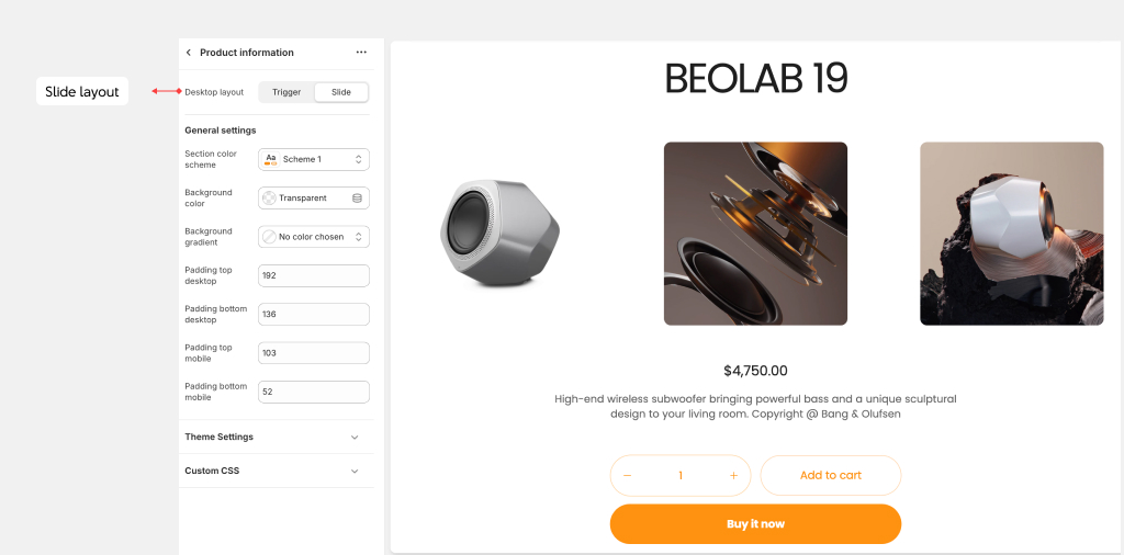
Slide layout

The Slide layout is the optimal choice to show all images of the product as a slideshow. On mobile devices, images are always displayed in a slider format.
For advanced control over the appearance and functionality of the slider, including settings for thumbnails, arrows, and product counts, refer to the theme settings.
Blocks

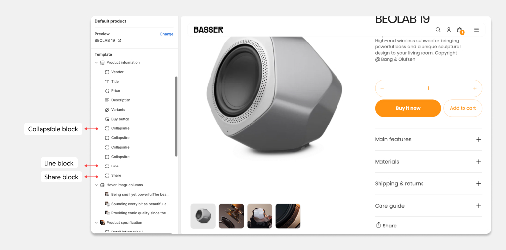
You have a wide selection of blocks at your disposal to enhance the functionality and appearance of the Product Information section. Blocks like Collapsible , Custom Liquid, Divider, Image, Pop-up, Rich Text, can be added multiple times as needed. However, please note that blocks like Vendor, Title, Description, Price, Variants, and Buy button are limited to one instance each.
Collapsible block
Use the Collapsible block to show a benefit of the product or service that your customers can collapse or expand on a click. Add the Collapsible block then insert the heading and content.
Complementary products block
To enhance the functionality of the product info, consider utilizing the Complementary Products block to showcase a variety of related products.
Customize the block heading using the text input field provided, adjust the maximum number of products to display with the range slider, and enable the navigation, pagination as needed.
Share block
Add the Share block to display links to Facebook, X (formally known as Twitter) and Pinterest.