Product information blocks
Overview
Product blocks are the core e-commerce elements that control how your products are displayed and purchased throughout your store. These blocks work across product pages, collection listings, search results, and promotional sections, providing consistent product presentation with flexible customization options for different contexts and user experiences.
Product information blocks
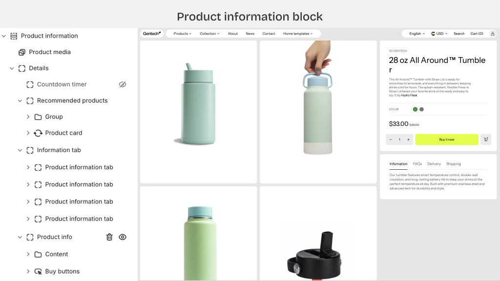
Complete your product page with comprehensive product details and purchase functionality.
Available blocks
- Product media Image galleries, videos, and 360° product views with zoom functionality.
- Details container Expandable section for organized product information with accordion-style display options.
- Countdown timer Sales countdown displays for limited-time offers and product launches.
- Recommended products Cross-sell and upsell product suggestions taken from the Search & Discovery app.
- Information tab Tabbed content areas for specifications, shipping info, and additional details.
- Product vendor Brand or manufacturer information display, often above the product title.
- Product title Main product heading, taken from the Shopify admin.
- Product description Rich text product details, taken from the Shopify admin.
- Variant picker Size, color, and option selectors with visual swatches and dropdown.
- Product price Pricing display with sale prices, compare-at pricing, and currency formatting.
- Buy buttons Quantity, Add to cart, Buy now buttons, with loading states and animations.
Product card blocks
Compact product displays for collection pages, search results, and product grids.
Product card blocks list
- Product card container Card wrapper with hover effects, and consistent spacing across grid layouts.
- Text block Custom text overlay or descriptive content with brand messaging capabilities.
- Product media Thumbnail images with hover effects and quick product preview functionality.
- Sale badge Promotional badges for discounts, new arrivals, and featured product indicators.
- Product vendor Brand display within card layout for multi-vendor stores and brand recognition.
- Product title Clickable product name with truncation options for consistent card heights.
- Product price Compact price display with sale pricing and currency localization support.
- Variant option links Quick color/size selection for easy add to cart.
- Add to cart Direct cart addition from card view with success feedback.
- Quick view Modal popup for detailed product preview without full page navigation.
- Product description Brief product summary with character limits for consistent card formatting.
Block settings configuration
With each block, you can set the settings for the best visual of the product. Each theme can vary, but these are the settings you can find:
Spacing & Alignment
- Padding/margin controls for block positioning and internal spacing
- Text alignment options (left, center, right, justify) for content blocks
- Vertical alignment settings for multi-element blocks like product cards
Background & Styling
- Background colors, gradients, and image overlays for container blocks
- Border radius, shadows, and border styling for visual enhancement
- Color scheme customization for text, buttons, and accent elements
Typography Controls
- Font family selection from theme fonts or custom font integration
- Font size, weight, and line height adjustments for readability optimization
- Text transform options (uppercase, lowercase, capitalize) for brand consistency
Media Configuration
- Image aspect ratios with focus positioning controls
- Gallery layout options (slider, grid, stacked) with thumbnail positioning
- Video autoplay, loop, and poster image settings for product videos
Pricing Display
- Currency formatting and symbol positioning for international stores
- Sale price styling with strike through and discount percentage display
- Price range formatting for products with multiple variants
Variant Management
- Swatch display options (color circles, image thumbnails, text labels)
- Variant selector style (dropdown, buttons, radio buttons) with custom styling
- Sold-out variant handling with disable states and availability messaging
Button Customization
- Button styles (filled, outlined, ghost) with hover state animations
- Loading states and success feedback for add-to-cart actions
- Icon integration and positioning within buttons