Product information blocks
Overview
Product blocks are the core e-commerce elements that control how your products are displayed and purchased throughout your store. These blocks work across product pages, collection listings, search results, and promotional sections, providing consistent product presentation with flexible customization options for different contexts and user experiences.
Product blocks
Product Card
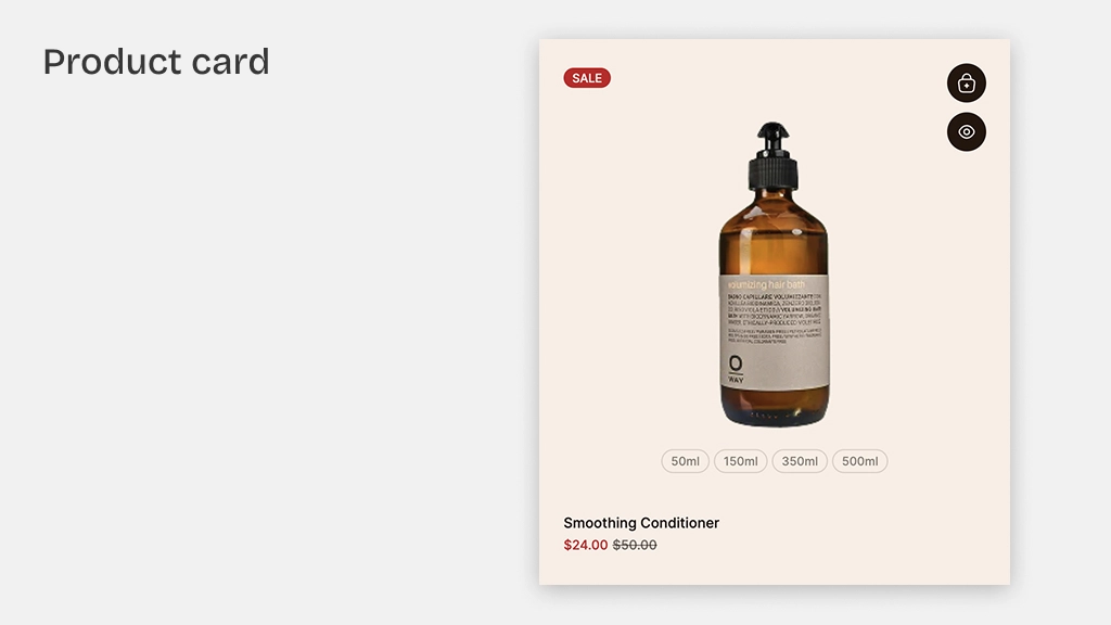
The Product Card block displays a product with its image, title, price, and quick-action buttons. This is the primary block for showcasing products throughout your store.
Settings:
- Product: Select a specific product (or use dynamic product from the section context).
- Card type: Choose from multiple card layout styles.
- Color scheme: Apply a color scheme to the card.
- Background: Color, gradient, or transparent.
- Border radius: Corner roundness.
- Animation: Entrance animation effect.
Product cards automatically display information from your product data — title, price, images, and sale badges. The card style can be customized globally in Theme settings > Product cards.
Product Card Bundle
A specialized product card variant for displaying product bundles with multiple items.
Settings:
- Product: Select the bundle product.
- Card type: Bundle-specific layout style.
- Color scheme & background: Visual styling controls.
Product Media
Displays a product's media (images, videos, 3D models) with gallery functionality.
Settings:
- Product: Source product for media.
- Aspect ratio: Control the media display ratio.
- Gallery style: Thumbnail, slide, or scroll navigation.
Product Title
Displays the product title as a heading.
Settings:
- Product: Source product.
- Tag: HTML heading tag (H1-H6).
- Typography: Font, size, weight, color controls.
- Link: Optionally link to the product page.
Product Description
Displays the product's description text.
Settings:
- Product: Source product.
- Line clamp: Limit visible text lines.
- Typography: Font, size, color controls.
Product Vendor
Displays the product vendor/brand name.
Settings:
- Product: Source product.
- Typography: Font, size, color controls.
Price
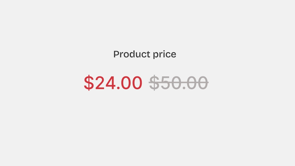
Displays product pricing with sale price and compare-at-price support.
Settings:
- Product: Source product.
- Typography: Custom font, size, weight, line height, letter spacing for the price.
- Price color: Color for the current price.
- Compare-at price color: Color for the original/compare-at price (strikethrough).
- Show tax info: Display tax inclusion/exclusion information.
- Alignment: Left, center, or right alignment.
Variant Picker
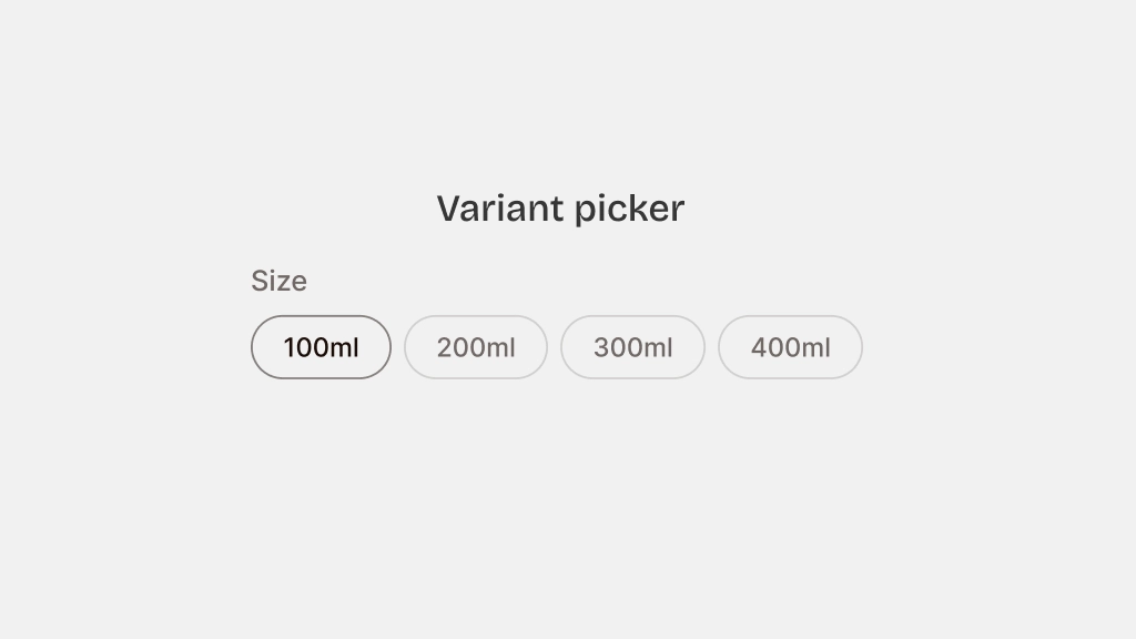
Allows customers to select product variants (size, color, material, etc.).
Settings:
- Product: Source product.
- Style: Dropdown, buttons, or pill-style selectors.
- Enable swatches: Show color swatches for color options.
- Show selected value: Display the name of the currently selected option.
- Typography: Custom font, size, weight controls.
- Direction & alignment: Horizontal or vertical layout.
Add to Cart
The Add to Cart button block allows customers to add products to their cart.
Settings:
- Product: Source product.
- Button type: Primary or secondary.
- Button variant: Filled, outline, or ghost.
- Tooltip: Enable/disable tooltip on hover.
- Size: Small, medium, or large.
- Width: Fit content or fill available space.
- Icon: Optional cart icon.
Quantity Selector
Allows customers to set the quantity before adding to cart.
Settings:
- Style: Input field or plus/minus buttons.
- Min/Max values: Set quantity limits.
Quick View
Opens a quick preview modal of the product without navigating away from the current page.
Settings:
- Button style: Icon only or text button.
- Modal content: What product info to show in the quick view.
Sale Badge
Displays a sale/discount badge on the product.
Settings:
- Style: Percentage off, amount off, or custom text.
- Position: Top-left, top-right, or custom positioning.
- Color scheme: Badge colors.
Inventory Status
Shows the product's stock status (in stock, low stock, out of stock).

Settings:
- Show count: Display the actual inventory count.
- Low stock threshold: Number at which "low stock" is shown.
Variant Option Links
Displays variant options as clickable links that navigate to the selected variant.
Settings:
- Product: Source product.
- Option name: Which variant option to display (e.g., Color, Size).
- Style: Text links, swatches, or buttons.