Basic Blocks
Basic blocks are the fundamental content elements in Lotio. These are the blocks you'll use most often to build your store's pages: text, images, video, icons, buttons, and small utility elements. Lotio includes 14 basic blocks. Every block also shares the universal controls described in Block Settings.
Text
The Text block displays rich text content with typography, hover, and animation controls. It replaces a separate heading block: pick the Text: Heading preset or set the typography preset to a heading level to turn it into a title.

Presets:
- Text: A paragraph of body copy.
- Text: Heading: An H2 heading with the Heading 2 typography preset.
Settings:
- Text: Rich text editor with formatting.
- Reveal text effect: Gradually reveals the text as it scrolls into view; set the starting Reveal text opacity.
- Layout: Width (fit, fill, or custom), alignment, and hide on mobile.
- Typography: Preset (default, paragraph, Heading 1-6, or custom). Custom exposes font, size, italic, weight, line height, letter spacing, case, and wrap.
- Color: Text color from the color scheme or a custom color, plus opacity.
- Line clamp: Limit the text to 1-5 visible lines.
- Hover: None, color, opacity, or underline in/out effects.
- Animation: Global preset, custom effect and duration, or none.
Reveal Heading
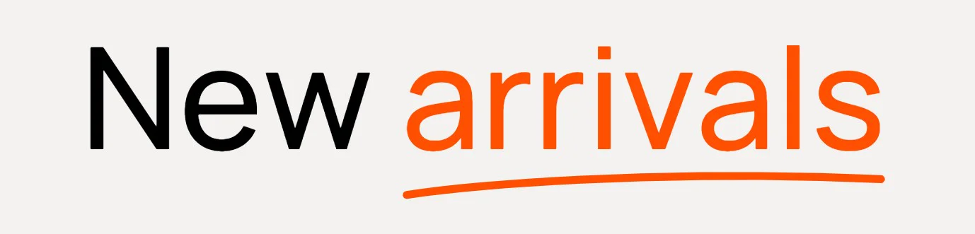
The Reveal Heading block displays an animated heading with a decorative highlight that reveals word by word as it enters the viewport.
Settings:
- Text: The heading text.
- Tag name: Choose the HTML tag (Heading 1-6) for SEO and hierarchy.
- Highlight: Decoration type (six drawn styles), stroke width, decoration color, text color, and italic for the highlighted words.
- Animation: Enable the reveal, pick an effect (slide, rotate, or zoom), the order (left to right, center, or random), and the duration.
- Layout: Width, alignment, and hide on mobile.
- Typography: Preset or custom font, size, weight, line height, letter spacing, and case.
- Color: Text color, opacity, and line clamp.
Use Reveal Heading for hero and editorial titles that need motion and a highlight. For everyday headings, the Text: Heading preset of the Text block is lighter and inherits your typography presets.
Image
The Image block displays an image with size, aspect ratio, border, and animation controls.

Settings:
- Image: Select an image from your store's library.
- Link: Optional URL wrapping the image, with an option to open in a new tab.
- Show on: Display on all devices, desktop only, or mobile only.
- Size: Aspect ratio (auto, 3:4, 1:1, 4:3, 16:9, or a custom width/height ratio), width (fit or fill), height (fit, fill, or custom), and an optional max width. Mobile can inherit the desktop values or use its own.
- Borders: Border style, width, color, opacity, and corner radius.
- Animation: Global preset, custom effect and duration, or none. The default preset uses a slow zoom-out.
Video
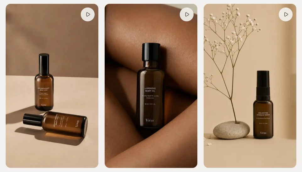
The Video block embeds a Shopify-hosted video or a YouTube/Vimeo video from a URL.
Settings:
- Autoplay: Start playback automatically.
- Enable video looping: Repeat the video when it ends.
- Shopify-hosted video: Pick a video uploaded to your store's files.
- Or embed video from URL: Paste a YouTube or Vimeo URL instead.
- Cover image: Thumbnail displayed before the video plays.
- Video alt text: Description for customers using screen readers.
Icon
The Icon block displays an icon from Lotio's built-in icon library or a custom image, optionally wrapped in a link.

Settings:
- Icon type: Built-in icon or your own image.
- Icon: Choose from over 100 built-in icons (arrows, cart, social, shipping, and more).
- Icon style: Custom (full appearance controls) or Style 1 (a preset box with its own background color).
- Icon size, color, opacity: Size of the glyph and its color from the scheme or a custom value.
- Width / Height: Size of the box around the icon.
- Link: Optional URL, with an option to open in a new tab.
- Appearance: Color scheme, background (none, color, gradient, or image with overlay), corner radius, and border.
- Animation: Global preset, custom effect and duration, or none.
Button
The Button block creates a clickable button that follows the button styles defined in Theme Settings.

Settings:
- Button label: The button text.
- Button style: Primary, Secondary, Solid primary, Solid secondary, Solid tertiary, or Link.
- Button size: Small, medium, or large.
- Enter the URL: The destination link.
- Open the link in a new tab: Open the destination in a new browser tab.
Badge
The Badge block displays a small label with an optional image, useful for "New", "Sale", or feature callouts.

Settings:
- Image: Optional small image shown alongside the label.
- Badge text: The label text.
- Background color: Badge fill color.
- Foreground color: Badge text color.
Divider
The Divider block adds a horizontal line between content, optionally with a short label in the middle.

Settings:
- Text: Optional label displayed in the center of the line. Leave empty for a plain line.
- Divider width: Line width as a percentage of the container.
- Divider weight: Line thickness.
- Divider style: Solid or dashed.
- Animation: Global preset, custom effect and duration, or none.
Spacer
The Spacer block adds empty space between blocks, vertically or horizontally.

Settings:
- Direction: Vertical (adds height) or horizontal (adds width inside a row layout).
- Desktop size (px): Space on desktop screens.
- Mobile size (px): Space on mobile screens.
Custom liquid
The Custom liquid block renders your own Liquid or HTML code anywhere a block is allowed.

Settings:
- Custom liquid: Add app snippets or other code to create advanced customizations.
Code entered here is rendered as-is. Test changes in an unpublished copy of the theme before publishing.
Text with image
The Text with image block displays rich text with small inline images placed wherever you type an [img] token; each token is replaced, in order, by one of the block's Image children.

Settings:
- Text: Rich text with
[img]placeholders marking where the images go. - Link: Optional URL wrapping the text, with an option to open in a new tab.
- Reveal text effect: Gradually reveals the text as it scrolls into view, with a starting opacity.
- Layout: Width, alignment, and hide on mobile.
- Typography: Preset or custom font, size, weight, line height, letter spacing, case, and wrap, plus color, opacity, and line clamp.
- Hover: None, color, opacity, or underline in/out effects.
- Animation: Global preset, custom effect and duration, or none.
- Child blocks: Image blocks (below) and app blocks.
Image
The Image child block is a small inline picture that fills one [img] token in the parent text. It is added from inside the Text with image block only.

Settings:
- Image: Select an image from your store's library.
- Link: Optional URL, with an option to open in a new tab.
- Size: Desktop and mobile width and height in pixels; mobile can inherit the desktop values.
- Borders: Border style, width, color, opacity, and corner radius (the preset uses a fully rounded corner).
Breadcrumb
The Breadcrumb block renders the current page's breadcrumb trail (Home > Collection > Product) so you can place it inside any section.

Settings:
- Alignment: Left, center, or right.
- Typography: Preset or custom font, size, weight, line height, letter spacing, case, and wrap.
- Color: Text color from the scheme or a custom color, plus opacity.
- Line clamp: Limit the trail to a number of lines.
Logo
The Logo block displays the store logo configured in Theme settings > Logo and favicon, sized for desktop and mobile.

Settings:
- Show on: Display on all devices, desktop only, or mobile only.
- Logo type: Default or inverse logo (useful on dark backgrounds).
- Size: Desktop and mobile width, plus an optional fixed desktop and mobile height.
- Appearance: Background (none, color, or gradient), corner radius, and border.
Social media
The Social media block displays a row of social network icons linking to your profiles.

Settings:
- Preset: Global uses the links from Theme settings > Social media; Custom lets you enter links for this block only.
- Network links: X (Twitter), Facebook, Pinterest, Instagram, TikTok, Tumblr, Snapchat, YouTube, and Vimeo. Empty links are hidden.
- Icon size, color, opacity: Size and color of the icons.
- Width / Height: Size of the box around each icon.
- Appearance: Color scheme, background (none, color, or gradient), corner radius, and border.
- Animation: Global preset, custom effect and duration, or none.
Basic blocks are meant to be stacked inside the container blocks described in Layout Blocks. A typical card is a Group containing an Image, a Text heading, a Text paragraph, and a Button.